Thursday 30 January 2014

Black Sketch Books 2 - Stillman & Birn

My collection of black books.

Stillman & Birn

My previous post in this series was about Moleskine Watercolour Notebooks which you can find here. Here I'll look at the sketchbooks am papers I have tried more recently from Stillman and Birn.  These come in a range of sizes, paper weights, paper colour and binding styles and are known as Alpha, Beta, Gamma, Delta, Epsilon and Zeta. You can see the whole range on their website here
Some of the Stillman and Birn range from their website http://www.stillmanandbirn.com/

It is a great range of books with something for everyone. This chart from their website is very helpful as it shows the weight, colour, surface and intended use of each book in the range. It can be found here.
The characteristics of Stillman & Birn sketchbooks from their website http://www.stillmanandbirn.com/specs.html
Unlike many of the books available these days, Stillman & Birn books do not have an elastic strap to hold them closed, or a pocket in the back to hold extra pieces of paper. Or a pen holder. If you want these features you need to add them yourself.

Pocket Alpha, Landscape Alpha and
square spiral bound Beta books.
The Book on the left is my Pocket Alpha 4" x 6". Alpha is white paper that is very versatile. It calls itself a 'dry media, light wash and ink' paper but takes even heavier washes surprisingly well, is nice to draw on and being 150gsm paper you get a lot of pages in each book. I use this hard bound portrait format pocket version as my sketch/notes/colour play book that I keep with me all the time.
Watercolour sketch from a cafe window in an Alpha pocket notebook

The second book in the photo is the larger landscape version that I enjoy to test out colours in my studio and for pen and wash or pencil and wash sketches and quick studies. It is slightly larger than the 'Large Moleskine'. I don't use it for more serious paintings, but one could. It's a fabulous paper and I really like it's versatility. Below are scans of two pages from this book.

Watercolour sketch of a statue in an Alpha 9" x 6"
landscape format sketchbook 
Samples of watercolour testing a range of Burnt Sienna and Indian Red varieties in my Alpha 9" x 6" landscape format sketchbook.
Notice that the watercolour washes are quite strong but there is not a lot of buckling. However, there is some degree of show-thorough so I certainly wouldn't paint serious sketches on both sides of the paper. Paint on one side, writing on the other is perfect. There are a range of sketch books available in the Alpha as shown here.

The two books on the right in the photo at the beginning of this post are Beta square 7" spiral bound. Beta books are made with heavier 270gms paper so there are less pages in each book than the Alpha. Each page can certainly be painted on both sides. So far it is not available in my favourite hard bound landscape format, but it is in either hard bound or spiral bound versions in a range of sizes as you can see here. It is lovely paper to paint on and though not smooth it also works well for pencil and ink drawing or writing. 
Painted swatches on both sides of the paper in a Stillman & Birn Beta 7" spiral bound sketchbook.

The Gamma is the same 150 gsm paper as the Alpha but in ivory. I haven't used a book in this range yet as I prefer white paper so far. I do have a pocket version waiting though...I have tested the paper and it works beautifully for its designed use for 'dry media, light wash and ink' and is really lovely. I tested a yellow and Buff Titanium on each sheet to see how well they showed up and there isn't a problem. 

S&B Gamma paper test
S&B Gamma paper test - back with wet wash.


The Delta is 270gsm Ivory paper. The same characteristics as the Beta but in Ivory. Once again, I have tested the paper but not used it in a book. I really love the paper, but am not sure about the slight ivory tint for my own work - perhaps just for warm scenes without any white? It is a very soft Ivory by the way, not a strong tone.

S&B Delta paper test - back with wet wash
S&B Delta paper test

Epsilon is Smooth white 150 gsm and Zeta is smooth white 270 gsm. These are also lovely papers, but I seem to recall they took a long time to dry. I haven't used them in a book as yet...I'd suggest these would suit those who like to write a lot of text as well as and draw/paint, or simply those who want a smoother surface. I always prefer a medium surface as I find the granulation of watercolour shows up more. For pure drawing and line work these are great and simply gorgeous for pencil.

Stillman & Birn Epsilon series test sheet
S&B Epsilon series test sheet back with wet wash


Stillman & Birn Zeta paper test sheet.
S&B Zeta test sheet back with wet wash


To be complete, I'll show my tests of the Alpha and Beta papers here too. This is the Alpha paper again. It really is quite special - some buckle but remarkably little for a relatively thin paper. Colours look bright - brighter than the smooth papers? Or am I imagining it?

S&B Alpha test sheet back with wet wash
Stillman & Birn Alpha test sheet


...and this is the Beta. Great paper that takes watercolour really well on both sides of the paper. Also fine for pen and other line work but not a smooth as the Zeta and Epsilon.

Stillman & Birn Best test sheet.
S&B Beta test sheet, back with wet wash

So something for everyone in this wonderful range of sketchbooks. 

Next up - other sketchbooks I've tried, though I think the Moleskine and Stillman and Birn are probably the most universally available. Make sure you try the Book Depository if you can't find them near where you are.

Sunday 26 January 2014

Black Sketch Books 1 - Moleskine Watercolour Notebooks.

I have a large number of black books that I have used over the last 30 years as sketch books, visual diaries, note books, study notes and so on. I have some other books that are not black - beautiful leather bound books and so on - but I'll concentrate on the black books for now! This first post is on the Moleskine Watercolour Notebooks. Future posts will cover Stillman & Birn, Handbook, Canson and others I have tried over the years.
My collection of black books jumbled onto one shelf. 
Moleskine watercolour sketchbooks. Pocket
on left. The others are 5 of the 'large' and two of the 'folio'.

Moleskine Watercolour Notebooks 

Of all the sketchbooks I have tried, my favourite for painting are the Moleskine Watercolour Notebooks. These are made with 200gsm cold-pressed white watercolour paper that is designed to be the same surface on both sides. It is also thick enough to take paint on both sides and takes watercolour washes well. Being cold pressed it is not completely smooth but is also nice to use for pen and ink and pencil drawing.

 The Moleskine watercolour notebooks come in landscape format in Pocket (A6), Large (A5), Folio Album (A4) and a larger Folio Album (A3). You can see them all here. They all have an elastic closure, which is helpful if the book is rattling around in a bag, and a pocket for extra papers or notes in the back, features that have been copied extensively in recent years. I have had a pocket version, on the left of the picture, since 2006, and it is a lovely little watercolour book but I prefer to carry a the larger A5 book with me these days, along with a Stillman & Birn Alpha Pocket notebook, which I'll show you in part 2.
The Large Moleskine Watercolour Notebook from the Moleskine.com website.
I really like the landscape format of these books. For plein air sketching it allows you to do a very wide view across the page if you wish, or turn the book vertically for an alternate view. The images below are all from an A5 'large watercolour sketchbook' as pictured above, which is 81/4' x 5" or 21cm x 13cm. You can see many more of my sketches on my website here. A great size for plein air and my absolute favourite sketch book.
Large watercolour sketchbook used horizontally. 
Large watercolour sketchbook used vertically
Large watercolour sketchbook with image extended partially across the page.
I am up to my 4th Large Notebook for plein air sketching, but have two others that I use for documentation. One I have called 'Every Watercolour', which has a painted swatch of every watercolour I have tried. They are arranged by colour type, lemon yellows together, deep blues etc, with details of colour name, brand and pigments used. Here is one of the cool blues pages. They are painted quite close together to waste as little space as possible but are also done with plenty of water at the top to show the full tonal range and characteristics of each colour.

'Every Watercolour' sketchbook - one of the cool blues pages.
My other Large Watercolour Notebook has a whole range of mixing experiments and triad work. It is very helpful to keep these in one well organised spot rather than to do them on a rough piece of paper and throw them away. They can then be referred to later and are very useful for my teaching. Here are a couple of sample pages.
A mixing wheel with Transparent Red Oxide mixed with some warm and cool yellows, blues and reds

A colour wheel using opaque earth colours. On the right are other compatible colours.

My A4 Folio Album books are also for my own reference notes. One contains a paint-out and research information, mixing experiments and pigment history of every Daniel Smith watercolour. Below is my page on Ultramarine.
Ultramarine, page from my Moleskine Watercolour Folio on Daniel Smith watercolours. In the left margin are other Ultramarine paints by other manufacturers for comparison.
Coming up next - Stillman & Birn.

Saturday 18 January 2014

Cockatoo Island

I have been planning to spend a day at Cockatoo Island for some time and finally made it today. Many of my students went, along with the Sydney Sketch Club. Over 60 sketchers spread all over the place drawing or painting away. Great stuff!

I was interested in the way the water has leaked and created wonderful washes of minerals and colour on the walls, which were already an interesting mix of brick and stone and paint.
My first 'wall' study. Watercolour in a Moleskine watercolour sketchbook.
The second wall with the ladder going up to no where in particular. Watercolour in a Moleskine watercolour sketchbook.
One of the many defunct machines. Watercolour and sepia pen in a Moleskine watercolour sketchbook.
 I could spend a year painting and drawing at that place. So many ideas for abstract compositions too....

Wednesday 1 January 2014

Watercolour Comparisons 6 - Reds

I have previously written about choosing a primary red - one that can stand alone in a primary triad of red, yellow and blue. In a limited palette of up to 7 colours I would choose Carmine, by Daniel Smith, as it will mix to make oranges and purples.

But I like to have a few different reds in my palette. I have added all these red swatches, and more, to my website here.

If I had two reds in a larger palette of perhaps 12 colours I would use Pyrrol Scarlet as a warm and Carmine as a cool. The Pyrrol Scarlet could mix with a blue to create an indian red hue.

If I had three reds in a palette of 15 or 16 colours, I would add Indian Red, and I would switch the warm red to Transparent Pyrrol Orange, though Pyrrol Scarlet is a wonderful colour, and is my recommended warm red option.

My four reds in a 20 colour palette would be Pyrrol Crimson and Quinacridone Rose instead of Carmine, along with Transparent Pyrrol Orange and Indian red. So the reds I choose depend on how many colours I have and how much each individual colour has to do in the palette.

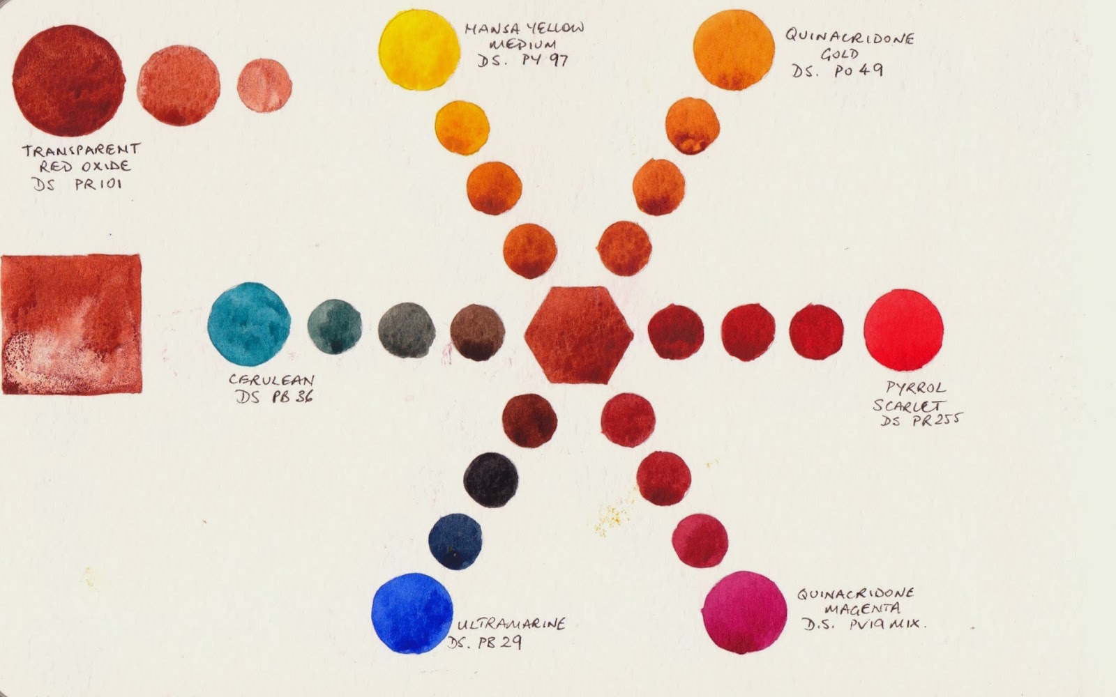
So how do you choose your reds?  Generally, one warm and one cool red are useful in the palette, though some like to have a mid 'fire engine' red as well. The warm red will mix to make wonderful bright oranges. The cool red will mix to create purples. If you choose to have an orange in your palette you may choose a mid red to spread your colours over the spectrum further. All the colours in your palette need to work together, so if you make a choice about one colour, it dictates other choices to a large degree. I generally like to have a warm red (or orange red), a crimson AND a rose red for mixing purples. With those 3 reds I can intermix with yellows and blues to make a huge range of oranges, mid reds and purples.

Now I'd like to look a little more at reds in general and show some comparisons.

Warm and mid reds

Here is a comparison of a range of warm (or orange-biased) reds and mid reds. Sadly it is difficult to reproduce reds and oranges accurately so a more useful idea of the actual colour might be found on individual manufacturer's websites. Most of the samples are single pigment colours, which is my preference, but some are a mixture. There are a huge number to choose from, and generally the key is do you want a transparent or opaque red? Do you want warm with a definite orange bias or mid red? Do you want a particular brand? do you want a staining red?

I don't have a problem mixing one brand with another, it's really about what brand you can get hold of most easily and most affordably. Make sure you look at the tube size when buying to compare the price per gram or ounce, but keep in mind that artist quality watercolour lasts a very long time so while a colour you love may cost a bit when you buy it, you may still be using the same tube 15 years later! Unless you are doing a lot of flower painting, you may find you get through your warm reds fairly slowly too, so a smaller tube is fine.

I tend to favour the Pyrrol reds for transparent colours and have Pyrrol Scarlet DS or Transparent Pyrrol Orange DS as my warm red options. If I want a true bright mid red I have a pan of Pyrrol Red in my studio, but I could equally mix this as a hue. MG Naphthol red and DV Naphthol red, though made from different pigments, also both work well as a mid red that mixes beautiful oranges. If I want an opaque red I'd go with Cadmium Scarlet or Cadmium Medium and most brands are fine. Cadmiums are expensive though, so only buy them if you really want the creamy opaque characteristics. Do note that Cadmiums are more toxic than many other pigments so don't let your cat drink your paint water!

You can see some degree of granulation in some of the samples below and they all painted out fairly well except the Mayan Orange, which I didn't like. I painted it from a very small dry sample, but as I always squeeze out my paints into a palette and let them dry, it didn't work for me. (Winsor Red is another popular option if you are looking at W&N watercolours - pictured in the cool reds section below, along with the lovely DS Permanent Red. Whoops!)

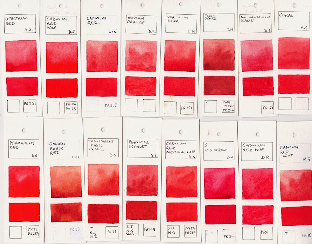
Spectrum Red AS, Cadmium Red Pale DR, Cadmium Red W&N, Mayan Orange DS, Vermilion Extra OH, Flesh Ochre, OH, Anthraquinoid Scarlet DS, Coral AS
Permanent Red RR, Golden Barok Red OH, Transparent Pyrrol Orange DS, Perylene Scarlet DS, Cadmium Red Hue DS, Scheveningen Red Medium OH, Cadmium Red Hue DR, Cadmium Red Light MG.
Pyrrol Red DS, Naphthol Red DV, Pyrrol Scarlet DS, Cadmium Red Scarlet DS, Naphthol Red MG, Organic Vermilion DS, Bright Red OH, Scheveningen Red Light OH.

Cool Reds

The many cool reds, or purple biased reds, are often variations of an Alizarin Crimson hue, since Alizarin Crimson PR83 is fugitive and certainly not recommended. Carmine by DS, mentioned above, is one of my favourites for a primary or single pigment red. W&N Permanent Alizarin also works well for this purpose. I also like the DS Permanent Alizarin as a deeper crimson but it is a mixture of three pigments, so I use DS Pyrrol Crimson.

The deep Perylene Maroons are an interesting and popular option too. Some use Perylene maroon + Quin Rose to create a more permanent alizarin crimson hue of their own. I tend to add a touch of phthalo green PG7 to my Pyrrol crimson to create these deeper maroons but they can be convenient for shadow colours.

While the traditional purpose of a cool red is to make purples, I generally find a rose or magenta makes clearer and more beautiful purples so I use crimson as a convenience colour and add a rose to my palette for making purples and pinks.

These painted out very well so the thing to watch is how many pigments are in the colour and how permanent they are. I love the colour of DS Permanent Red Deep but closer inspection of the pigment eliminated it from my palette as the light-fast of that specific version of PR170 is not good enough. It's a shame as it is another great primary red colour, but only if it is in a sketchbook or for reproduction, not for framing or sale.
Permanent Alizarin DS, Carmine DS, Anthraquinoid Red DS, Pyrrol Crimson DS, Perylene Red DS, Winsor Red W&N (a warm red), Permanent Red DS (a mid red)
Permanent Alizarin Crimson W&N, Alizarine Crimson (Quinacridone) DV, Permanent Red Deep DS, Alizarin Crimson DS, Alizarin Crimson W&N, Perylene Red DR, Napthalmide Maroon DS, Perylene Maroon DS.

Pinks and Roses

If you are adding a pink or rose to your palette there are a number of options. I'd steer clear of the fugitive Rose Madder and Opera Rose/Pink though. I'd also keep away from DS Rhodonite as it changed colour in my light fastness tests.

For general use is it hard to go past PV19 - Quinacridone Rose/Permanent Rose. This pigment is ASTM II rated and makes lovely purples with almost any blue. PV19 seems to be a very versatile pigment. It comes in a rose version and a violet version and will be found in Alizarin Crimson hues, permanent rose, quinacridone rose, quinacridone red (not to be confused with the W&N Quinacridone Red made with PR209), quinacridone violet, red rose deep and so on. It covers a range from a gorgeous rose pink to a rose crimson to a violet. Choose one that you like on its own first, and then make sure you also like the way it mixes. A rose colour is lovely in florals and sunsets and is useful for portraiture as well.

I like DS Quinacridone Rose, DV Permanent Rose Quinacridone, DV Red Rose Deep Quinacridone (which I have as a huge 37ml tube) and the MG Quinacridone Rose, except that this colour, like all in the MG range, is best for the studio as it doesn't 'set' or dry.

Potter's Pink PR233 is an interesting granulating dusty pink - lovely but of limited use. I have this as an occasional use pan just in case, but wouldn't recommend it as a 'must have' colour.

The other lovely option for a cool red for mixing purples is a magenta, which will be covered in a later post - Watercolour Comparisons 13 - Purples. Most of the samples painted out well except the Mayan Red. I tend to avoid the multi-pigment Holbein colours too - this one has white in the mix.
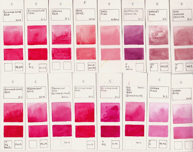
Quinacridone Red W&N, Quinacridone Coral DS, Mayan Red DS, Rose Dore W&N, Shell Pink Holbein, Rhodonite Genuine DS, Potter's Pink DS, Rose Madder Genuine DS
Quinacridone Red DS, Permanent Rose W&N, Permanent Rose (Quinacridone) DV, Quinacridone Rose MG, Quinacridone Pink DS, Rose Red Deep (Quinacridone), Opera Pink DS, Opera Rose W&N.

So there is a vast range of reds to consider. You can probably manage very well with 2, 3 or 4 of them depending on the size of your palette and what you paint, and perhaps a fun one for special effects. Remember to check the light fast rating of all you buy, and make sure your colours interact and mix nicely together.

I will compare earth reds in a separate post - Watercolour Comparisons 11 Earth Reds.

Watercolour Comparisons 1 - Ultramarine Blue here
Watercolour Comparisons 2 - mid yellows here
Watercolour Comparisons 3 - Primary Red here
Watercolour Comparisons 4 - Burnt Sienna here
Watercolour Comparisons 5 - Greens (Single Pigment, convenience mixes and special effect) here
Watercolour Comparisons 6 - Reds (Cool, mid and warm) here
Watercolour Comparisons 7 - Yellows (cool mid and warm) here
Watercolour Comparisons 8 - Blues here