
I recently put together a set of 6 colours to get someone started in watercolour.

This page shows just some of the possible two colour mixes you can make with this set.
 |
| Amazing mixes with just 6 colours. |
Add a third colour to each mix and increase the possibilities further.
There are many possible 'just 6' combinations. I have chosen a mid yellow and a primary red that will each mix clean secondary colours, added a warm blue as this will make cleaner purples and more realistic greens. I have then added a phthalo green as this increases the green mixes but also makes black with crimson and turquoise with Ultramarine. Burnt Sienna makes wonderful dark browns, deep blues and greys with Ultramarine and deep earthy greens with phthalo green. The final colour could be an earth yellow such as yellow Ochre or raw sienna but I have chosen Quinacridone Gold as this warm and slightly neutral yellow makes wonderful realistic greens and will mix with Burnt sienna to make other yellow earths. There isn't much this palette can't do.
These are all Daniel Smith colours but Da Vinci's Alizarin Crimson Quinacridone or W&N Permanent Alizarin or Carmin make alternative primary crimson reds; Ultramarine in most brands is an option, Phthalo Green BS is also available in most brands (called Winsor Green by W&N); Schmincke make a Pure Yellow that is a lovely primary yellow as is Winsor Yellow. Burnt Sienna is available in most brands but I prefer the versions made with PBr7. Quinacridone Gold genuine is only available from Daniel Smith but Yellow Ochre is an alternative, or use a Hansa Yellow Deep or New Gamboge.
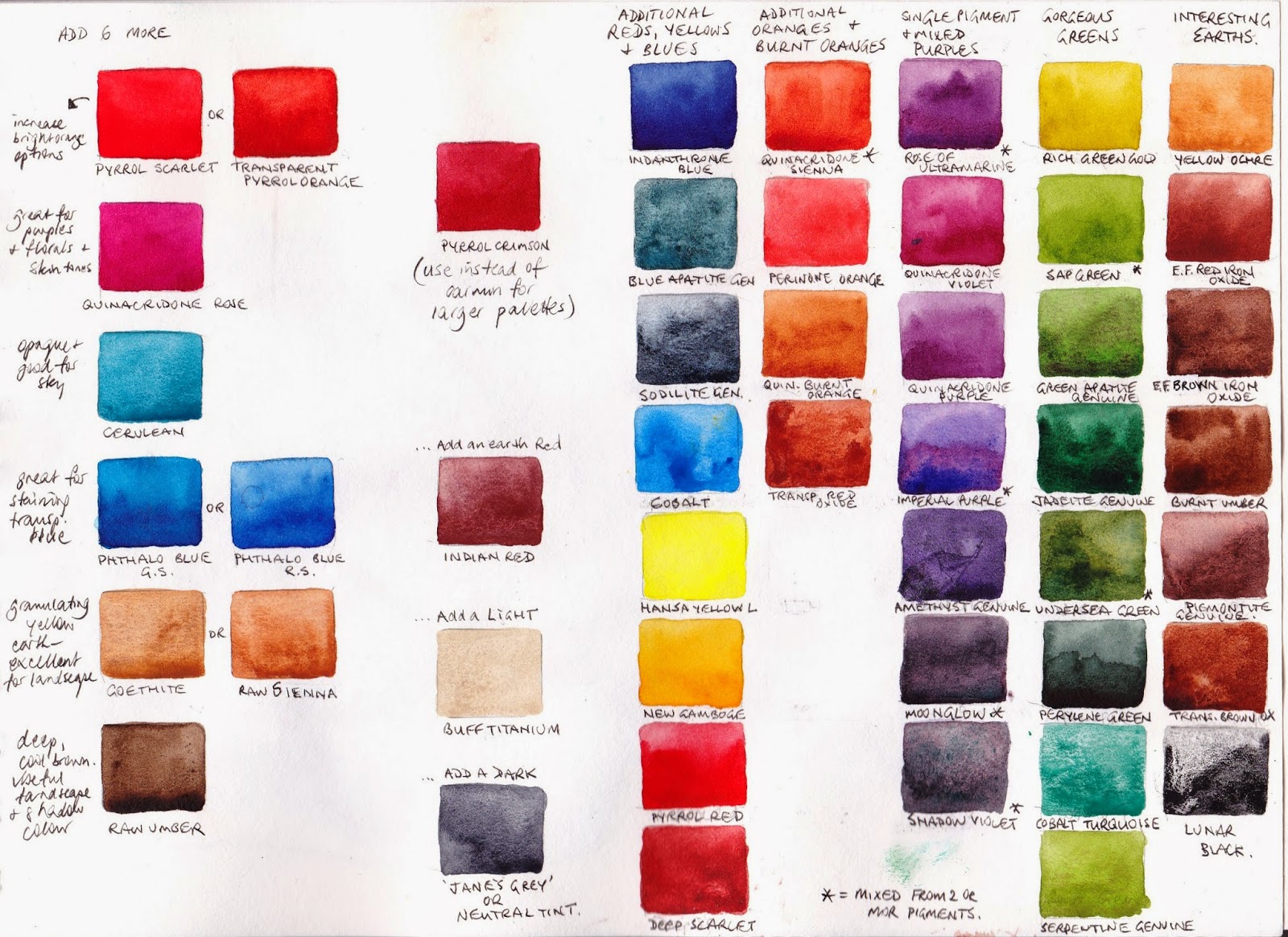
The next page shows my suggested next 6 colour additions to increase the colour range. These are Pyrrol crimson - a warm red, a Quinacridone Rose, an opaque Cerulean, a phthalo blue, a granulating earth yellow and a lovely deep raw Umber. With this set of 12 colours I would switch from Carmine to Pyrrol Crimson as the Quinacridone Rose covers the making purples role, or leave out Quinacridone Rose and keep Carmine.
I would then add Indian Red, so I can use an earth triad, and then perhaps a lovely light Buff Titanium and a dark.
Next are a whole lot of other wonderful Daniel Smith colours that are available to increase the palette. They are convenience mixtures to save time or special granulating colours that add and extra dimension to your work. I like to have some convenience colours so I don't spend all my time mixing while painting. Also I like to use only two or a maximum of three pigments in a mix if I can. Using a single pigment green, purple or orange can help with this. The mixtures are marked with an asterisk. All the others are single pigment colours.
I really love your color studies. I'm learning so much from you.
ReplyDeleteThanks Lianna - it's great to know it's helpful! Happy painting. :-)
DeleteHi Jane, I was wondering...is there a way to mix an approximation of buff titanium from the basic palette -- or maybe a slightly broader one? Or is it a color you really must break down and buy? I've been experimenting all weekend and never get it quite right. But maybe it's not possible?
ReplyDeleteBuff titanium is actually a white pigment though lovely and creamy coloured, with some opacity and lots of granulation. To make an approximation you would need to use a white watercolour paint as a base otherwise you will be painting mostly with water to get something so light. You would have to mix a bit 'jane's grey' mix of ultramarine and burnt sienna into the quin gold and add a touch of that to the white and you might get sort of close but without the granulation. Even if you have Goethite and white it is not the same. I think is is a worth while colour to buy, but i use it all the time :-)
DeleteOh thanks for this. You're making me feel much better. This mix is a lot like one I tried over the weekend (I had some Chinese white lying around) and it was always a little too blue, a little too yellow, a little too gray. Well, my birthday is coming up. Now I know what to ask for!
ReplyDeleteLOVE your website. Such a great find. I will be back. Thank you again!
Well happy birthday! Depending where you live you will fine it really useful. I don't know if DS is easy to find where you are but in Sydney Australia it is gradually being brought into stores. At a price! I paint a lot of Sydney sandstone and Buff Titanium, Goethite and Transparent Red Oxide are fabulous. TRO is a brighter and more granulating orange version of Burnt Sienna, made with PR 101. Not essential by any means but one of my favourite 'Extras', along with the expensive but amazing Green Apatite Genuine and the interesting three pigment mix Moonglow.
DeleteI found my way to your site via Liz Steel who holds you in high esteem. I can't tell you how much I appreciate ALL the work studies you've done with watercolor paint. This is an amazing resource. Thanks so much for saving me scads of time picking out colors for a rather limited palette, which I've always enjoyed using, preferably no more than 12 colors. I live in the USA in the high desert which is made up of red and buff colored sandstone mountains and an alkali hard pan desert valley, once the bottom of a vast sea.
ReplyDeleteJoan that sounds like a wonderful landscape to paint! It is fascinating how much each artists' limited palette varies. It depends so much on what you are painting. I try to come up with colours that will mix to paint any subject, but if you specialise in a particular subject you can be more specific in your colour choices. I imagine your palette would have some wonderful earth colours, especially granulating colours with few bright yellows or bright reds.
DeleteDaniel Smith Piemontite, Hematite burnt scarlet, transparent Red Oxide, Buff Titanium, Lunar Red Rock, Lunar black and goethite are all fabulous colours for painting the desert, with great granulation. You can see some of these painted out above but rather small. I have also painted out some of them in my Blog looking at Burnt Sienna options - http://janeblundellart.blogspot.com.au/2013/11/watercolour-comparisons-4-burnt-sienna.html Others are in the tutorial section of my website. Others are still waiting to be added....so many paints!
Hello Jane! I am thrilled to have located your well-thought out limited pallete as we are getting ready to head out for a long safaris trip. These sacred Big Five and more will indeed bring out their lively radiant energy through many wonderful combinations from your chosen colors. This in turn calls for my profound THANKS! to you. As they say, Keep Calm and Keep on Painting! Steven
ReplyDeleteThank you. This palette will really do a lot of you are not intending to get the 'exact' colour for all you paint. I love exploring limited palettes even if I don't choose to use one :-) Have a great trip.
DeleteI have bought your ebook but my computer crashed and have a question - do you have instructions on how to paint your own watercolor mixing chart? Hope to retrieve my ebook from my harddrive!
ReplyDeleteThanks, Paula in Florida
You should be able to reload the book if you go into your Blurb account. It can load back into iBooks on any Mac device.
DeleteAs for making your own charts - there are many ways! One of the most useful is to set them up in a good quality watercolour sketchbook or a loose-leaf folder system so you can refer to them. Set up one with green mixes, one with orange, one with purples and one with neutrals. Rule lines as a guide (I like to work 1.5cm high) and I use a 1/4" brush to paint the swatches showing a range of mixes from one colour through to the next.
Good luck!
hi jane! I'm really curious about your choice of buff titanium - would you consider showing us the diff ways you use it/ the things you use it for? I know you mentioned its great for textures of sand/stone/buildings and such, but I'd love to see what it looks like!
ReplyDeletealternatively, which purple (in moonglow, shadow violet, and I guess piemonthe) is most diverse in its use in your opinion? thanks so much!
Hi Quin. You can see how Buff Titanium mixes in this post http://janeblundellart.blogspot.com.au/2015/08/3-mixing-with-buff-titanium.html
DeleteTo see it in action, look at my plein air sketches here http://www.janeblundellart.com/plein-air-sketches.html
It's a colour I use a lot and really love, but it's not for everyone :-)
In terms of purples, that really depends what you are after. Moonglow, being a 3-pigment mix, is interesting for its unique granulation - the crimson floats and the ultramarine and viridian settle and you can see all three in washes which looks great. It is a slightly neutalised purple though.
DeleteIf you want a very bright mid purple that granulates, Imperial Purple DS is a good option. For one that doesn't granulate try Carbazole violet. For a more red-purple with granulation, try Rose of Ultramarine. For a lovely blue-violet with granulation, try Cobalt violet. See them all here - http://www.janeblundellart.com/purple-watercolour-swatches.html
For the Pthalo Green here, are you recommending the yellow or blue shade for the limited palette? Thanks so much for your wonderful helpful blog!
ReplyDeletePhthalo green BS, as it will neutralise the carmine to create lovely dark greens, greys, plum colours, black etc.
DeleteHi Jane,
ReplyDeleteHave you got an update to a 6 colour palette or are you still happy with this one.
Thanks,
Clarisa
There are many 6-colour palette suggestions, and they all have their strengths and limitations. You might use goethite instead of quinacridone gold if you want the granulation of that lovely earth yellow. You might use quinacridone rose instead of carmine for a purer rose colour (though then you can't make the same black). You might prefer to have a definite cool yellow and definite warm yellow (such as hansa yellow light and hansa yellow deep) rather than a mid yellow and quinacridone gold...
DeleteWorking with just 6 colours will have limitations. I prefer to use more, but this is still a very useful 6-colour set. You can see others here https://www.janeblundellart.com/sketchbook-pages.html
Just saw this above, thank you Jane!
DeleteI'm new to watercoloring and art in general. I found your blog and its great. I was debating on getting a cool and warm of red, yellow, and blue. However, after reading this article and seeing the color combinations as well as the colors I can add as I grow I have decided to try your six color palette. Thank you.
ReplyDeleteThey work very well! Quinacridone Rose (or permanent rose in some brands) is an alternative 'primary' red option rather than carmine, but I love the depth of the black and grey mixes you can created with carmine and phthalo green.
Deletewhat is the difference between carmine red and cadmium red? Could they be used interchangeably? I already own the wiinsor newton cadmium and I find a little goes a long ways. I try not to accumulate too many tubes of paint because it overwhelms me, and I work best using a limited palette.
ReplyDeleteI don't know which brands you are referring to, but Carmine in Daniel Smith is a deep crimson-rose. Cadmium red is usually more of a warm red. They are quite different in mixing and in characteristics so not interchangable.
DeleteI just found your website and blog! I am in awe of all the work you have done in the beautiful color mixing charts...I wish I had found your site back in April so I could have bought your book(soft cover) on Blurb with that 15% discount! :( As it is, I will be happy with the Ebook, thanks for including it for sale. You are phenomenal!
ReplyDeleteI'm struggling with warm vs cool colors. Any tips? For example I think Hansa yellow is considered cool while quadricone gold is warm. But those just feel opposite to me. I know that mixing warm red and a warm blue gives a different purple color then mixing a cool red and a warm blue etc. But I can't find a Daniel Smith chart that shows which colors are warm and which are cool.
ReplyDeleteCan you help?
Thanks
Hansa Yellow light (PY3) is cool as it leans towards green. Hansa Yellow Medium is mid - a primary yellow that is neither warm nor cool. As it is so bright, it may feel warmer than the slightly more neutralised Quin Gold. However Quin Gold is a warm, though neutralised, yellow.
DeleteMixing a warm red (such as DS pyrrol scarlet) and a warm blue (such as DS Ultramarine) will create dull purples. Mixing a warm red (pyrrol scarlet again) and a cool blue (phthalo blue Green Shade) will not make purple at all - it will make greys, blacks, deep cool blues and red earth hues. Mixing a cool red (quinacridone Rose) and a cool blue (phthalo blue GS) will make amazing purples simply because Quin Rose makes purples with almost any blue. Mixing a cool red (quin Rose ) with a warm blue (ultramarine) will create the cleanest purples as both lean towards purple, so have no yellow to dull the mix.
The same applies with making greens - a greenish yellow and a greenish blue will make the brightest greens. That means a cool yellow and a cool blue. If you mix a warm yellow and a warm blue (quin gold and ultramarine) you'll make dull, but often useful, greens as both contain a little red to dull the mix.
And a warm yellow and warm red will make the brightest oranges.
Hope that helps.
You have an amazing color knowledge that you share freely to the world. And it is greatly appreciated. I am just a beginner at watercolors. I bought a little Winsor en Newton sketching set, and made few easy "copies" around Christmas. Now I want to make my 'own' art. First, I am trying to improve my sketching abilities, as I haven't been drawing for years. My father was an artist and I never felt like it was something that I could do too. Maybe also because I have colour blindness. But then, so did he. Now it feels like it is something I have to do...
ReplyDeleteAnd your color knowledge will help me I hope. 😉
Thank you - enjoy the journey :-)
DeleteYou are an incredible resource. Thank you for all the wonderful sharing you do.
ReplyDeleteThank you :-)
Delete