Thursday 28 August 2014

Colour exploration - a single pigment colour wheel


My sketch books have been busy!

Below is a colour wheel painted out in only single pigment colours. Some are not quite ideal, and not all are necessary, but an interesting exercise to do.

  • Ultramarine Violet in the 5.30 position is very weak in Daniel Smith. Another brand may be better, though it is a weak tinting pigment. Try Da Vinci or perhaps QoR.
  • Amethyst Genuine could go in the 5.30 spot instead, but is very dark and neutralised. 
  • Indanthrone Blue in the 4.30 position is also a neutralised blue. 
  • Cobalt Turquoise in 2.30 is not as bright and powerful as a mix of Phthalo blue and Phthalo green would be, and is more opaque and granulating but I love it!  Amazonite genuine is a more transparent alternative.
  • Cobalt Green in 1.30 would be better replaced with phthalo green YS.
  • In the 11.30 position I have placed New Gamboge, but have mixed Quinacridone Gold below as that's my favourite warm yellow.
  • Quin Rose in 7.30 could equally be Quin Magenta PR122. They are different but are both used as a cool clean mixing red for making purples.
Notice the two triangles in the middle connect the primary triad Hansa Yellow Medium, Ultramarine and Pyrrol Crimson and the secondary triad Benzamida orange, Phthalo Green and Carbazole Violet. Together they make fantastic 6 colour palette seen here.


Each of these pairs opposite each other on the wheel neutralise each other to a grey or black, creating a huge range of earth and tertiary colours, with the exception of the yellow greens and the red purples.

Here they are painted out in pairs.


3 - lovely deep greys

12 - don't neutralise each other to grey. good for orchids!


1 makes raw umber hues

2 neither ultramarine violet nor Smalt a perfect combination. Try amethyst?

4 Lovely orange earth colours


5 Indigo and red earth hues


6 Orange earth hues


7 Indian red and venetian red hues


8 Deep greens and greys

9 Black, grey, plum, aubergines

10 Lovely purples and deep greens


11 not so interesting.


I don't tend to work with a palette of pure bright colours as I love the earth pigments, but it's fascinating to see where they all fit into the palette.


Colour exploration - Super bright 6 colour palettes - updated.


Once again I have been exploring palettes with no earth colours but this time using neutralising pairs. Here are a couple of gorgeous bright palettes to consider. 

The first is based on my gorgeous bright quartet, posted here, that contains DS Hansa Yellow Medium, DS Transparent Pyrrol Orange,  S Purple Magenta (or use DS Quinacridone Lilac) and DS Phthalo Blue RS. The Red Shade of Phthalo Blue neutralises completely with Transparent Pyrrol Orange to create a black. (2020 update - Transparent Pyrrol Orange is now mid orange rather than a red-orange.)

Here in this set I have switched to Phthalo Blue GS. I have added Phthalo Green YS PG36 which neutralises purple magenta to a grey, though not a black. I have also added  Carbazole Violet which neutralises Hansa Yellow Medium to create yellow earth hues and raw umber hues. So the palette contains one of each primary and one of each secondary in neutralising pairs. They are quite neatly arranged around the colour wheel, though not completely evenly. All are Daniel Smith watercolours except the Schmincke Purple Magenta.

Super bright 6 colour palettes
The second set switches Purple magenta to Carmine (or better yet a crimson such as Pyrrol Crimson or Permanent Alizarin). This will neutralise with phthalo green BS to a black and a whole range of lovely aubergine and plum colours. That combination is why I tend to have a crimson in my palette. Ultramarine is my favourite blue for painting and is completely neutralised by the orange as seen here. The yellow and purple neutralise each other as noted above. (see these and other neutralising pairs here.) Notice how evenly the colours fit around the colour wheel. I think this would be the brightest, most balanced 6 colour set I could find. See this star set of colours on the full colour wheel here. All are Daniel Smith watercolours except the Benzimida Orange Deep, which is Da Vinci (sorry it is actually PO36 not PO71 as labelled). (W&N and QoR also make gorgeous transparent/translucent oranges of a similar hue using PO71, or DS Transparent Pyrrol Orange could be used as it is now (2020) a mid orange.)


Monday 25 August 2014

Plein Air watercolour Sketching Workshop

Feel like coming to a Plein Air Workshop this Friday?

If you are in Sydney I'd love to see you there.
For bookings check this link
http://www.artest.com.au/ArtEst.WeekendWorkshopsandMasterclassesforadults2014.html

Thursday 21 August 2014

Ultramarine, Mid yellow and Magenta - a gorgeous basic bright triad with Ultramarine.

I wrote a post about this set here in May 2013. I wanted to have another look at them, so here is the amazing range you can get with Ultramarine Finest Schmincke PB29, Purple Magenta PR122 Schmincke and Hansa Yellow Medium PY97 Daniel Smith, though Schmincke Pure Yellow would do the same thing. Or if using W&N, Winsor Yellow, the more granulating French Ultramarine and Quinacridone Magenta.
If you want to add a 4th to create neutral browns and greys more quickly, add an orange - a bright orange as seen here or a Burnt Sienna as seen here

Other Burnt Sienna options are shown here

This is an alternative to the beautiful bright quartet using Phthalo Blue Red Shade shown here.

Alternative primary red options are the more crimson W&N Permanent Alizarin, DS Carmine or DV Permanent Alizarin Quinacridone. I prefer the more crimson primary reds, since I don't see a lot of 'magenta' out in the real world - more pinks and crimsons, but nothing I have used mixes cleaner than PR122. Another excellent primary red is a PV19 Quinacridone Rose (or Permanent Rose). It will also mix clean purples and oranges. It is slightly less powerful than the magenta, but more lightfast and is a basic colour in my palette.

Ultramarine and Oranges - looking for a neutralising pair.

My previous post showed what is possible with a quartet of transparent non-granulating colours based around Phthalo Blue RS and Transparent Pyrrol Orange D.S. See here

But what if you don't mind granulation and love Ultramarine but still want a really bright limited palette?

In these sketch book tests I was looking for an orange to neutralise with Ultramarine to create blacks, greys, deep blues and browns the way Burnt Sienna does.

Row 1 - a tiny dot sample of W&N new limited edition Transparent Orange PO171with their limited edition Phthalo Saphhire which is very like Phthalo blue RS. This mix makes greens rather than greys and black.

Row 2 - W&N Transparent Orange mixed with DS Ultramarine. This looks promising but I ran out of my dots sample! I'll add to this if I get some more. It is a lovely orange, though incredibly similar to the Schmincke PO71 version :-)

On the right is the more red Transparent Pyrrol Orange DS - made from the same PO71 as Schmincke Transparent Orange seen in row 3, but, as is often the case, it doesn't mix in the same way. It is so important to know the brand, colour name AND pigment numbers to be able to match a particular paint mix.

Row 3 - W&N Phthalo Sapphire next to DS Phthalo Blue RS - you can see how similar they are. Then Schmincke Transparent Orange and DV Benzimida Orange Deep PO36 which are also very similar though perhaps the Benzimida Orange Deep is cleaner and slightly less yellow? I then mixed Benzimida Orange Deep with Ultramarine - creates a wonderful range of earthy browns, greys, black and deep blues :-) Very similar to the mixes I get using Burnt Sienna and ultramarine.

4 - Ultramarine blue mixed with Schmincke Transparent Orange. These are also lovely lively colours with a hint more yellow perhaps.

5 - Phthalo Blue RS mixed with Benzamida Orange Deep and they don't neutralise, though they do produce lovely greens. (Even better with Phthalo blue GS!)

So the perfect neutralising bright orange for DS ultramarine seems to be Da Vinci Benzamida Orange Deep or Schmincke Transparent Orange with W&N Transparent orange looking promising. Three different pigments, three very similar colours.

Would they be the same with other brands of Ultramarine?
Below is Ultramarine Finest and Transparent Orange, both Schmincke. Lovely.
The second row is DaVinci Ultramarine Blue with DV Benzamida Orange - same as with DS
Oranges and ultramarine blues, different brands.
Next is DS Ultramarine with Schmincke Transparent Orange and finally DS ultramarine with Benzamida orange again.

Schmincke Transparent orange has a slightly more golden glow, so adds a slightly green cast to the neutrals.

To see Ultramarine mixed with Purple Magenta and Hansa Yellow medium, click here


Tuesday 19 August 2014

Colour exploration - 4 bright, non-granulating watercolours - an amazing quartet. (updated)

I have been exploring limited palette options again and came up with this set. This is an unusual palette of watercolours for me as it doesn't contain Ultramarine, my favourite blue, or Burnt Sienna, my favourite earth orange, and it does contain Quinacridone Magenta though that is not a favourite! Note this is called Purple Magenta in Schmincke or Quinacridone Lilac in Daniel Smith - who added this pigment to their range in 2017. I find it a difficult 'real world' colour and would generally rather use a rose or crimson. However, PR122 is an amazing mixing colour which, like phthalo green, can transform other colours beautifully and mixes very cleanly but in my opinion is best not used alone.

This quartet of colours is designed to be transparent, bright and non granulating - a bit like working with inks - and works beautifully!

It is based around a fabulous pair of transparent watercolours - Transparent Pyrrol Orange DS and 
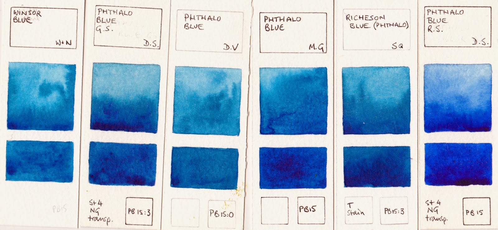
Phthalo Blue RS DS. These neutralise each other completely to create a fantastic range of greys, black, warm browns and burnt oranges. See the first colour mixing row 1.

Other manufacturers make Phthalo blue RS (or Winsor Blue RS) but I have not found an alternative brand for this orange. Schmincke make Translucent Orange with the same pigment but it is not as red. (see separate post on oranges and blues) QoR also make a transparent pyrrol orange but it is not the same hue. As mentioned in the comments below, I'd recommend using Daniel Smith with or without Schmincke for this set, but I find W&N colours can fight with DS colours so I don't suggest mixing those brands.

Hansa Yellow Medium PY97 Daniel Smith, Purple Magenta PR122 Schmincke (or use the new DS Quinacridone Lilac), Phthalo Blue R.S. PB15 Daniel Smith and Transparent Pyrrol Orange PO71 Daniel Smith.
To make oranges and greens a mid yellow is added - Hansa Yellow Medium PY97 DS, though it could be Schmincke Pure Yellow or W&N Winsor Yellow or DV Hansa/Arylide Yellow Medium. This is a lovely bright yellow. for even more transparency it could also be a PY150 yellow such as DS Nickel Azo Yellow but I like the purity of Hansa Yellow Medium.

2 -  Hansa Yellow Medium mixed with Transparent Pyrrol Orange PO71 DS 

4 - Hansa Yellow Medium mixed with Phthalo Blue RS PB15 DS to make bright greens. 

To make purples and reds and crimsons the very bright Magenta PR122 is required. This was not made by Daniel Smith when I created this post (I often wondered why not) but was added to the range in 2017 and is called Quinacridone Lilac. Is also available as Purple Magenta by Schmincke or Quinacridone Magenta in many other brands including W&N, Daler Rowney,  Old Holland, and QoR. It is often used as a primary red pigment. I prefer the Schmincke version or the new DS version. The advantage of this pigment over my usual preferred PV19 Quinacridone Rose is that it will create a rich crimson when mixed with Transparent Pyrrol Orange.

3 - Mixed with the DS Transparent Pyrrol Orange it creates gorgeous reds and crimsons 

5 - Mixed with Phthalo Blue RS it makes amazing purples  

6 - I mixed Purple Magenta with Yellow as they also make wonderful oranges, reds and crimsons. 

You can see how easy it is to create bright mixes of oranges, greens and purples. 

7 - I then added a little magenta to the Phthalo Blue RS to create a warmer blue, which made more neutral greens when yellow was added 

8 - I did the same thing adding some Transparent Pyrrol Orange to the yellow to made it warmer, then adding the blue to make more mossy greens 

9 - The last row is all three primaries mixed together to create a range of darks and neutral earth hues.

Another very bright transparent and non-granulating pigment is Phthalo Green PG7. I use this for many mixes, especially to make a rich black with a crimson. I mixed it with the Purple Magenta (1 below) to see if it would neutralise to black. Like Quinacridone Rose, it makes great purples but not black. 

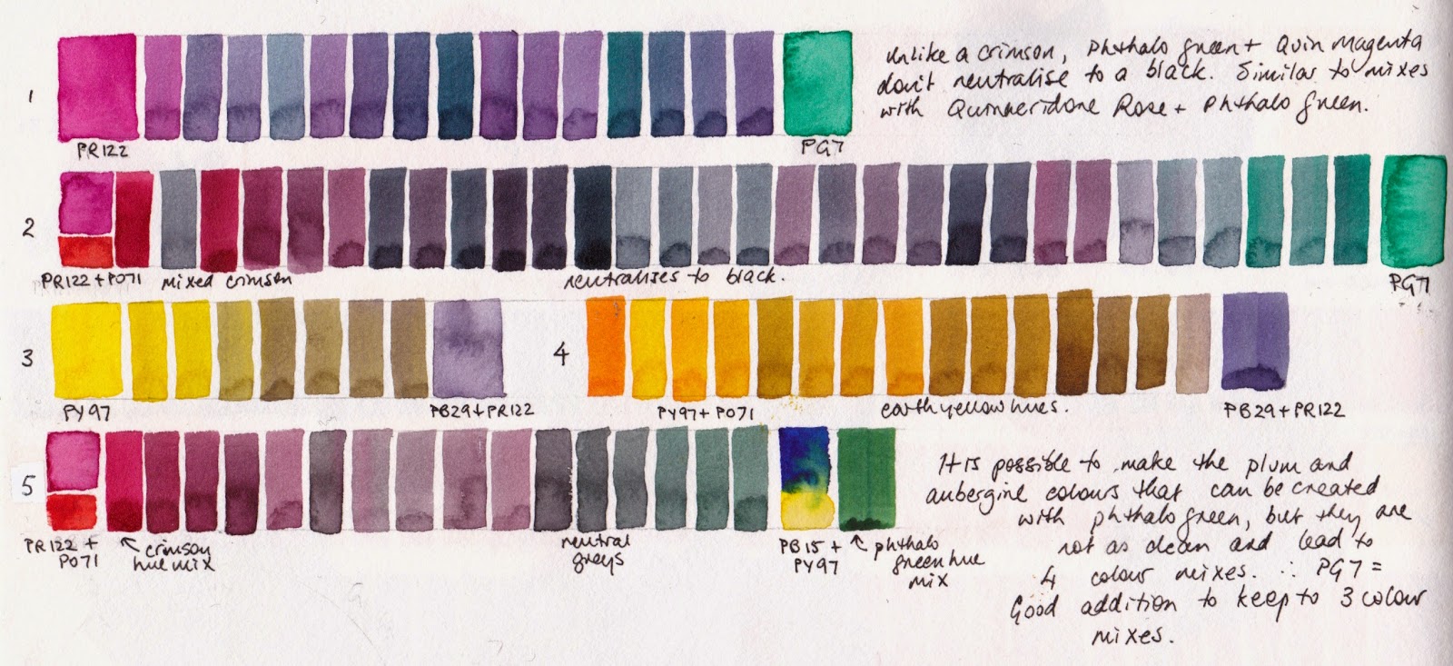
Mixes with my amazing quartet along with Phthalo Green PR7.
2 -  I mixed a crimson hue by mixing Transparent Pyrrol Orange with Purple Magenta, then mixed that crimson with Phthalo Green and yes - blacks and aubergines are possible. 

3 - back to my bright quartet colours, I tested the yellow to see what earth yellows I could create just with my initial 4 colours. Alone mixed with a purple made from the blue and magenta, hansa yellow medium creates some interesting cool earth colours. 

4 - With a little orange added Hansa Yellow Medium creates yellow ochre and raw sienna hues and some raw umber options.

5 - I tried mixing a crimson from the magenta and orange then creating a phthalo green hue to try to create the same aubergine and black options. It comes close, though required all four pigments. I try to steer away from 4 pigment mixes but it is possible. 

So I think a phthalo green is a useful addition if you want to limit yourself to three pigment mixes but increase to 5 bright transparent colours. Phthalo Green yellow shade would be the best option as it neutralises magenta to a grey. And if you want a 6th? A purple is the obvious choice for a balanced palette. Such lovely sets of 6 can be seen here, but as purple is very easy to mix, I'd rather add Quinacridone Gold DS :-)

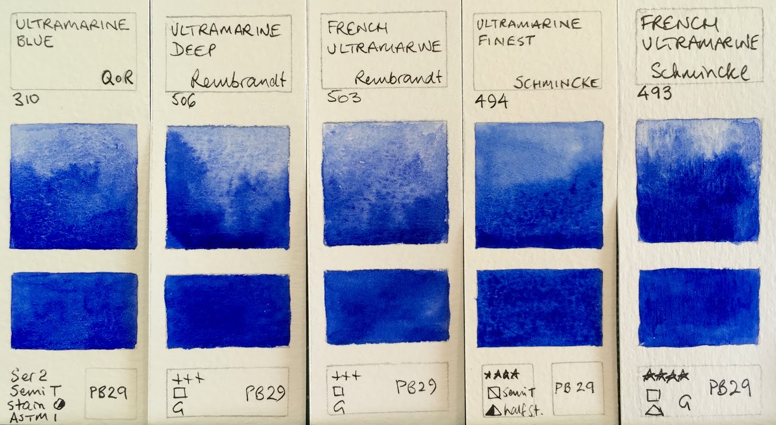
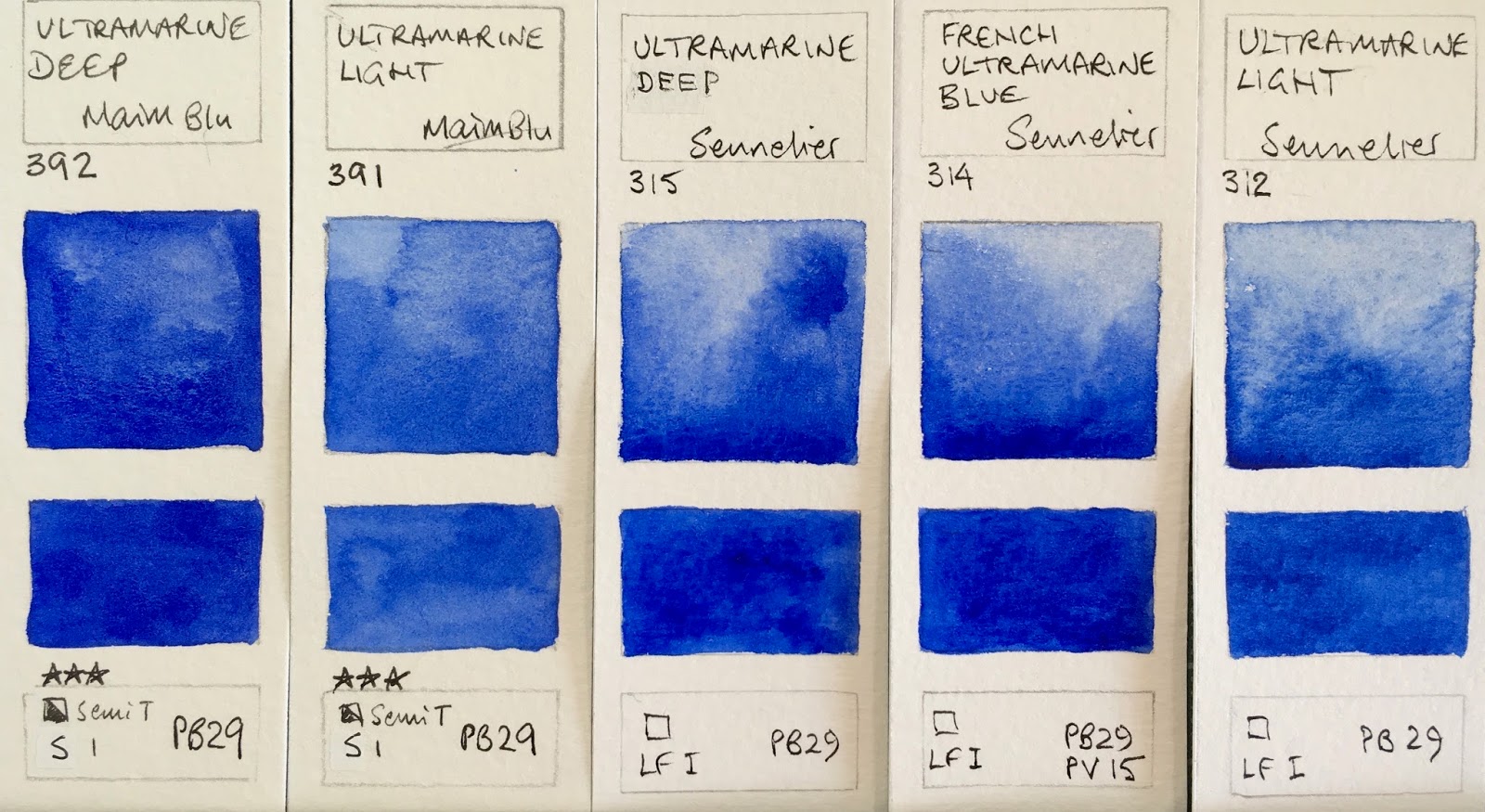
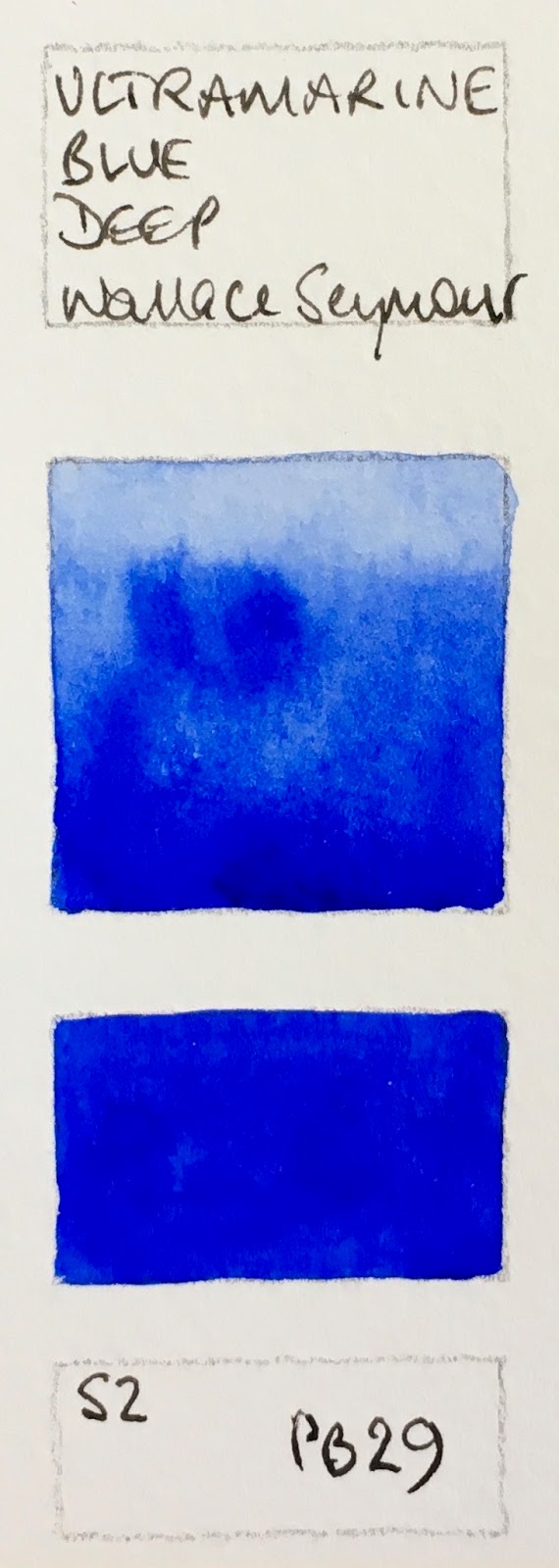
My next tests will be with Ultramarine instead of Phthalo Blue RS to see if I can find a completely neutralising bright orange........ see here.

Happy painting!

Sunday 17 August 2014

Last couple of days to support The Perfect Sketchbook

The Perfect Sketchbook

This link gives you all the information about this great idea, or see my earlier Blog post http://janeblundellart.blogspot.com.au/2014/07/the-perfect-sketchbook.html

https://www.kickstarter.com/projects/theperfectsketchbook/the-perfect-sketchbook-for-travel-artists-and-art

It is almost there but only a couple of days to go. Erwin has added a 10 book reward for backing $220 which is a great idea. Check it out please :-)

Winsor & Newton limited edition watercolours

I received a Winsor & Newton dot card with their limited edition water colours 'inspired by the Australian outback' at a recent art society  meeting. I love to try out new colours so here they are.


...and here they are painted out. They are each single pigment colours, which is always my preference, with some interesting characteristics. 
Yellow Titanate, Transparent Orange, Indian Red Deep, Phthalo Sapphire, Gold Brown, Dark Brown Winsor & Newton watercolours

Yellow Titanate is considered an option as a Naples yellow. It is opaque and like many versions of Yellow Ochre but this is made with PBr24. Some granulation.
Transparent Orange made with PO107 is probably the most beautiful Orange I have tried. Bright and beautiful with little colour shift, it really glows. No other manufacturers have made a watercolour with this pigment though it seems to be reliable. 
Indian Red Deep is made from PBr 25. Daniel Smith have a Permanent Brown made from the same pigment - a definite red-brown. Something like a transparent Indian Red option. 
Phthalo Saphhire is similar to a Phthalo Blue Red Shade in other brands, made with PB15:6. 
Gold Brown is apparently made from PBk12, which is curious. It says it is transparent on the chart but I found it more opaque with some interesting granulation.
Dark Brown is a very opaque and unusual brown, that has some granulation.

I tested the blue and orange to see if they would neutralise each other as DS Transparent Pyrrol Orange and DS Phthalo Blue RS do, but they don't - they make an interesting range of hues but not a neutral black. I tried the orange with ultramarine and created a more neutral grey but by then I'd run out of pigment to test any further. :-)

This orange is one I would consider buying and will compare it further with Da Vinci Benzamida Orange Deep and Daniel Smith Transparent Pyrrol Orange, my other favourite single pigment oranges. DS Quinacridone Sienna is another lovely one but a two pigment mix.
The last two swatches are the W&N phthalo sapphire next to DS Phthalo Blue RS - similar but not identical.

Thursday 14 August 2014

Watercolour Comparisons 8 - Blues

I have posted in detail about Ultramarine as a primary Blue. Here I will show comparisons of a larger range of blue watercolours from different manufacturers. I have now added all these and more to my website so you can compare them all here.

Ultramarine (updated February 2018)

Ultramarine has been covered in more depth in a previous post. It is a warm blue so leans toward purple - they all have a hint of red in them. They will mix with a rose or pink to create beautiful clear purples, and with a yellow to make slightly neutralised greens. Here are a number of examples all made with PB29 (though one is a two pigment mix). They vary in how easily they re-wet, the amount of granulation and also slightly in hue. My favourites are Da Vinci and Daniel Smith, though I also like the new Schmincke French Ultramarine added in 2017. These photos are taken under 'sunlight' bulbs with no adjustment for best comparison.

Ultramarine Blue Watercolours: Ultramarine - Art Spectrum, French Ultramarine Blue Deep - Blockx, French Ultramarine Light - Blockx, Ultramarine Blue - Daniel Smith, French Ultramarine - Daniel Smith.

Ultramarine Blue Watercolours: French Ultramarine Permanent (RS) - Da Vinci, Ultramarine Blue - Da Vinci, Ultramarine (Green Shade) - Da Vinci, French Ultramarine - Daler Rowney, Permanent Blue - Daler Rowney.

Ultramarine Blue Watercolours: Ultramarine Light - Holbein, Ultramarine Deep - Holbein, Ultramarine Blue Light - Lukas, Ultramarine Blue Deep - Lukas, Ultramarine Blue - M.Graham.

Ultramarine Blue Watercolours: Ultramarine Light - Mission Gold, Ultramarine Deep - Mission Gold, Ultramarine Blue Deep - Old Holland, Olutramarine Blue - Old Holland, French Ultramarine Light Extra - Old Holland.

Ultramarine Blue Watercolours: Ultramarine Blue - QoR, Ultramarine Deep - Rembrandt, French Ultramarine - Rembrandt, Ultramarine Finest - Schmincke, French Ultramarine - Schmincke (new 2017)


Ultramarine Blue Watercolours: Ultramarine Deep - MaimeriBlu, Lutramarine Light - MaimeriBlu, Ultramarine Deep - Sennelier, French Ultramarine Blue - Senelier, Ultramarine Light - Sennelier.

Ultramarine Blue Watercolours: Ultramarine - St Petersburg, Ultramarine Blue - Schmincke, Ultramarine - White Nights, Ultramarine (Green Shade) Winsor & Newton, French Ultramarine Blue - Winsor & Newton.

Ultramarine Blue Watercolours: Ultramarine Blue Deep - Wallace Seymour.


Cobalt Blue
Closest to a primary blue in that it is neither 'greenish' nor 'purplish', Cobalt is a lovely but expensive pigment. Look for the genuine PB28 for the most beautiful and liftable granulating washes. Some artists prefer cobalt to the deeper Ultramarine as a basic blue. I have it as an 'extra'.

Cobalt Blue W&N, Cobalt Blue ShinHan, Cobalt Blue Hue Derivan, Cobalt Blue AS, Cobalt Blue DS PB28.


Cerulean 

Cerulean varies from brand to brand but generally behaves as a cool blue making bright greens. Genuine Cerulean PB35 is slightly warmer than my preferred Cerulean Chromium PB36 DS. It is a rather opaque colour with plenty of granulation and particularly useful for skies and for mixing opaque greens. 

Cerulean Blue Derivan, Cerulean Blue W&N, Cerulean Blue (Hue) Da Vinci, Cerulean Blue DS


Cerulean Genuine DV, Cerulean Blue Chromium DS, Cerulean Blue Deep OH, Cerulean Blue Genuine DV

 Phthalo Blue

A cool and staining blue, phthalo blue is a very common colour in any palette. Available in Green Shade and Red Shade versions, with the green shade being the most common. Phthalo Blue Red Shade is another primary blue option if transparency, staining or non granulating properties are desired.

Winsor Blue W&N, Phthalo Blue GS DS, Phthalo Blue GS DV, Phthalo Blue MG, Richeson Blue (Phthalo) SQ, Phthalo Blue RS DS.

Prussian Blue

Not one of my favourites, Prussian Blue is an alternative blue if a less staining cool blue is desired. Made from PB27. Easily mixed with Phthalo Blue and a warm red.

Prussian Blue MG, Prussian Blue W&N, Prussian Blue DS, Prussian Blue DV

Deep Blues

Genuine Indigo is not light fast but the colour is very popular. It is a deep blue that can be warm or cool depending on the manufacturer. Often made with Indanthrone blue or phthalo blue and black, Da Vinci is unusual as it is made from Prussian Blue and Quinacridone Rose or Violet.
Indanthrone Blue also varies, with Daniel Smith being a warm version and Winsor and Newton a cooler. The S. Quiller example is in between. I don't often use indigo though it is rather lovely with quinacridone gold, but I love using DS Indanthrone Blue in dramatic skies.


Manganese Blue

Sadly most versions of Manganese Blue are hues and don't have the magical granulating characteristics of the genuine pigment, famous for painting snow effects. It is not an essential colour as it is not strongly tinting but quite beautiful.


Other Blues

The first three of these are mixes of little value as far as I can see. Smalt Genuine is an interesting very warm blue - almost a violet, made in a limited edition by Winsor and Newton. Lunar Blue is made of the highly granulating Lunar Black with phthalo blue and is wonderful for special effects. Daniel Smith Mayan Dark Blue is an interesting stormy blue colour thought I prefer Sodalite below, Mayan Blue Genuine did nothing for me! 


Primatek Blues

These Daniel Smith colours are fascinating to try. I love the granulation of Blue Apatite Genuine and Sodalite Genuine, especially for stormy skies or a granulating grey option. Some were very disappointing.

Kyanite Genuine, blue Apitite Genuine, Azurite Genuine, Smalt Genuine, Lapis Lazuli Genuine, Vivianite Genuine, Sodalite Genuine (all Daniel Smith)

So how many to you need?

Depending on the size of your palette, you may work with just one blue such as Ultramarine or Phthalo Blue RS that you warm up or cool down as required, two blues - probably both ultramarine and phthalo blue GS, three if you want to add the granulating and more opaque cerulean, four if you want to add the deep indanthrone blue, 5 if you want a granulating special effects blue....and so it goes on. The blues you choose need to work to make a good range of greens and purples and are very important colours on your palette. I like to have at least three - Ultramarine, Phthalo blue and Cerulean PB36. My basic palette of 20 also has Indanthrone blue, and I have Blue Apatite Genuine and Sodalite genuine and some others as special effect colours in my studio.

Watercolour Comparisons 1 - Ultramarine Blue here
Watercolour Comparisons 2 - mid yellows here
Watercolour Comparisons 3 - Primary Red here
Watercolour Comparisons 4 - Burnt Sienna here
Watercolour Comparisons 5 - Greens (Single Pigment, convenience mixes and special effect) here
Watercolour Comparisons 6 - Reds (Cool, mid and warm) here
Watercolour Comparisons 7 - Yellows (cool mid and warm) here
Watercolour Comparisons 8 - Blues here

Next up - Earth Yellows.

Watercolour Comparisons 7 - Yellows

I have posted about mid yellows in a primary triad palette, but here I will show comparisons of a full range of yellows, including warm and cool yellows. I will post about earth yellows separately. I have also added all these and more to my website so you can compare them here.

You have the choice of opaque or transparent yellows, with the very popular cadmiums being more opaque. You also have the choice of single pigment and mixed pigment colours. I use single pigment colours where possible. You also have a choice of staining or non-staining colours and to some extent granulating or not.

Cool Yellows

The cool yellow range includes many lemon yellows, cadmium light, hansa light and so on. These colours lean towards green and have no apparent red in them so will make very bright greens when mixed with a cool blue and more neutral greens when mixed with a warm blue. My favourite is Hansa Yellow Light PY3, made by Daniel Smith or Da Vinci. Art Spectrum use the same pigment in their Lemon Yellow. It is a bright, pure lemon yellow with plenty of tinting strength. Bismuth Yellow is more opaque, as are the genuine Cadmium Yellow Light colours. I don't like the Nickel titanate Yellows PY 53 at all - it is weak and ugly. I have added DS Aureolin here though it could equally be in with the mid yellows - either way it is not recommended as PY40 is not a reliable pigment.

Nickel Titinate Yellow Daler Rowney, Cadmium Yellow Winsor &Newton, Lemon Yellow Art Spectrum, Cadmium Yellow Light DS, Cadmium Yellow Light Hue DS, Winsor Lemon W&N, Bismuth Yellow, Steven Quiller

Nickel Titanate Yellow Daniel Smith, Bismuth Vandate Yellow DS, Hansa Yellow Da Vinci, Hansa Yellow Light DS, Aureolin DS, Aureolin Hue Lukas

Mid Yellows

The mid range are yellows that are neither warm nor cool - they don't lean toward green or orange - but can be tinted with a blue to cool them or with a red to warm them. They are ideal in a limited palette, but I rather like them in my regular palette too. The best known mid yellow is Cobalt Yellow or Aureolin PY40. Unfortunately, though you will see this recommended in many many watercolour books, it is not a good choice as the pigment fades in washes and goes grey in mass-tone so look for better alternatives if you want your paintings to last. If you have Aureolin, use it in a sketch book only, where it is protected from light, and photograph or scan your work for posterity.
I have written more about Mid Yellows in a previous post here  as I tend to use a mid yellow rather than a light yellow in my palette, but have tried out a few more colours since then. There are many that are good, my favourites being Hansa Yellow Medium DS and Arylide Yellow Medium Da Vinci. Schminke Pure yellow and Winsor and Newton Winsor Yellow are also good. In my experience Mayan Yellow didn't rewet well once dry on the palette. W&N Transparent Yellow made with PY150 is shown here, the DS and MG versions are with the warm yellows below, though they are all fairly similar slightly neutral yellows.

Arylide Yellow DV, Hansa Yellow Medium DS, Mayan Yellow DS, Schev Yellow Light Old Holland, Tranparent Yellow W&N.

Azo (Aureolin) M. Graham, Azo Yellow DS, Pure Yellow Schmincke, Aureolin W&N, Cadmium Yellow Medium Hue DS, Winsor Yellow W&N.
Warm Yellows

Warm yellows are yellows that lean towards orange. These will mix with blues or phthalo green to make more olive-greens due to the neutralising red in them. In Australia I find the warm yellows make wonderful realistic greens. In Europe mid or cool yellows may be more useful. The first two rows are the brighter hue warm yellows. My favourites of all these are New Gamboge by Daniel Smith and Hansa Yellow Deep by Daniel Smith or Da Vinci. As always, I am less interested in the mixed pigment yellows.

Isoindoline Yellow DS, Indian Yellow W&N, Cadmium Yellow Deep Hue DR, Cadmium Yellow Deep DR, Indian Yellow DS, New Gamboge DS, Gamboge Hue DV

Gamboge Hue DR, Gamboge Hue DR, Cadmium Yellow W&N, Permanent Yellow Deep DS, Hansa Yellow Deep DV, Cadmium Yellow Deep DS, Hansa Yellow Deep DS.

The next group are slightly neutralised yellows. Quinacridone Gold PO49 by Daniel Smith is one of my favourite warm yellows and can double as a transparent yellow earth colour. Nickel Azo Yellow washes out to a lighter almost lemon yellow but has a deeper, slightly dirty masstone. W&N Transparent Yellow uses the same pigment.
Nickel Azo Yellow DS, Nickel Azo Yellow MG, Quinacridone Gold W&N, Quinacridone Gold DS, Australian Red Gold AS, Quinacridone Gold Deep DS.
Remember with yellows, like all colours, the most expensive are not always the best - the price of artist quality colours relates to the cost of the pigment. Cadmium and Cobalt pigments are expensive. Arylide pigments are cheaper, so the Hansa colours, which have wonderful purity, are a good choice for colour and for price.

Watercolour Comparisons 1 - Ultramarine Blue here
Watercolour Comparisons 2 - mid yellows here
Watercolour Comparisons 3 - Primary Red here
Watercolour Comparisons 4 - Burnt Sienna here
Watercolour Comparisons 5 - Greens (Single Pigment, convenience mixes and special effect) here
Watercolour Comparisons 6 - Reds (Cool, mid and warm) here
Watercolour Comparisons 7 - Yellows (cool mid and warm) here
Watercolour Comparisons 8 - Blues here


Wednesday 13 August 2014

A Drawing a Day (post 2)

I went to the Powerhouse Museum on Saturday with the Sydney Sketch Club and really enjoyed sketching some of the costumes from 'Strictly Ballroom' the film. Watercolour pencil and watercolour has always seemed the perfect way to sketch costumes and I had a lovely time giving it a go. My favourite are the Faber Castell Albrecht Dürer watercolour pencils. They have a huge colour range but what I love is that the colours are realistic, don't change dramatically when you add water, are generally lightfast and are nice and soft so rewet well.
Strictly Ballroom costume sketches in Moleskine watercolour sketchbook.
I then went to the Tea Cosy in the Rocks, Sydney, and met up with a lovely bunch of sketchers for a tea party with my friend and fellow sketcher Liz Steel. So my next artist's style to tackle is Liz. Not easy as she works very quickly and I don't. However I started by drawing a teacup - one of her favourite subjects - complete with tea.  The initial drawing was done in a grey water-soluble pencil. I used a lovely fountain pen with a flexible nib to do the black details, filled with De Atramentis Document Black ink which is waterproof. Then added the watercolour washes.


I tried to draw another subject in a much faster way than I usually would so I did a quick sketch in water soluble pencil, added line-work in fountain pen - my Lamy Joy with an EF nib this time - added a wash of watercolour and left it alone. I was using Sailor Nano ink in the pen, which is not completely waterproof in this pen so it blurred just a little. Probably a good thing as it stopped me from fiddling :-)
A quick study, watercolour pencil, pen and watercolour.
I'll try that Chinese bronze again with water-soluble pencil and watercolour without the ink in a more realistic style another day...

Tuesday 12 August 2014

A Drawing a Day.

Starting this month, I am trying to do a drawing a day. There are many people who have started this sort of challenge. Some have lots of rules. All pen. No pencil. All from life. Only black or blue. For a year. For 75 days......Whatever.

I just plan to do a sketch/study/drawing/painting in a sketchbook every day. If I miss a day, I'll do two the next day. Some will be started in pencil, some in pen, some with a wash. No rules :-) In the meantime, I also plan to 'try on' a couple of different drawing styles by other artists. First up - ball point pen, in the style of Andrea Joseph, famous for very detailed drawings that fill a page with ball-point pen studies. There is a great video of her drawing in ball-point pens here

This double page spread was done over a few days during the first week of August. I added another item each day, or a bunch of buttons.  I am amazed at the sensitivity of drawing with a ball-point pen! Now I need to find a good brown one....apparently Fisher make a sepia...
Right side of the page in progress - Buttons, drawn with brown pens of various sorts and pencils - in a Moleskine Watercolour A4 sketchbook.

Left side of double spread in progress - Red things. Drawn with red and black ballpoint pens, with the centre section in blue pens.
This study of keys was started with a brown Pilot pen then black ball-point added over the top. I started to draw the pens in. It takes a very long time...like the one above, this is rather a work in progress. I love the Pilot for writing with but it is more like a felt tip pen for drawing. The ballpoint is wonderful for drawing but not comfortable to hold for a long time and I have never liked them for writing.


A tiny study of a piece of Pumpkin Crunch in ballpoint with some coloured pencil added. Drawn in Bic cristal black pen.

Cufflinks, made from bits of Swiss watches - really testing the limits of my medium Bic cristal pen. I had to add watercolour using a fine brush to get the finest details.

Working Sketchbook pages - Fountain Pen and Drawing Inks

I have many pages in my sketchbooks that I use to explore different materials or mediums.

They are not finished sketches but exploratory tests. Some may be useful to others.

This are a series of test sheets in Stillman & Birn Alpha landscape sketchbooks - my favourite for this sort of exploration. I love using a fountain pen to write and draw. I use a number of Lamy pens (as well as a number of other brands) and have had problems with damage apparently caused by Noodlers ink. So I started a search last year for a waterproof black ink.

The German made and highly respected De Atramentis have a huge range of inks. In their Document range they have Document Black, Blue and Dark Blue, Red, Fuschia (Magenta), Turquoise (Cyan), Green and now Brown (update also violet, yellow, and fog blue-grey) that are waterproof once dry. They also have an Archival Black that has been tested under more stringent tests but appears the same as the Document ink. I have used both of these black inks in my Lamy Joy, Safari and Al-Star pens and they are wonderful. They are also excellent in a Sailor EF and a Namiki/Pilot Falcon EF soft (see a gorgeous video of a custom Namiki Falcon here.)  The Document Brown is wonderful - many brown inks are variations of reds and oranges rather than a true sepia or burnt umber brown like this ink - see Noodlers 'Singapore Sepia' below - which is maroon. You can see all the tests and mixes I have done if you do a search for De Atramentis in my blog.

I also wanted non waterproof inks for the Lamy pens as it can be rather nice to draw with a fountain pen then wash watercolour over and soften the lines. You just need to know before you start whether the ink is permanent or not. While I haven't yet found the perfect waterproof brown, I rather like the non waterproof De Atramentis Ochre Yellow and Terra Di Sienna. The Ochre Yellow actually looks more yellow/orange than this image and the Terra Di Sienna a little less red. (Update - I find Document Brown to be the perfect waterproof brown fountain pen ink :-) Mixed with Document Blue and some thinner, it creates the perfect grey too)

Fountain pen ink tests De Atramentis and Noodlers
Below are the De Atramentis Fog Grey and Ochre Yellow so you can see them in more detail. I use these for drawing with in my Lamy pens. The grey is lovely to write with too but they are certainly not waterproof. The colour is still a bit bright for the Ochre Yellow but you can see it is not at all 'yellow' - much more of an orange.

De Atramentis Fog Grey and Ochre Yellow fountain pen inks


 This page is testing the De Atramentis Archive ink in a Shaeffer pen. Dry after a minute.


This is Sailor ink - a lovely Nano ink that is almost waterproof if you use a very fine pen such as the Sailor with the EF nib.


In the Sailor EF the ink is applied very thinly so is more waterproof. De Atramentis is the most reliable though if completely waterproof is needed.


This next page is testing some Higgins inks with dip pens, which I also like to use. These proved not to be waterproof, which can have its uses. :-)


Below are some more explorations with Higgins Fountain pen India ink - non waterproof - and De Atramentis Fog Grey. I was testing them out for drawing -  looking for an ink that could be softened with a wash.