Monday 7 September 2015

Packing inks and pens

I am about to head off to the US for three weeks and was asked if I'd packed. Well I have filled my little travel watercolour palette, and my sketching palette, and my demonstrating palette to give them time to dry.

I've decided which sketch books to take for my demonstrations and for my own sketching, and printed out some maps for my travel journal.

I've filled my ink bottles and made sure they are all properly labelled.

I use the terrific little Nalgene storage bottles to carry ink - just 15ml. I also have a spare cartridge for the pens in which I use cartridges.

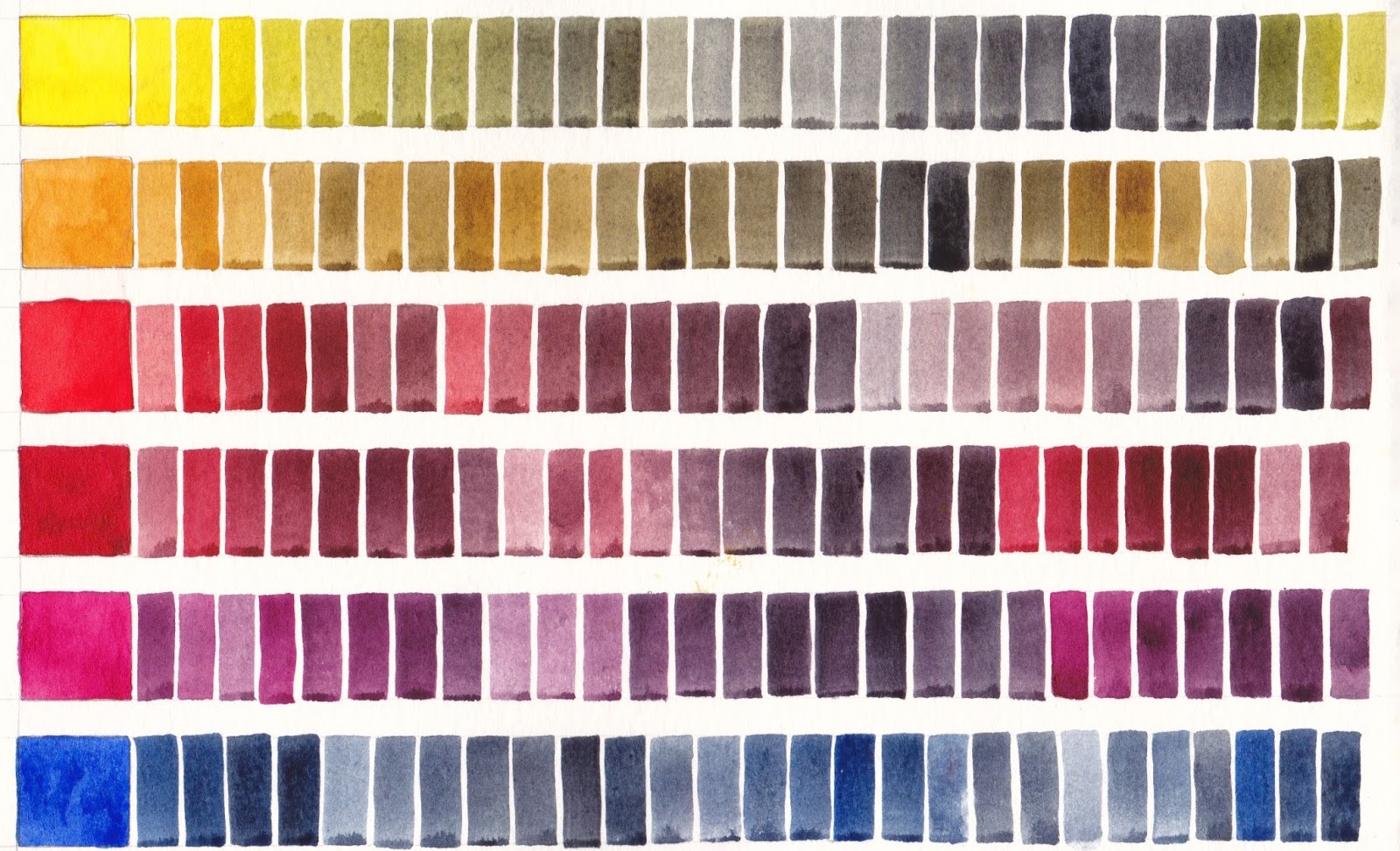
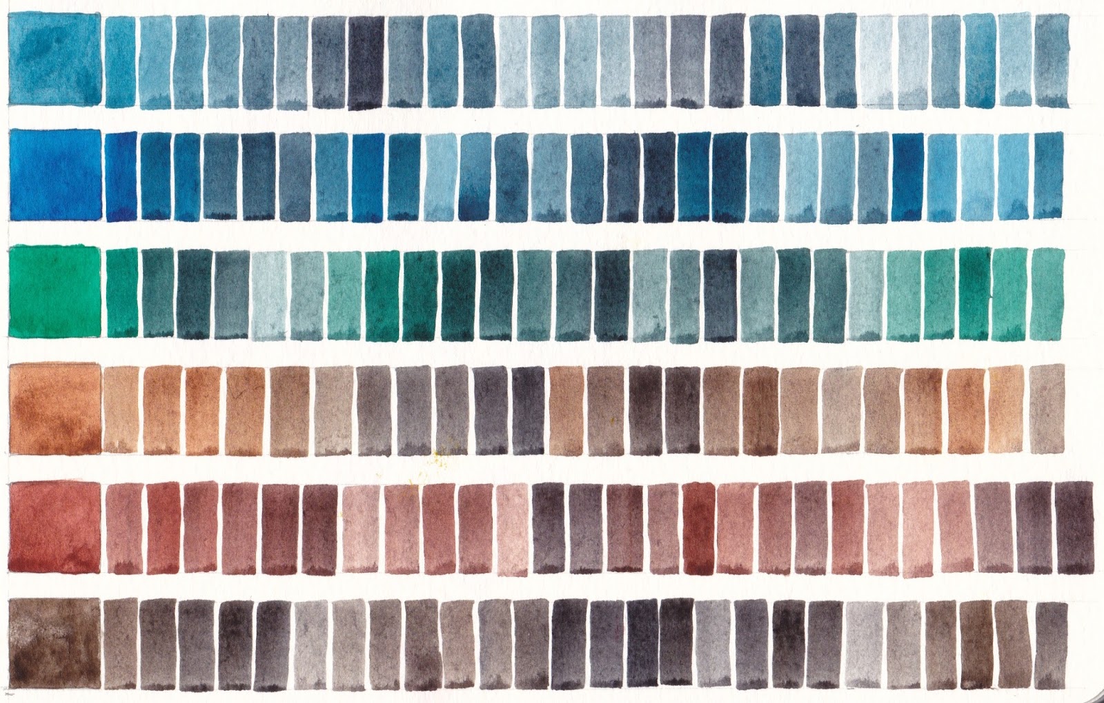
I'll take another set of 8ml bottles with the other Document Ink colours and the thinner for mixing custom colours.


I've filled my fountain pens, made sure they are all named, and double checked which ink is appropriate for each one.


Here are all my pens with their ink. I am using De Atramentis Document Black for the Lamy Joy, Pilot Desk pen and Pilot Falcon EF (top right). The Pilot Falcon F on the left has Document Brown ink. I just love that ink! The Carbon pen has a spare Platinum Carbon Ink cartridge. The copper Lamy Al-star in the middle on the right has a spare brown Monte-verde cartridge - I like this as a water-soluble brown ink. In the middle the Pentel Brush pen has a spare cartridge. At the bottom left the Pilot Falcon F has my custom Document Grey Ink and on the right the Lamy Al-star and the Hero are both filled with the original DA fog Grey ink - the non-document version which is a lovely soft grey but not waterproof. the lines will slightly soften in a wash.


The rest of my sketching kit is also named and pencils sharpened with extra leads. 

So am I packed? Well I have the important stuff sorted :-)


Thursday 3 September 2015

6 - Mixing with Jane's Grey

This is the 6th and final part of this series about mixing with my Ultimate Mixing Palette. These charts show 12 of the palette colours mixed with my custom mix Jane's Grey, which is made up of Ultramarine and Burnt Sienna. It acts as a neutral tint, darkening the other colours. Alone it is a lovely granulating and liftable dark grey, useful for shadows, skies and so much more.

Many artists use this combination of Ultramarine + Burnt Sienna, or perhaps Ultramarine + Burnt Umber as a basic grey and mix it each time they use it. I find having it as a premixed dark in the palette incredibly useful. Unlike commercial Payne's Grey or most Neutral Tints, it contains no black to deaden your paintings.

Jane's Grey added to Daniel Smith watercolours Hansa Yellow Medium, Quinacridone Gold, Pyrrol Scarlet, Pyrrol Crimson, Quinacridone Rose and Ultramarine, Moleskine watercolour sketchbook A5.
Jane's Grey added to Daniel Smith watercolours Cerulean Chromium, Phthalo Blue GS, Phthalo Green BS, Goethite, Burnt Sienna and Raw Umber, Moleskine watercolour sketchbook.

I make other greys while painting - Cerulean + Burnt Sienna for a dusty grey, Phthalo Blue + Burnt Sienna for a cooler grey, Pyrrol Crimson + Phthalo Green for a darker staining, non-granulating grey or black, but Jane's Grey is my go-to colour for darks as I would probably always include Burnt Sienna and Ultramarine in my paintings, so it always harmonises.

This series of 6 posts shows a fraction of the huge range of colours that can be produced with my Ultimate Mixing Palette. My book, 'The Ultimate Mixing Palette: a World of Colours' contains over 7500 different mixes, all indexed and cross-referenced. It is available as a hard or soft cover, an eBook or a PDF from Blurb.com here, along with my other comprehensive colour mixing book 'Watercolour Mixing Charts'.

Happy painting :-)

Super 5 fountain pen and inks

I was given a Super5 fountain pen to try. It's not intended as a drawing pen but has quite a nice 0.5mm italic nib for writing. It is quite heavy for a plastic pen so not one I'd be grabbing for over some of my other favourites but as I have recently posted about a number of pens thought I'd add this one.

Of more interest perhaps is the Super5 range of waterproof inks, which can be seen on their website here. The colours are unusual. There is a black (called Darmstadt) and a very useful looking grey (Frankfurt), a blue (Atlantic), an olive green (Dublin), a dull yellow (Delhi) and an Indian red (Australia).

They rate from 6 - 8 on the Blue Wool Scale, with the black rating the highest (7-8), which is acceptable, and they claim to be totally waterproof.

The Super5 Inks, from http://papierlabor.de/en/shop/inks/super5-ink-waterproof/
I haven't tried them - the blue in the pen was from the regular non-waterproof range - but I would be happy to hear from those who have. In the meantime I am perfectly happy to keep using the De Atramentis inks and mixing my own colours.

(If you want to see these mixes please search my blog or click Mixing De Atramentis Inks and you'll see some of the huge range of colours that can be created.)

Tuesday 1 September 2015

5 - Mixing with Indian Red

This is my 5th in my series on mixing with my Ultimate Mixing Palette colours. Just one more to go - mixing with Jane's Grey.

Indian Red is an interesting paint. It is the most opaque of any Daniel Smith watercolour I've used. It is best to use it without fiddling with it as the heavy pigment can be hard to control. What I love about it though is that it is the perfect colour for lips and the 'pink' of eyes in portraits, provided it is very diluted. It can also be used in mixes to paint the more red-toned skin. It is also lovely as an earth triad with Cerulean Chromium and Goethite for subdued paintings, and can be very useful for painting landscapes and rust.

Of my 15 palette colours, this is the one that is perhaps least used, but it completes the set of earth yellows (Goethite and Raw Umber), earth orange (Burnt Sienna) and earth Red (Indian Red) along with the earth blue Cerulean Chromium. An interesting earth green choice would be chromium green oxide but I would prefer Serpentine Genuine or Green Apatite Genuine.

Indian Red is made from PR101, one of the multi-personality pigments that can be anything from a transparent burnt orange colour, through a range of Venetian red and light red hues to a transparent brown.  Like PBr7 and PV19, the pigment number alone isn't enough to know what the paint will look like.