Monday 21 December 2015

A great year with the Urban Sketchers Part 2 - Paris

From Hong Kong I flew into Paris. I have some wonderful relatives on my sister's side I was able to meet up with, along with some of the Paris urban sketchers and friends from the Sketchbook Skool community.

Paris at the end of March was still very cold so sketching was a bit of a challenge on a very windy day but I had a lovely lunch with Cassandra, Lavinia, Tula and Marissa. You can see the door I sketched in the background of the photo.
L'observatoire, Meudon, Paris.

I went to Meudon in the suburbs of Paris and visited the beautiful observatory, which I sketched with Jean-Paul until we decided it just wasn't fun to be in the cold any more. Such an elegant building.


It was wonderful to catch up with the delightful Jean-Christophe for lunch on a rather rainy day. His gift for story-telling in text and pictures is legendary.


Pencil and watercolour studies of the fascinating eglise Saint Laurent, Paris

I was staying near Gare Du Nord and found a very old and architecturally eclectic church to sketch until it was time to meet up with Natalie and Emmanuel.

I headed off to England for a few weeks (see part 3) then returned with my daughter for a few more days in Paris - in much more friendly weather :-)

We did a lot of walking and exploring and had a fantastic time, though I didn't manage to sketch Notre Dame. Maybe next time.


We spent a very enjoyable morning at the gardens of the Musee de Rodin, where I loved seeing The Kiss again. I drew it as an assignment while at school, along with a number of other very famous sculptures, which seem like old friends whenever I come across them as a consequence. It was great to see our Kiwi friends Alexander and Linda while we were there. I did a very quick sketch of The Thinker and we headed off on our next expedition.
Peta's saw her first  carouselle in Paris when she was 2 years old and simply adored them. This one's a beauty. So is she :-)

I left Peta in Paris to head back to Cambridge and university and I returned to Hong Kong, then home.


Sunday 20 December 2015

Blockx Watercolours full range


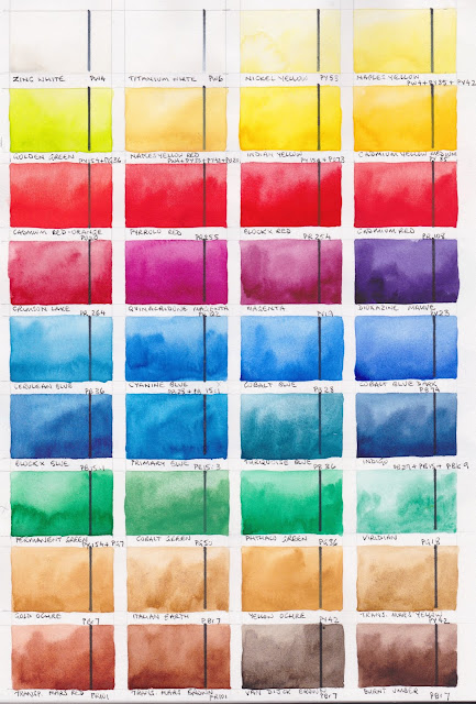
I had the opportunity to try out the full 72 colour Blockx range, and they have all been added to my website, but I thought it may be helpful to be able to see the full range here together as well. The majority of the colours are single pigment colours, mixed with gum Arabic and honey. They come from Belgium and are available in half pans, giant pans, 15ml or 35ml tubes.

Blockx watercolour full range chart 1
There is a good range of colours, with many gorgeous cadmium colours - probably the brightest versions of any brand I have tried - including the less common deep crimson-maroon colour called Cadmium Purple.

Since Cadmiums have been discontinued in many brands it is good to see them still being produced so nicely by Blockx, as while I don't use cadmiums for my general painting, I value them tremendously as excellent pigments when you want a more opaque colour. I keep a supply of the old DS cadmiums in my studio - Cadmium yellow light and deep, Cadmium scarlet and Cadmium red and I've now added the lovely Blockx Cadmium Red-Orange to my studio collection.

Other really lovely colours are the Turquoise Blue and Turquoise Green both made with PB36, a lovely deep blue-purple Ultramarine Violet PV15, and the granulating Manganese Violet PV16.

Blockx watercolour full range chart 2
Some of the watercolours don't re-wet as well as I would like, and they certainly didn't re-wet as well as the Daniel Smith paints I am used to. Some are difficult to use even straight from the tube.

While I don't recommend every colour in the range, I really enjoyed painting them all out. The particularly tricky pigments are difficult in any range - PY53, PG18, PV14 and PG23 in particular i.e. Nickel Yellow, Viridian, Cobalt Violet and Green Earth.

You can see the interesting Cadmium Purple left, but it is actually much stronger than it looks on my screen.

Notice there are two Ultramarines and two burnt siennas - nice to have options. I liked the Burnt Sienna Light best - nice and granulating (both are made with PBr7).

There are only a few mixed pigment colours and I wasn't that interested in any of them, but with so many single pigment paints it's easy to mix your own.


A real plus with this range is that you can try them out buying half pans of colours you may use only a little but buy tubes of those you may use regularly - or large tubes of those you'll use a lot. Note - I haven't tried the pan colours. I expect that if you are in or near Belgium these watercolours should be well-priced. There are sets available on Amazon.com but they contain some less useful colour combinations so it may be better to choose your own.

October 2018

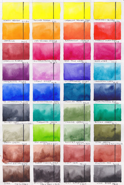
I have been working my way through my many lists of updates I have wanted to do, and one was to photograph and add these swatches. I'll leave the above versions since they are painted over a black line, but add the more detailed ones below.

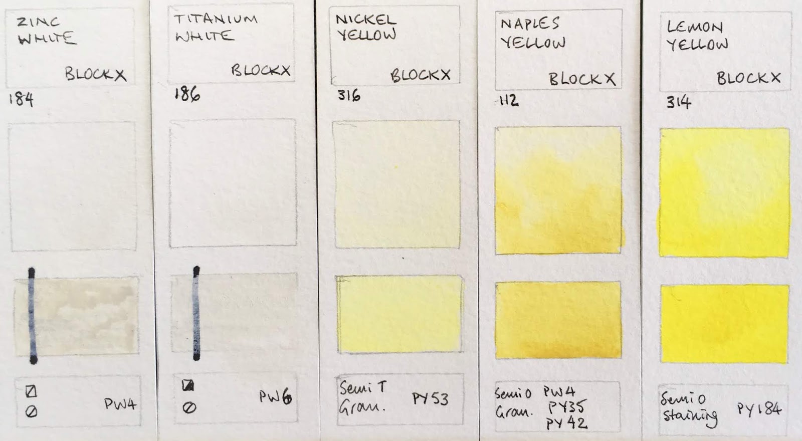
The Lemon Yellow is a really lovely bright version.
Block Watercolours - Zinc White, Titanium White, Nickel Yellow, Naples Yellow, Lemon Yellow.
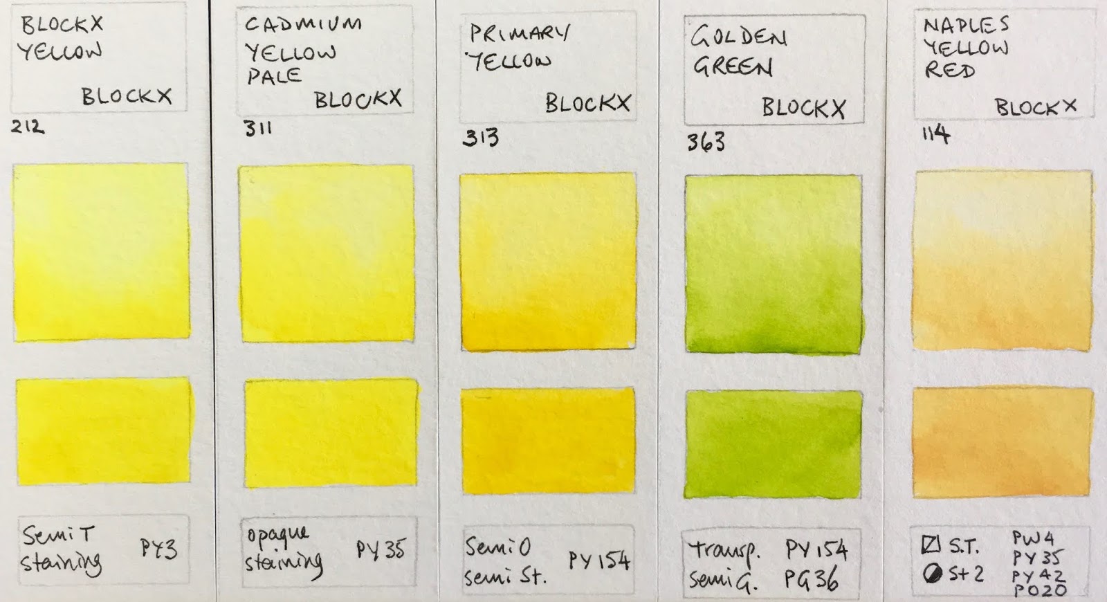
The first three here are all brighter than they look on my screen. The Primary Yellow would be a great choice for a limited palette.
Block Watercolours - Blockx Yellow, Cadmium Yellow Pale, Primary Yellow, Golden Green, Naples Yellow Red.

This set are also brighter than they appear on my screen - beautiful warm yellows and oranges. Gamboge is a lovely choice for a warm yellow.
Block Watercolours - Indian Yellow,  Cadmium Yellow Medium, Gamboge, Cadmium Yellow Orange, Permanent Orange.

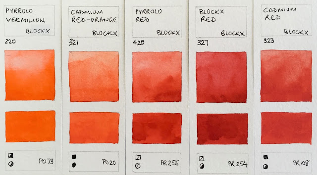
Pyrrolo Red is made from my favourite warm yellow pigment PR255. Blockx Red is a gorgeous bright fire engine red.
Block Watercolours - Pyrrolo Vermilion, Cadmium Red-Orange, Pyrrolo Red, Blockx Red, Cadmium Red.

Rose Pale Lake and Rose Lake are almost indistinguishable. Either works as a primary red or a cool red in a larger palette. Crimson Lake is my favourite crimson pigment.
Block Watercolours - Cadmium Purple, Quinacridone Red, Rose Pale K=Lake, Rose Lake, Crimson Lake.

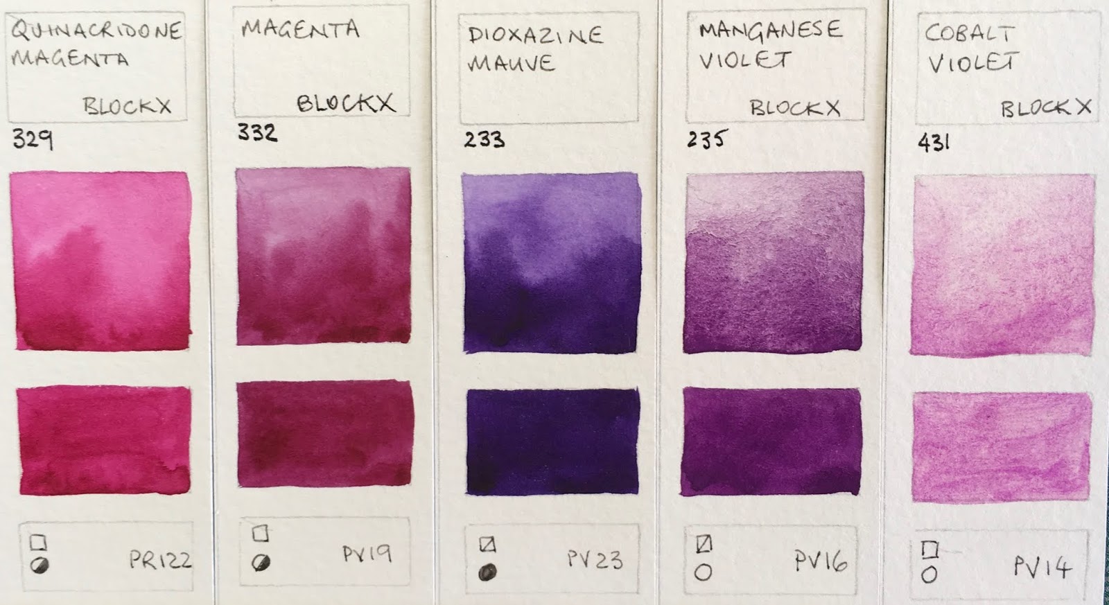
This set is pretty true to colour. I love the granulation of Manganese Violet.
Block Watercolours - Quinacridone Magenta, Magenta, Dioxazine Mauve,Manganese Violet, Cobalt Violet.

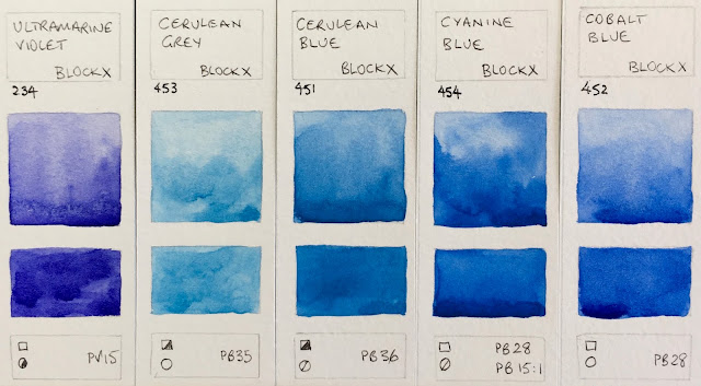
This is a lovely version of PV15, which can often be very weak.
Block Watercolours - Ultramarine Violet, Cerulean Grey, Cerulean Blue, Cyanine Blue, Cobalt Blue.


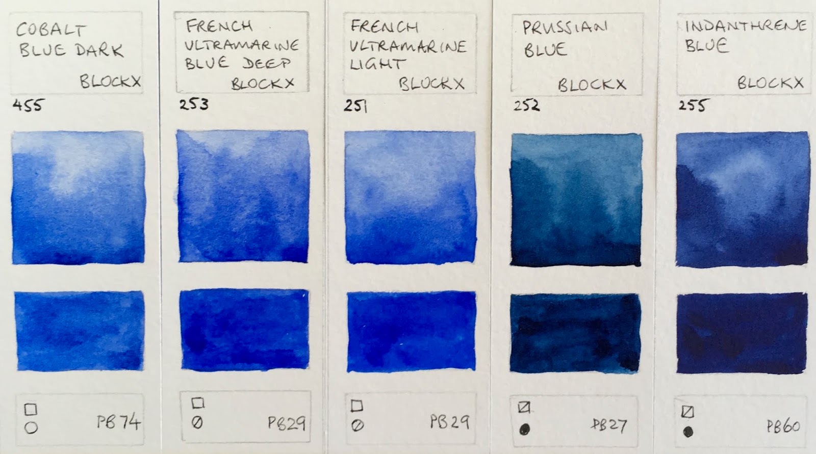
Block Watercolours - Cobalt Blue Dark, French Ultramarine Blue Deep, French Ultramarine Light, Prussian Blue, Indanthrene Blue.
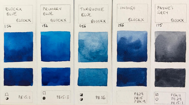
Block Watercolours - Blockx Blue, Primary Blue, Turquoise Blue, Indigo, Payne's Grey.

I like the fact that there are largely single pigment greens in this range, with a range of characteristics.
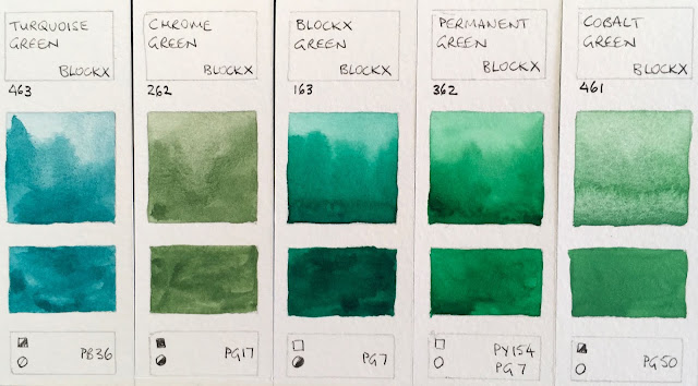
Block Watercolours - Turquoise Green, Chrome Green, Blockx Green, Permanent Green, Cobalt Green.

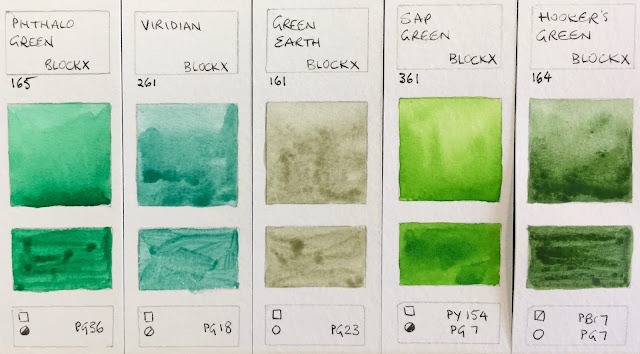
Block Watercolours - Phthalo Green, Viridian, Green Earth, Sap Green, Hooker's Green.

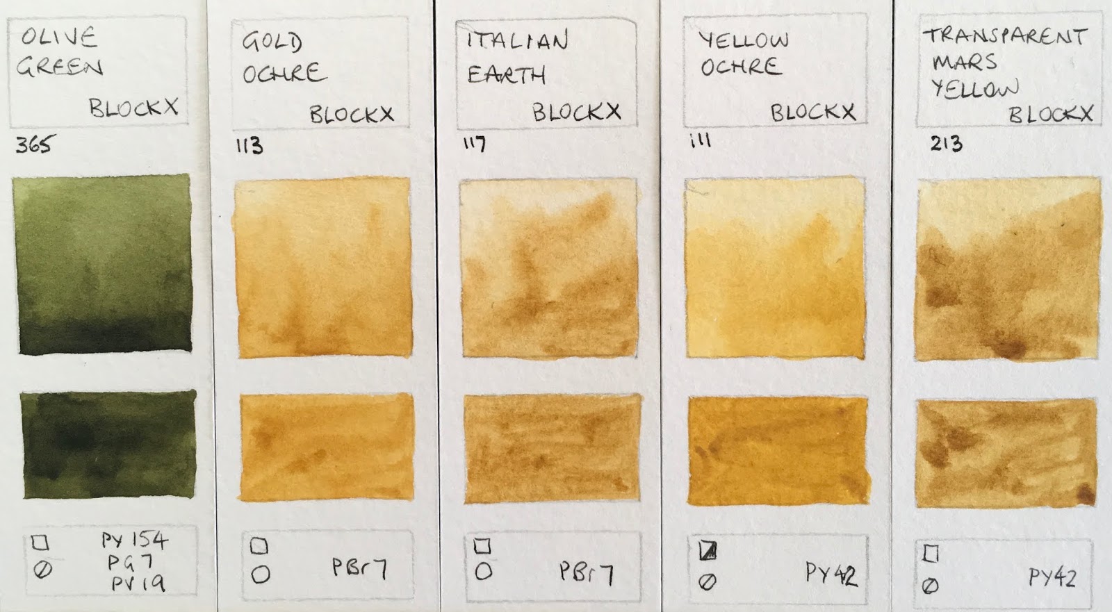
Block Watercolours - Olive Green, Gold Ochre, Italian Earth, Yellow Ochre, Transparent Mars Yellow.
Block Watercolours - Burnt Sienna Light, Burnt Sienna Deep, Light Red, Venetian Red, Transparent Mars Red.

Block Watercolours - Transparent Mars Brown, Van Dijck Brown, Burnt Umber, SEpai.

Block Watercolours - Neutral Tine, Ivory Black, Lamp Black.
Happy painting :-)

Wednesday 16 December 2015

An amazing year with the Urban Sketchers - Part 1 - Hong Kong


I've had a fantastic year travelling to a number of places in the world and meeting up with many other Urban Sketchers. During March and April, I had the chance to spend four weeks travelling to Hong Kong, Paris, London, Sheffield, York and Cambridge. I attempted to sketch in each location, though sometimes it was too cold to complete the views I started.

I was lucky to arrive on the day of an Urban Sketching event for the Hong Kong Urban Sketchers so I met up with about 30 of them and we sketched the Maryknoll Convent School. It is 90 years old and has really interesting brickwork.

The Maryknoll Convent School, Hong Kong. A5 Moleskine sketchbook.

The paving through the old part of the school was created with locally mined granite. The bougainvilleas were out in full bloom and looked gorgeous.
Paving in the Maryknoll convent School. A5 Moleskine Sketchbook


We had a great lunch locally and a chance to chat before returning to the school for some more sketching. It is just wonderful to be able to meet up with fellow sketchers in almost any city in the world. USK is a fantastic organisation to be part of.

Amid lunch-time discussions, I heard that Graham Street, a famous wet-market, was to be 'renewed'. Many sketchers have been documenting this lively street for some time. I joined Alvin and Ben and sketched a stall in a couple of visits.
Graham Street stall, watercolour and pen in Moleskine A4 sketchbook.


We were joined by Tommy as he made his way down the street.


A corner building, Graham Street, watercolour in A5 Moleskine sketchbook.
It was quite disconcerting sketching the corner building as the sound of a regular, ground shaking banging was continuous - a reminder that this scene wasn't going to last.

I also explored the lovely Hong Kong park, found an amazing red flower, went to the aviary and saw some turtles.

On may way back through Hong Kong I sketched the education centre with Victor.

I also enjoyed spending some more time in the Asia Society building.
The Education Centre. Pen and watercolour.
A little turtle, watercolour in The Perfect Sketchbook.


Monday 14 December 2015

Bath 2016

I really enjoy teaching workshops. Having a full day to explore a specific area of ink drawing, plein air sketching, watercolour, colour mixing or whatever is terrific. Even better is having more days!

I am very excited to be teaching three 5-day watercolour 'bootcamp' workshops in 2016. We'll have the time to take a detailed journey through the ins and outs of pigments and colour choices, colour mixing, different ways to create washes, sketching with watercolour, botanicals and so much more. It will be exhausting but wonderful.

In January and July I'll be teaching at the Mitchell School of Arts in Bathurst. Also in July 2016 I'll run a 5 day workshop in Bath, UK, which will of course include some plein air sketching of the lovely buildings.

Then I'll do some demonstrations in the UK and head to the Urban Sketchers Symposium in Manchester :-)

I am hoping to add more workshops in the US and Canada in September and October.

I keep my website updated with upcoming workshops and demonstrations here.

Saturday 12 December 2015

Daniel Smith artist palette dot cards - Joseph

An artist's colour and palette choice is a very individual thing and the subjects an artist chooses to paint can have a huge impact on the choice of colours used. Conversely, the pigments included in the palette can limit or open up subject possibilities. One of the fascinating things I always love to see is another artist's palette. I always enjoy analysing what any set of colours will be able to do.

As well as the fabulous sets of dot cards of their watercolour range, which make it possible to try a colour before buying a whole tube, Daniel Smith have made dot cards of a number of artists' chosen palette colours. It's a great tool for us to have when running workshops but it's also a great way for others to try new colours.

I have collected a number of Daniel Smith Artist palette dot cards over the years, and found some more doing internet searches and with a bit of help from a few friends. There are about 20 of them, and they include in total about 125 colours from the Daniel Smith range! Isn't it fantastic that we all like such different paints :-)

I decided to paint a swatch of each of the colours used in one of my sketchbooks. As it's not always possible to get hold of each of these cards I thought I'd share a scan of each of those I can find here, with a paint-out so the colours can be seen. I'm also including, where possible, the information printed on the back of the cards which has each artist's website so you can see what magic they weave with their chosen palette.

The most commonly included colour is, not surprisingly, Ultramarine/French Ultramarine - such a wonderful basic blue for watercolour or any medium. Second is Cobalt Teal blue, third is Cobalt blue, which many artists have along with Ultramarine.


Keep in mind, palettes also evolve and change over time, so any choices made may not remain constant for ever. Artists may also use extra colours beyond the basic palette colours for particular purposes. Furthermore, some colours that look similar as a 'dot' of paint have different characteristics - transparent/opaque/granulating and so on and not every colour from the palette will be used in every painting :-)

More of these to come.

You can see Joseph's website here


Friday 11 December 2015

Agapanthus


Agapanthus, pen and watercolour.


These are some more studies from my large studio sketch book. The purple one below was painted in 2008 - the first painting in the book. The white agapanthus was from last week - the only white one we had in the garden.

I am enjoying using more pen again these days, which worked well with the white flowers since this isn't a book for washed in backgrounds.

One of the reasons I love painting flowers is that I can work from life - unlike when painting birds. Another reason, of course, is that they are just beautiful.

Agapanthus, watercolour.

Thursday 10 December 2015

Seed pod study

'Seed Pods' etching 1987
Many (almost 30!) years ago  - I did a copper etching of some seed pods. It was etched in a very gentle Dutch Mordant, which allows exquisite detail. It's one of my favourite etchings.

Yesterday one of my students gave me a branch full of these seed pods. I am still fascinated by these complex though rather dull and ugly subjects.


I decided to do a life-sized study in a gorgeous leather-bound book I keep specially for studio work. It's lovely Italian paper that is great for pen and careful watercolour rather than large washes - perfect for botanicals.


Starting with a very light pencil line to get the proportions correct, I then switched to my Sailor 1911 - a lovely pen for super fine detail - and drew the whole plant.

I then used watercolour to finish it off.