I have been a little quiet here lately. I had a fabulous trip to the UK in July, which I started to write about, including teaching a 5-day workshop in Bath and teaching at the Urban Sketchers Symposium in Manchester. I had another really enjoyable and varied trip to New York and Montreal in September/October. I'll add more on them later.
I have done a couple of interviews. Part of one has been published here: http://www.artistsnetwork.com/medium/watercolor/10-essential-watercolor-tips-jane-blundell
I have also done some sketches of course, some of which I have added to my Facebook Page Jane Blundell Artist, or to Instagram janeblundellart.
In between, we have bought a new house and sold the house we've been in for 12 years - the longest I have ever lived in one place. We are now in the process of repainting the new house, then moving. We are going little more that 3km away, still in Sydney, but it requires packing up our lives...again. In the process, we are trying to reduce the amount we own...
Once we move, my goal for 2017 is so get my online lessons onto a more accessible platform, add videos to my own YouTube channel and get my next book completed. Its working title is 'Working With Triads' and it will be a great companion book to The Ultimate Mixing Palette: a World of Colour.
I'll be enjoying the sunsets we'll see from the new house, which may well inspire some paintings :-)

I am a watercolour artist, passionate about colour. I have been painting professionally for over 40 years and love to share my discoveries, so I have created this 'Colourpedia - a swatching Wikipedia' to quote one of my YouTube followers. You can see more of my work, links to my online courses, and many resources and tutorials on my website www.janeblundellart.com. You can also find me on Facebook at Jane Blundell Artist, and on Instagram as Janeblundellart, and on YouTube as Jane Blundell
Tuesday 8 November 2016
Monday 12 September 2016
Greens
I missed out on a week of turquoise, which would have been the next logical colour, but added it in later. There's a fine line between a greenish-blue and a blueish green - when do they become turquoise/aqua/teal? And it's the same with the opposite of turquoise - a red-orange vs an orange-red, though there is no name for the in between colour.
There are many mixed greens available but I focussed here on more of the single pigment greens. I love the granulation of the Daniel Smith Primatek colours Green Apatite Genuine, Jadeite and Serpentine Genuine. I included DS Undersea green, even though it is a two-pigment mix, since it is one of my favourite convenience greens. I also included the DS Sap green - and other lovely useful hue. Chrome green is an interesting more opaque green - not one I've used very often though I like it. Rare Green Earth is only just a green shade of grey - a gentle landscape green, that could be used in distant mountains in a landscape.

For more greens, see my website here.
Saturday 10 September 2016
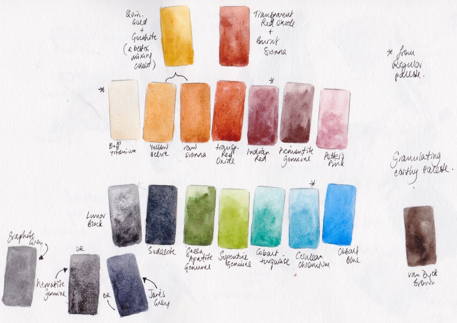
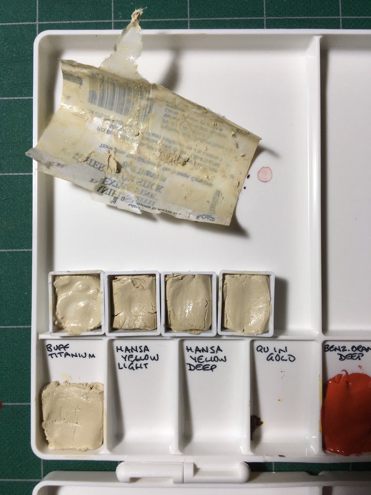
A 14-colour Granulating Earth pocket palette
Following on from the previous post about a 7-colour earth palette, I looked at the 'extras' I carry in my little Pocket Palette. (Note all watercolours are Daniel Smith)
 I normally set it up with 14 of my Ultimate Mixing Colours as picture left (more information here and here), but my 'extras' version had hansa yellow light, phthalo blue RS and pyrrol scarlet (since they are not in my regular palettes and I sometimes need to demonstrate them) and a whole pile of earthy colours - almost a perfect earth palette in fact.
It had a number of pigments that I love for different reasons, and may want to paint with along with my regular palette - the basic 20 colours that I generally use. The yellows in my regular palette are Hansa Yellow Medium, Quinacridone Gold, Goethite and raw umber.
The extras were -
yellow ochre - which I like to use for landscapes or portraits
raw sienna - which mixes into a grey rather than a green with blues - good for skies, though also for skin-tones
transparent red oxide - which I love for its gorgeous burnt orange colour and crazy granulation
piemontite genuine - which is fabulous for rusty effects with transparent red oxide
cobalt blue - which is a beautiful colour that I don't use much (outside Santorini!) and want to get to know better
cobalt turquoise - which is lovely for copper effects and the sea
green apatite genuine - which is gorgeous for foliage, and is a multiplicity of greens in one pigment
serpentine genuine - which is perfect for grassy meadows
graphite - which intrigues me, though I don't often use it...
sodalite genuine - which has a little deep blue colour but lots of granulation
lunar black - which is the only black watercolour I use - fantastic granulation and texture
 I wanted of keep most of these colours in their natural form, so they are still available when I need them, but turn the palette into a full stand-alone granulating earthy palette to paint with rather than just an extras palette.
So I added buff titanium, Indian red and cerulean chromium from my regular palette, instead of the hansa yellow, pyrrol red and graphite grey. I have also added the gentle potter's pink that is a long time favourite of Liz Steel that I have rarely used, as a granulating dusty rose (instead of the powerful phthalo blue RS that would overpower this new earth palette). It will mix gentle purples with cobalt blue. Purpurite genuine was another possibility here.
Cobalt blue is arguably too bright for this palette, and Blue apatite genuine would be a very fitting alternative, but I do want to get to know cobalt blue better so it is staying :-)
 Outside the 14-colour palette paint-out, you can see that up the top I have also painted the lovely earthy mix of Quin Gold and Goethite, (I guess that would be Jane's Granulating gold :-) and the mix of Transparent Red Oxide and Burnt Sienna (Jane's Sienna) that are both in the 7-colour palette I posted about here.
Below are Graphite Grey, Hematite Genuine and Jane's Grey, which are alternatives for the dark colours, with VanDyck brown over on the right.
If I were suggesting a 12-colour granulating earth palette, it would have my Granulating Gold mix instead of Yellow Ochre and Raw Sienna, my burnt sienna mix, Indian Red alone (without Piemontite or Potter's Pink) and a deep granulating brown such as Van Dyck Brown instead of Lunar Black. Though of course Blue apatite genuine and Jadeite genuine are also gorgeous :-) The basic triad of a yellow earth, Indian red and cerulean are the starting point. How many you add to it is all about personal taste and what other pigments you happen to have or to like.
Now it's time to go out and paint with my new granulating earth pocket palette...

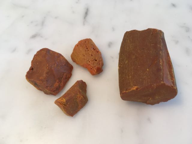
I went to a park in Rozelle and chose to paint the rocks on the shore. Not a challenging subject with an earthy palette I'll admit! It worked fine, but don't like to be missing Jane's Grey from my palette. Sodalite is interesting but not actually as versatile as my grey mix. Nor do I like missing ultramarine to be honest, even though cobalt blue works in a similar though gentler way. Nor quinacridone gold or goethite. So what have I learnt? That I am very stubborn! I have favourites because I love working with them. Why change? It's important to experiment and test things out, even if one returns to the status quo.
I'll keep my earthy 14 colour palette made up of course, but will continue to use them as extras to my usual set.
 I normally set it up with 14 of my Ultimate Mixing Colours as picture left (more information here and here), but my 'extras' version had hansa yellow light, phthalo blue RS and pyrrol scarlet (since they are not in my regular palettes and I sometimes need to demonstrate them) and a whole pile of earthy colours - almost a perfect earth palette in fact.
It had a number of pigments that I love for different reasons, and may want to paint with along with my regular palette - the basic 20 colours that I generally use. The yellows in my regular palette are Hansa Yellow Medium, Quinacridone Gold, Goethite and raw umber.
The extras were -
yellow ochre - which I like to use for landscapes or portraits
raw sienna - which mixes into a grey rather than a green with blues - good for skies, though also for skin-tones
transparent red oxide - which I love for its gorgeous burnt orange colour and crazy granulation
piemontite genuine - which is fabulous for rusty effects with transparent red oxide
cobalt blue - which is a beautiful colour that I don't use much (outside Santorini!) and want to get to know better
cobalt turquoise - which is lovely for copper effects and the sea
green apatite genuine - which is gorgeous for foliage, and is a multiplicity of greens in one pigment
serpentine genuine - which is perfect for grassy meadows
graphite - which intrigues me, though I don't often use it...
sodalite genuine - which has a little deep blue colour but lots of granulation
lunar black - which is the only black watercolour I use - fantastic granulation and texture
 I wanted of keep most of these colours in their natural form, so they are still available when I need them, but turn the palette into a full stand-alone granulating earthy palette to paint with rather than just an extras palette.
So I added buff titanium, Indian red and cerulean chromium from my regular palette, instead of the hansa yellow, pyrrol red and graphite grey. I have also added the gentle potter's pink that is a long time favourite of Liz Steel that I have rarely used, as a granulating dusty rose (instead of the powerful phthalo blue RS that would overpower this new earth palette). It will mix gentle purples with cobalt blue. Purpurite genuine was another possibility here.
Cobalt blue is arguably too bright for this palette, and Blue apatite genuine would be a very fitting alternative, but I do want to get to know cobalt blue better so it is staying :-)
Below are Graphite Grey, Hematite Genuine and Jane's Grey, which are alternatives for the dark colours, with VanDyck brown over on the right.
If I were suggesting a 12-colour granulating earth palette, it would have my Granulating Gold mix instead of Yellow Ochre and Raw Sienna, my burnt sienna mix, Indian Red alone (without Piemontite or Potter's Pink) and a deep granulating brown such as Van Dyck Brown instead of Lunar Black. Though of course Blue apatite genuine and Jadeite genuine are also gorgeous :-) The basic triad of a yellow earth, Indian red and cerulean are the starting point. How many you add to it is all about personal taste and what other pigments you happen to have or to like.
Now it's time to go out and paint with my new granulating earth pocket palette...

I went to a park in Rozelle and chose to paint the rocks on the shore. Not a challenging subject with an earthy palette I'll admit! It worked fine, but don't like to be missing Jane's Grey from my palette. Sodalite is interesting but not actually as versatile as my grey mix. Nor do I like missing ultramarine to be honest, even though cobalt blue works in a similar though gentler way. Nor quinacridone gold or goethite. So what have I learnt? That I am very stubborn! I have favourites because I love working with them. Why change? It's important to experiment and test things out, even if one returns to the status quo.
I'll keep my earthy 14 colour palette made up of course, but will continue to use them as extras to my usual set.
Thursday 8 September 2016
What colour next? (with an update)
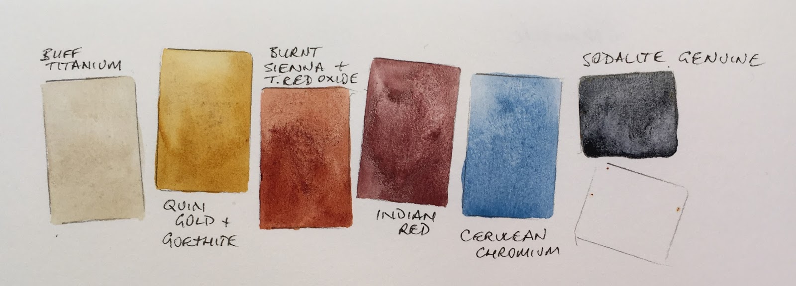
I am setting myself a challenge. I made a palette that will have serious limitations, so that painting exactly the colour I see is not an option....like this range. There is not a bright yellow to make greens, or a true red, or pink to make purples. It will force some interpretation. It is also full of granulating and some non-transparent colours.
I mixed Quinacridone Gold with Goethite to create a brighter mixing granulating earth yellow. (Jane's Granulating Gold); I mixed Burnt Sienna with Transparent Red Oxide to create a brighter Burnt Sienna. (Jane's Sienna). I initially chose Sodalite Genuine rather than Jane's Grey (burnt sienna + Ultramarine) as a dark to add even more granulation. It was also good for colour harmony since I didn't include ultramarine in the palette (!) I'll probably switch it back to Jane's Grey though...
It is based around a primary triad of Indian red, Cerulean chromium and the earthy gold so it's a very earthy palette. Without Ultramarine, my basic blue, it'll be really interesting to paint with, especially wet into wet with a large brush.
But my little palette has room for one more colour. I considered adding Green Apatite Genuine or Serpentine for a granulating green, but chose one from below that I think will fit in best to keep harmony with the set. What would you add?
So here is the final palette painted out, with a 'mixed black' using the primary triad and a quick colour wheel. I like the balance of strength with this now :-)
I mixed Quinacridone Gold with Goethite to create a brighter mixing granulating earth yellow. (Jane's Granulating Gold); I mixed Burnt Sienna with Transparent Red Oxide to create a brighter Burnt Sienna. (Jane's Sienna). I initially chose Sodalite Genuine rather than Jane's Grey (burnt sienna + Ultramarine) as a dark to add even more granulation. It was also good for colour harmony since I didn't include ultramarine in the palette (!) I'll probably switch it back to Jane's Grey though...
It is based around a primary triad of Indian red, Cerulean chromium and the earthy gold so it's a very earthy palette. Without Ultramarine, my basic blue, it'll be really interesting to paint with, especially wet into wet with a large brush.
 |
| Buff Titanium, Jane's Golden Earth, Jane's Sienna, Indian Red, Cerulean Chromium and a space for ? |
But my little palette has room for one more colour. I considered adding Green Apatite Genuine or Serpentine for a granulating green, but chose one from below that I think will fit in best to keep harmony with the set. What would you add?
 |
| Quinacridone gold and Goethite make Jane's Gold, burnt sienna and ultramarine make Jane's grey, transparent red oxide and burnt sienna make Jane's sienna. |
Update 2017.
Thank you for the suggestions :-)
I did end up adding Cobalt blue - it was the best fit for a softer blue with the other palette colours, and then switching to my Jane's Grey instead of Sodilite. The cobalt blue will probably switch to ultramarine when it runs out - I'll have to think about that one. Ultramarine and cerulean chromium are such a lovely pair for skies, but Cobalt fits in very nicely with this more subdued palette.
The other change I made was to switch the Indian Red for Jane's Earth Rose - another custom colour made from Indian Red and Potter's Pink. It combines the gorgeous granulating pink of the PR233 with the strength of the PR101. It's a strong granulating dusty rose colour - very nice :-)
 |
| Potter's Pink and Indian Red make Jane's Earth Rose |
I am not deliberately naming a whole range after myself but it really is the clearest way to explain that it is a colour I've created, not a commercial mix.
 |
| Earth palette with Buff Titanium (DS), Jane's Golden Earth, Jane's Sienna, Jane's Earth Rose, Cerulean Chromium (DS), Jane's Grey and Cobalt Blue (DS) |
Here is the palette and some of the mixes. The purples made with Cobalt Blue and Jane's Earth Rose are just lovely.
 |
| Mixing earthy greens, purples and neutrals with the earthy palette colours. |
Sunday 4 September 2016
Using Daniel Smith watercolour sticks to make palettes.
Here I have cut one stick of Buff Titanium into 5 pieces. You could cut it into 6 but 1/5th fills the half pan nicely. (For full pans use 1/3 of a stick.) I added a drop or two of distilled water to the pans to soften the watercolour stick and then pressed it in. I used one piece in a Masters palette as well. The very convenient part of setting up pans or palettes like this is that you don't need to wait for them to dry.
You could just cut 1/5th off the stick for a palette and keep the rest to use as a drawing stick. They work best in less humid climates - they do tend to soften in humidity.
If you want to create my Ultimate Mixing Palette using sticks, here are the suggested sticks to buy
1. Buff Titanium
2. Hansa Yellow medium (or Hansa Yellow Light if you want a cooler yellow)
3. Quinacridone Gold (or Hansa Yellow Deep if you want a brighter warm yellow)
4. Organic Vermilion (since there isn’t a Pyrrol Scarlet)
5. Quinacridone Red (since there isn’t a Quinacridone Rose)
6. Perm Alizarin Crimson (since there isn’t a Pyrrol Crimson)
7. Ultramarine Blue
8. Phthalo Blue GS
9. Cerulean Blue Chromium
10. Phthalo Green BS
11. Yellow ochre (since there isn’t Goethite) or Raw Sienna
12. Burnt Sienna
13. Piemontite since there isn’t Indian Red
14. burnt umber (Since there isn’t raw umber)
15. Jane's Grey - you need tubes to mix Jane's Grey so could buy ultramarine and burnt sienna in tubes. Or use Sodalite Genuine watercolour stick, as it is a very similar colour.
If you want to create my suggested 12-colour urban sketching palette using sticks, you'd get
Buff Titanium
Hansa Yellow Light
Hansa Yellow Deep
Organic Vermilion
Quinacridone Red
Ultramarine
Cerulean Chromium
Sap Green
Yellow Ochre
Burnt Sienna
Burnt Umber
Sodalite Genuine (or get tubes of ultramarine and burnt sienna to make Jane's Grey)
If you are using tubes or watercolour to make up pans or palettes, make sure you shake the tube well before you open it and always open watercolour tubes cautiously - the paint can flow out very fast at times. Ideally, fill the pan half at a time and stir thoroughly to make sure the pigment and gum arabic are thoroughly mixed. Allow to dry in a warm place and you are set to paint.
Update 11/1/2017 - see more information, including the colours painted out here.
Saturday 3 September 2016
Blues
There are many wonderful blues. They vary in intensity, temperature and characteristics. In our blue week we had a fabulous range of blue objects to draw and paint and once again created the shadow colours by adding the opposite, orange.
Burnt Sienna is of course a neutralised orange and a classic mixing colour with ultramarine. What is more surprising is that the opposite of phthalo blue is really a red - pyrrol scarlet or another warm orange-red - as phthalo blue is such a greenish-blue. Who says mixing a blue and a red will always make a purple?
I have included the beautiful genuine Old Holland Manganese Blue here even though it is no longer very easy to get hold of. The soft colour and pretty granulation is lovely. I have also included some Daniel Smith Primatek blues. I love the texture of Sodalite and Blue Apatite Genuine. I generally use ultramarine, cerulean chromium and phthalo blue in my palettes, perhaps with the lovely Indanthrone blue, but some of the others are fun extras :-)

An Urban Sketching watercolour palette with Daniel Smith watercolours
I am often asked what colours to buy to start painting with watercolour. I created an 'ultimate mixing set' to address this question - a palette of 15 colours that will be suitable for mixing any colour and painting just about anything, and a book that shows how to mix them.
They are a great set for anyone, but this time I wanted to look more specifically at those who are urban sketching, and who may be new to watercolour. They are painting a largely man-made urban world and looking for a compact and portable palette. I also wanted to focus on more forgiving colours than the phthalos which are powerful and staining, so can be a little scary for beginners, though they are wonderful :-)
Here is a suggested 12 colour 'starter' urban sketching palette using Daniel Smith watercolours. I am focusing on the colours that are available as 5ml tubes and/or watercolour sticks so that the initial investment is not too high - then it is easier to get started with wonderful artist quality watercolours rather than student ranges. I'll look at other brands in separate posts.
This set of 12 contains a fairly classic bright split primary palette with an emphasis on transparent or semi-transparent colours that are non-staining so it is very forgiving - you can lift off 'mistakes' if you need to!
There is a cool and a warm yellow, then a warm and a cool red, then a warm and a cool blue. All are transparent or semi-transparent so your carefully drawn pen or pencil lines won't be covered when you paint - an important consideration for sketching.
This particular sap green is a very useful and realistic convenient green straight from the palette. It can be further neutralised with the addition of either of the reds or burnt sienna for more olive greens. Or it can be warmed further with either of the yellows, or cooled down with the blues. Other greens can be mixed with the blues and yellows.
Then there are the earth colours, which help to speed up your painting and create the colours you need for building materials and even skin tones - the yellow earth - yellow ochre; an orange earth - burnt sienna; and a deep cool earth - raw umber.
Buff Titanium is an unbleached white pigment. It is perfect for creating the look of marble (with Jane's Grey) or sandstone (with yellow ochre and burnt sienna) and also for skin tones or pastel hues. It is a colour and texture exclusive to Daniel Smith and one of my favourite urban sketching pigments.
These colours can be bought either as sticks, 5ml tubes or 15ml tubes. Some, though not all, are available in all forms. Making half pans from the Daniel Smith watercolour sticks is very efficient and cost effective, as you can just cut 1/6 (or 1/5 if you want it really full) off the stick and press it into the half pan - no need to let it dry overnight like tube colours. They re-wet just like regular pan watercolours when you are painting. Then you still have the rest of the stick to draw with if you wish, or make some spare pans for extended travel. I would put a drop or two of distilled water in the bottom of the pan to soften the paint if you are in a very dry environment so the stick wedges into the pan perfectly.
* The watercolour sticks are all one price, regardless of the series number. Consequently they are a very affordable way to purchase series 2 or higher watercolours to make up into palettes. The pigment load is 1.6 times the tube colours and they contain no chalk or fillers.
The final colour has to be made with tube colours - it is a mix of the burnt sienna and ultramarine to make the very convenient 'Jane's Grey'. Instructions on mixing this here.
*The Daniel Smith Essentials set of 6 x 5ml tubes could certainly be used in this palette, then add Cerulean Chromium along with the other colours so you have a non-staining cool blue for creating skies anywhere in the world with or without mixing with ultramarine. New gamboge and hansa yellow deep are almost exactly the same bright warm yellow colour.
This is the Schmincke palette, available empty, designed to hold 12 colours, but you can easily add another 2 into the metal holding plate. A very similar version is also available for around US$15 or AU$25 (Art Basics from Art Scene in Australia.)
This gives you the option of adding 2 more of your own chosen colours at some time - another blue, such as phthalo blue; a deep green such as perylene green, a convenience orange such as quinacridone sienna; an earth red such as Indian red (which is excellent for brickwork and certainly one I'd add), a convenience purple such as Imperial purple - whatever you wish. I also love the mixing pair phthalo green and pyrrol crimson or Undersea green for Australian foliage. The point is, it's up to you.
Here I have set it up with space for perylene green (or phthalo green, or undersea green) and Indian red (or burnt umber). The half pans can be moved around easily, or stuck more firmly into place with blu-tac or you can stick magnetic strips to the bottom of each pan.
They are a great set for anyone, but this time I wanted to look more specifically at those who are urban sketching, and who may be new to watercolour. They are painting a largely man-made urban world and looking for a compact and portable palette. I also wanted to focus on more forgiving colours than the phthalos which are powerful and staining, so can be a little scary for beginners, though they are wonderful :-)
Here is a suggested 12 colour 'starter' urban sketching palette using Daniel Smith watercolours. I am focusing on the colours that are available as 5ml tubes and/or watercolour sticks so that the initial investment is not too high - then it is easier to get started with wonderful artist quality watercolours rather than student ranges. I'll look at other brands in separate posts.
This set of 12 contains a fairly classic bright split primary palette with an emphasis on transparent or semi-transparent colours that are non-staining so it is very forgiving - you can lift off 'mistakes' if you need to!
There is a cool and a warm yellow, then a warm and a cool red, then a warm and a cool blue. All are transparent or semi-transparent so your carefully drawn pen or pencil lines won't be covered when you paint - an important consideration for sketching.
This particular sap green is a very useful and realistic convenient green straight from the palette. It can be further neutralised with the addition of either of the reds or burnt sienna for more olive greens. Or it can be warmed further with either of the yellows, or cooled down with the blues. Other greens can be mixed with the blues and yellows.
Then there are the earth colours, which help to speed up your painting and create the colours you need for building materials and even skin tones - the yellow earth - yellow ochre; an orange earth - burnt sienna; and a deep cool earth - raw umber.
 |
| Suggested 12-colour starter set of Daniel Smith watercolours |
These colours can be bought either as sticks, 5ml tubes or 15ml tubes. Some, though not all, are available in all forms. Making half pans from the Daniel Smith watercolour sticks is very efficient and cost effective, as you can just cut 1/6 (or 1/5 if you want it really full) off the stick and press it into the half pan - no need to let it dry overnight like tube colours. They re-wet just like regular pan watercolours when you are painting. Then you still have the rest of the stick to draw with if you wish, or make some spare pans for extended travel. I would put a drop or two of distilled water in the bottom of the pan to soften the paint if you are in a very dry environment so the stick wedges into the pan perfectly.
* The watercolour sticks are all one price, regardless of the series number. Consequently they are a very affordable way to purchase series 2 or higher watercolours to make up into palettes. The pigment load is 1.6 times the tube colours and they contain no chalk or fillers.
The final colour has to be made with tube colours - it is a mix of the burnt sienna and ultramarine to make the very convenient 'Jane's Grey'. Instructions on mixing this here.
*The Daniel Smith Essentials set of 6 x 5ml tubes could certainly be used in this palette, then add Cerulean Chromium along with the other colours so you have a non-staining cool blue for creating skies anywhere in the world with or without mixing with ultramarine. New gamboge and hansa yellow deep are almost exactly the same bright warm yellow colour.
 |
| The Schmincke 12-colour metal sketching palette set up with 12 half pans of Daniel Smith watercolours. |
This gives you the option of adding 2 more of your own chosen colours at some time - another blue, such as phthalo blue; a deep green such as perylene green, a convenience orange such as quinacridone sienna; an earth red such as Indian red (which is excellent for brickwork and certainly one I'd add), a convenience purple such as Imperial purple - whatever you wish. I also love the mixing pair phthalo green and pyrrol crimson or Undersea green for Australian foliage. The point is, it's up to you.
 |
| Possible additional colours to personalise a 14 or more colour palette |
 |
| A metal 12-pan palette st up with 14 half pans |
Here I have set it up with space for perylene green (or phthalo green, or undersea green) and Indian red (or burnt umber). The half pans can be moved around easily, or stuck more firmly into place with blu-tac or you can stick magnetic strips to the bottom of each pan.
If your collection grows, as they often do, the whole internal metal tray can be removed so either 18 half pans and a travel brush, or 24 half pans, or a mix of whole and half pans can be added to create a personalised palette. You can see a lot of other palettes on my website here.
Happy sketching!
Thursday 1 September 2016
Gamboge - what is it?
Many people are familiar with the name Gamboge, often called New Gamboge, but not so many will have come across the resin that made the original paint.
NY24 is Natural Yellow 24 - natural gamboge, a resin from a few trees found in Asia from the Garcina genus, and particularly in Cambodia. the name is derived from cambugium - as is the name Cambodia itself. It is a strange substance, appearing as a dull earthy yellow lump but when you touch a brush to it a stunning yellow paint appears. Sadly, though, it is a fugitive colour, not suited to long-term use.
Most companies have a paint based on this pigment colour. It is generally a mid to warm transparent yellow.
PY153 was a popular pigment to use - available in Daniel Smith and Winsor & Newton, but it is no longer available so alternative mixes are being used. You can read a great W&N article about it here.
Here is the natural gamboge. A touch of a wet brush and the colour is a very pure and lovely yellow.
But it also fades. Here it is in my lightfast tests after just a few months. The left side was exposed to light, the right side wasn't.
Natural gamboge is apparently a powerful purgative/cathartic and/or diuretic depending what you read and is poisonous so not a substance you'd want to ingest by accident. Fascinating though :-)
Please note - this is not a recommended pigment, though traditionally used in Chinese painting.
 |
| Gamboge chunks |
Most companies have a paint based on this pigment colour. It is generally a mid to warm transparent yellow.
PY153 was a popular pigment to use - available in Daniel Smith and Winsor & Newton, but it is no longer available so alternative mixes are being used. You can read a great W&N article about it here.
 |
| Natural Gamboge painted out as a pigment |
Here is the natural gamboge. A touch of a wet brush and the colour is a very pure and lovely yellow.
But it also fades. Here it is in my lightfast tests after just a few months. The left side was exposed to light, the right side wasn't.
Natural gamboge is apparently a powerful purgative/cathartic and/or diuretic depending what you read and is poisonous so not a substance you'd want to ingest by accident. Fascinating though :-)
Please note - this is not a recommended pigment, though traditionally used in Chinese painting.
Tuesday 30 August 2016
Cambridge
I didn't have very long in Cambridge this time, but as I was staying in an Air BnB with a bike, I was able to cover some ground :-)
I love the Gonville and Caius building, which is opposite Great St Mary's and next to the Senate building. I suppose I like the scale of it - not as enormous as the lovely Kings College and others that date back so many centuries, but more of a 'human' scale.
I started painting the tower it last April on a very cold windy day, so was determined to return to my spot outside St Mary's and finish it this year. Last year I also went up and had a look at the view of Cambridge from the St Mary's tower - quite wonderful. This year I sat in the sunshine, and a busker set up and started singing gorgeous love songs just behind me. What a tough life :-)
 There were tour groups wandering past giving a commentary in various languages and a lovely sense of Summer holidays.
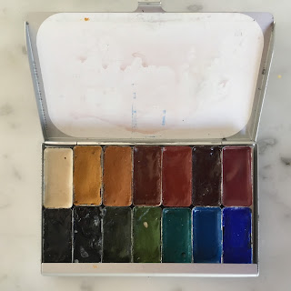
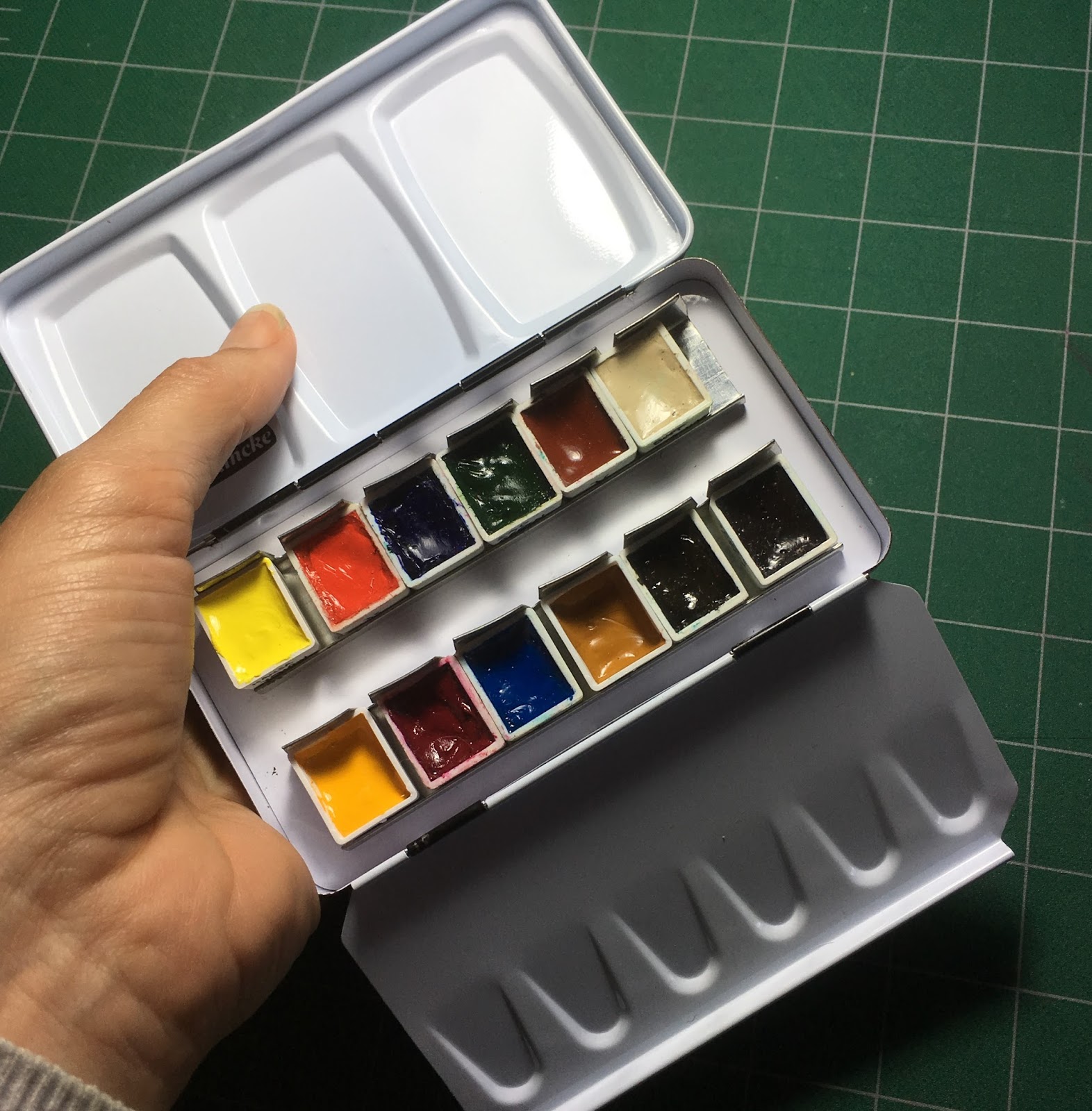
I was using my lightweight Herring palette - shown left - which I have modified to hold 24 Daniel Smith watercolours. More than really necessary but I enjoy having so many colour options and a number of lovely earth colours and convenience greens. Here are the colours in this palette and here is a post on many of the palettes I use for watercolour and gouache.
The brushes are Rosemary & Co - a size 10 and a new size 2 sable, and I was also using a Faber Castell watersoluble graphite pencil and a Copic cool grey felt tip pen.
 The markets in Cambridge are open every day, but with different stalls on different days. I bought a lot of gorgeous fresh summer berries :-)
I also spent some time sketching from this shaded position - a rather nice view of Great St Mary's from the rear. It's a very important church for the university - all Cambridge students must live within 3 miles of it. On graduation day they parade to the church, and then into the Senate building to be presented with their degrees.
 Walking around in Cambridge, like Bath, is lovely. I feel there are more historical buildings in one English city than in my whole country! Fortunately many of them are beautifully preserved.
I'll come back next year and finish my painting :-)
 |
| Gonville and Caius College, Cambridge |
 |
| Gonville and Caius from St Mary's. |
I started painting the tower it last April on a very cold windy day, so was determined to return to my spot outside St Mary's and finish it this year. Last year I also went up and had a look at the view of Cambridge from the St Mary's tower - quite wonderful. This year I sat in the sunshine, and a busker set up and started singing gorgeous love songs just behind me. What a tough life :-)
 |
| Gonville and Caius tower, Moleskine watercolour sketchbook A5. Herring Compact palette with Daniel Smith colours. |
 There were tour groups wandering past giving a commentary in various languages and a lovely sense of Summer holidays.
I was using my lightweight Herring palette - shown left - which I have modified to hold 24 Daniel Smith watercolours. More than really necessary but I enjoy having so many colour options and a number of lovely earth colours and convenience greens. Here are the colours in this palette and here is a post on many of the palettes I use for watercolour and gouache.
The brushes are Rosemary & Co - a size 10 and a new size 2 sable, and I was also using a Faber Castell watersoluble graphite pencil and a Copic cool grey felt tip pen.

I also spent some time sketching from this shaded position - a rather nice view of Great St Mary's from the rear. It's a very important church for the university - all Cambridge students must live within 3 miles of it. On graduation day they parade to the church, and then into the Senate building to be presented with their degrees.
 |
| Great St Mary's, Cambridge, in The perfect sketchbook B5. Stage one. |
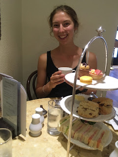
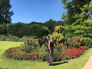
A visit to Cambridge wouldn't be the same without enjoying some of the college gardens, checking out the freshly made fudge shop, a high tea, a cello and violin concert in a stunning chapel and an open air Shakespeare - all with my lovely daughter as my tour guide!


I'll come back next year and finish my painting :-)
Sunday 28 August 2016
Teaching in Bath, United Kingdom. July 2016.

I flew into Heathrow and headed straight to Bath to prepare to teach another 5 day watercolour workshop. It's terrific having that much time to thoroughly introduce watercolour to both new and more experienced participants.


Bath is full of gorgeous sandstone. We sketching just a little as part of the watercolour workshop and will do a little more in the repeat workshop in July 2017. We are considering an Urban Sketching week in 2018 though need to figure out great locations in case of rain.
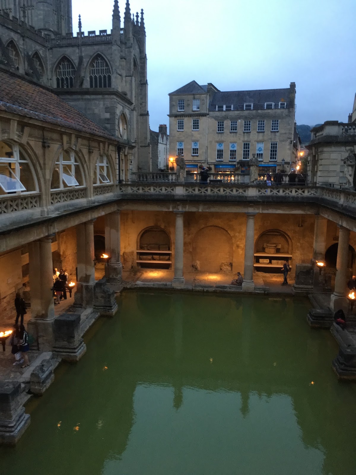
I visited the Roman Baths in the evening. It's lovely to see the transition between the ancient bath house and the more recent upper story additions.
I then visited the enormous Art in Action event, a massive festival of arts near Oxford, before catching a cross-country bus to Cambridge.
Friday 26 August 2016
Purples
Purples are easily mixed, but there are many different characteristics to explore - staining, granulating, lifting...Mixing yellows to neutralise purples creates another fabulous range of colours from deep greys through earthy colours depending on the colours chosen.

Thursday 25 August 2016
A busy month...Bathurst, NSW
July started out with a great week teaching a 5-day watercolour workshop in Bathurst, NSW. It's run by Art Scene, a terrific art store in Sydney. Up to 25 tutors and a couple of hundred students head to Bathurst twice a year for this Mitchell Summer or Winter Art School.
I taught Mastering Watercolours to a lovely group of participants. They worked very hard to explore their pigments, mix them to create colour wheels, colour charts and then a range of paintings to explore many different watercolour techniques. I'll do it again in January :-)

I taught Mastering Watercolours to a lovely group of participants. They worked very hard to explore their pigments, mix them to create colour wheels, colour charts and then a range of paintings to explore many different watercolour techniques. I'll do it again in January :-)

At the end of the week we had an exhibition of all the students' work arrange by tutor - very impressive.
Then I headed straight home to get on a plane to the UK...
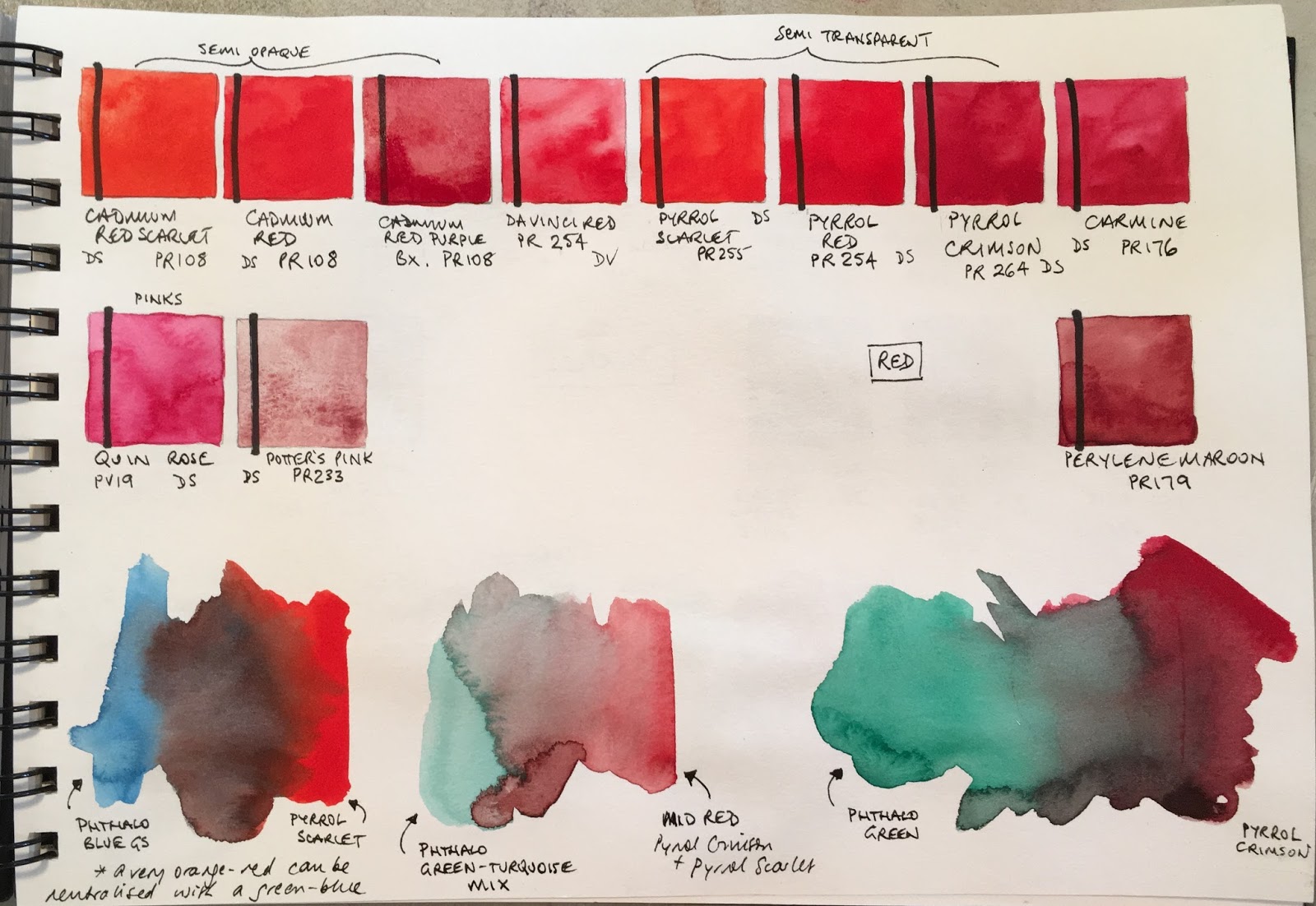
Reds
The third week was reds. It's rather a long time ago now - I've been to Bathurst and the UK and back, then New Zealand and back. So much to write about...
I find reds fascinating. Adjust the bias from orange to purple and the mixing possibilities change dramatically. I tend to choose the semi-transparent reds though the cadmiums are excellent pigments. I like to use three reds rather than the standard warm and cool - a warm, a crimson and a rose red - great mixing options there.
I love the dramatic blacks and greys you can mix with a good strong crimson and phthalo green. And phthalo blue with a warm red won't make a purple. Fascinating :-)
My students had a go at painting a still life filled with red objects and using greens to create the shadow colours.
Saturday 2 July 2016
Oranges
Week two was Oranges

While I don't usually include an orange in my palette (apart from Transparent Pyrrol Orange, which I use as a warm red), since it is so easy to mix with Hansa yellow and pyrrol scarlet as shown, there are some gorgeous orange pigments available.
Thursday 30 June 2016
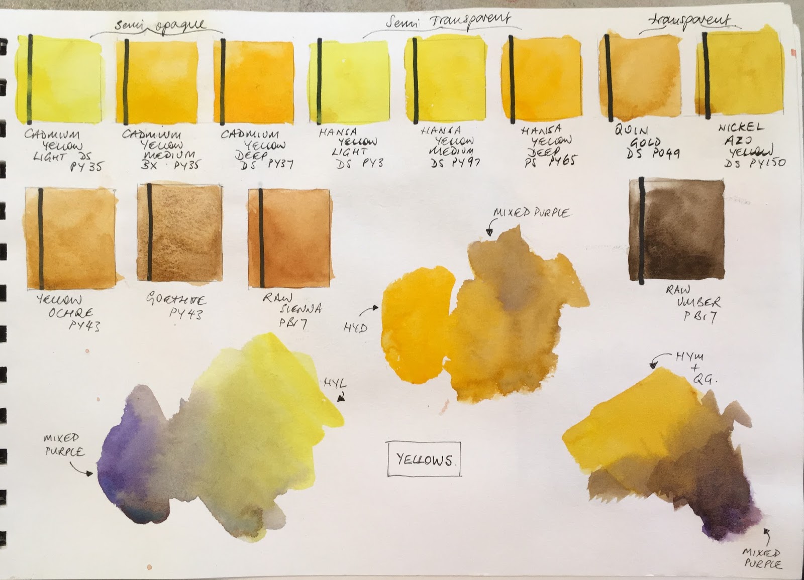
Yellows
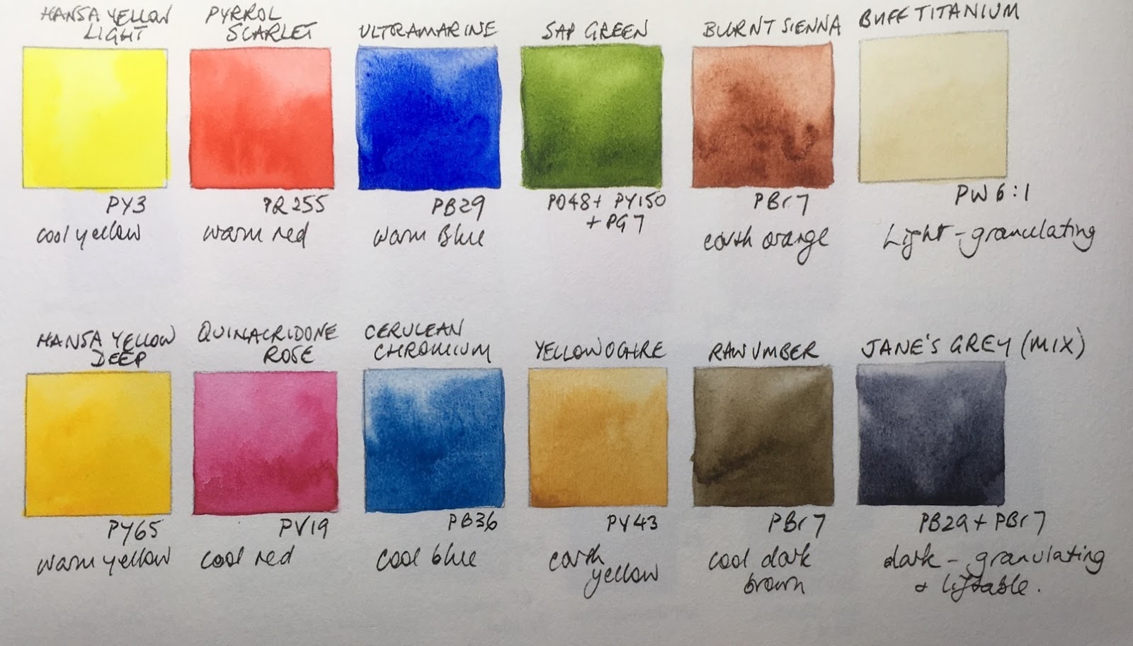
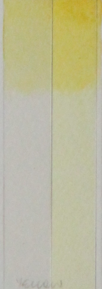
This term my classes have been working through the rainbow of watercolours painting still life objects in each colour family. We started with Yellow.
 I painted out a swatch of a number of yellow pigments, focusing on single pigment yellows where possible. I also included the earth yellows for comparison including raw umber, a reduced yellow.
 I painted out a swatch of a number of yellow pigments, focusing on single pigment yellows where possible. I also included the earth yellows for comparison including raw umber, a reduced yellow.
The opposite of yellow is purple, so we used purple to put the yellow into shadow in the still life studies.
It's rather nice to see all these yellows together so I thought I'd share the swatch pages here.
Friday 29 April 2016
Maimeri Blu watercolours - full range updated 2017
I had previously tried a number of Maimeri Blu watercolours, but have recently had the opportunity to test out the whole range with thanks to Winifred. These are a popular range of watercolours from Italy. There are a large number of single pigment colours, including the more expensive but lovely cadmiums, cobalts and ceruleans.
The Cadmiums are bright and clear and paint out nicely. While I only use cadmiums for special purposes, I do like to have them available and have heard that, while generally considered toxic, in fact the amount you would have to consume to have a toxic effect is enormous as the cadmium is so well bound in the pigment compound that it cannot do any harm.
When I first wrote this blog, they were set out in a fairly random way. Interestingly the colour chart also looks fairly random as they are arranged by number not by colour.
January 2017 - Rephotographed and reloaded in my own more logical order. The lightfast ratings on the colour chart are not much help as they are all rated three stars ***, even though many of the pigments are not ASTM I or II.
The pigment information chart includes staining, granulation and, unusually, diffusion, so I'll add those notes into the captions. If non granulating or non staining I'll omit a comment on that aspect.
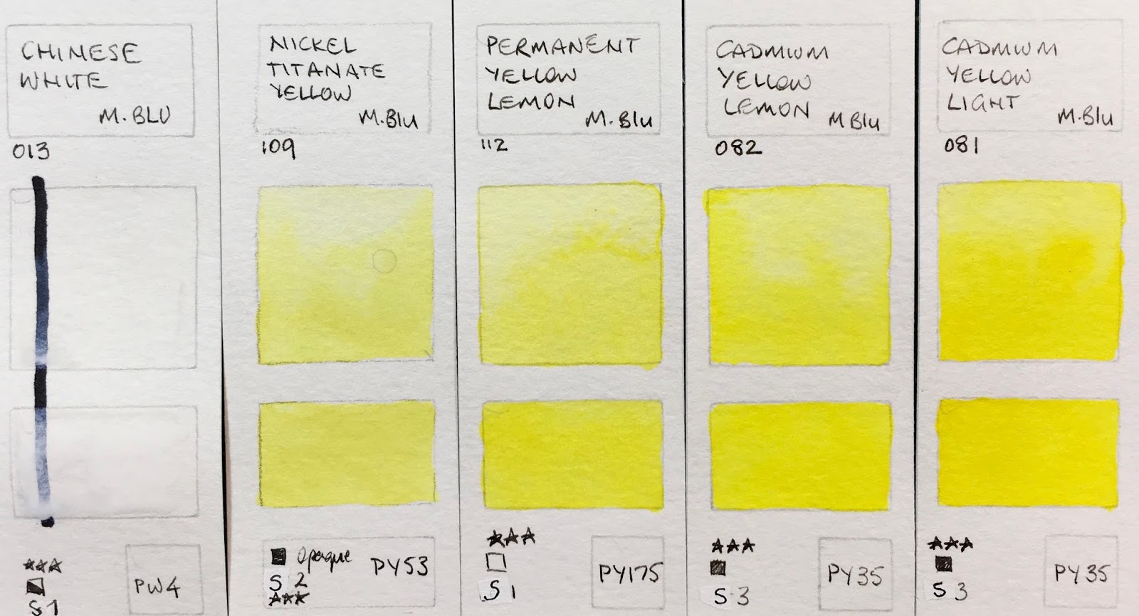 |
| MaimeriBlu Superior Watercolours - Chinese White (medium Diffusion) , Nickel Titanate Yellow (high diffusion), Permanent Yellow Lemon (medium diffusion), Cadmium Yellow Lemon (hight diffusion), Cadmium Yellow Light (high diffusion). |
 |
| MaimeriBlu Superior Watercolours - Primary Yellow (staining, high diffusion), Indian Yellow (staining, high diffusion), Permanent Yellow Deep (staining, high diffusion), Cadmium Yellow Deep (high diffusion), Permanent Orange (high diffusion) |
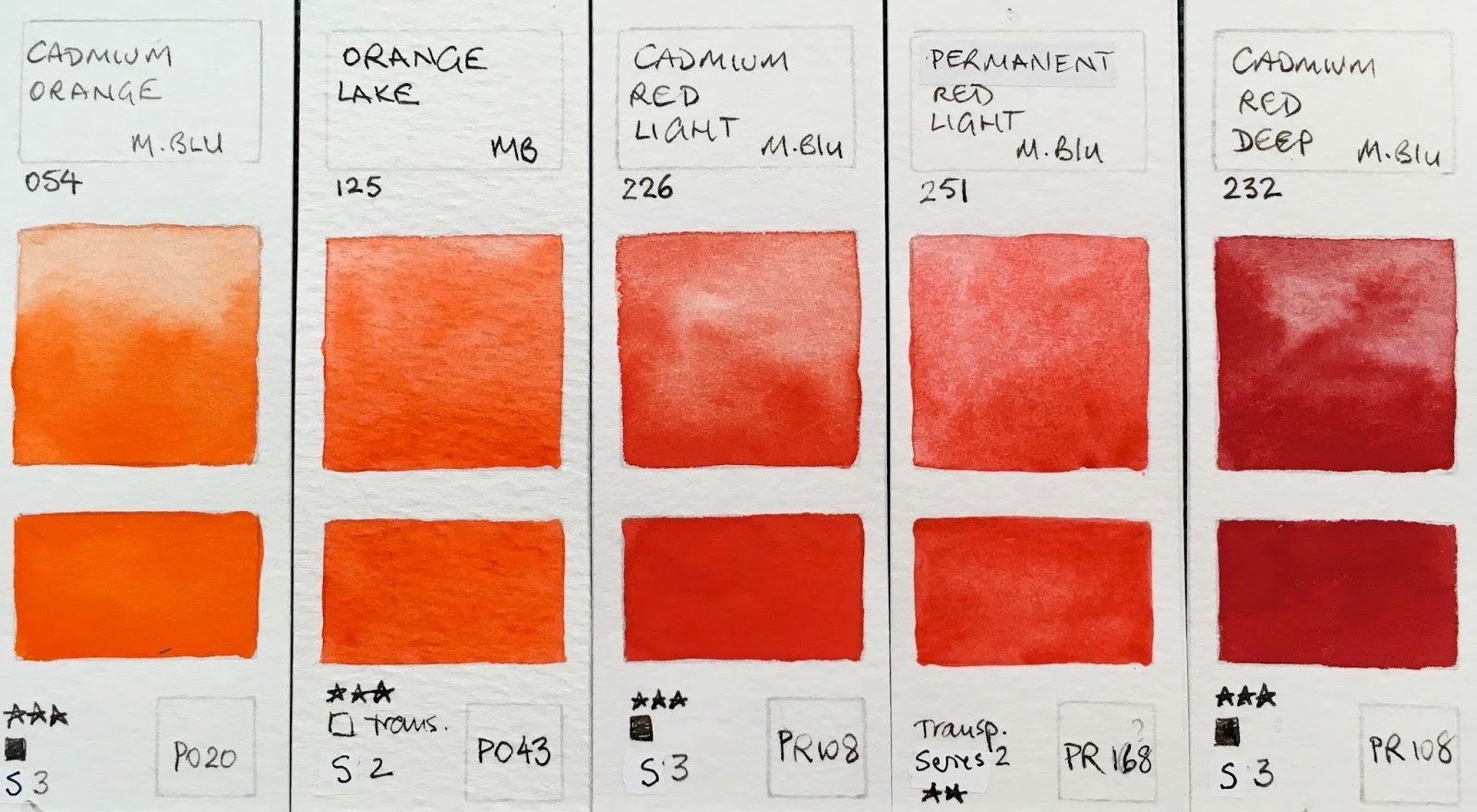 |
| MaimeriBlu Superior Watercolours - Cadmium Orange (high diffusion), Orange Lake (staining , medium diffusion), Cadmium Red Light (high diffusion), Permanent Red Light (staining, high diffusion), Cadmium Red Deep (granulating, low diffusion). |
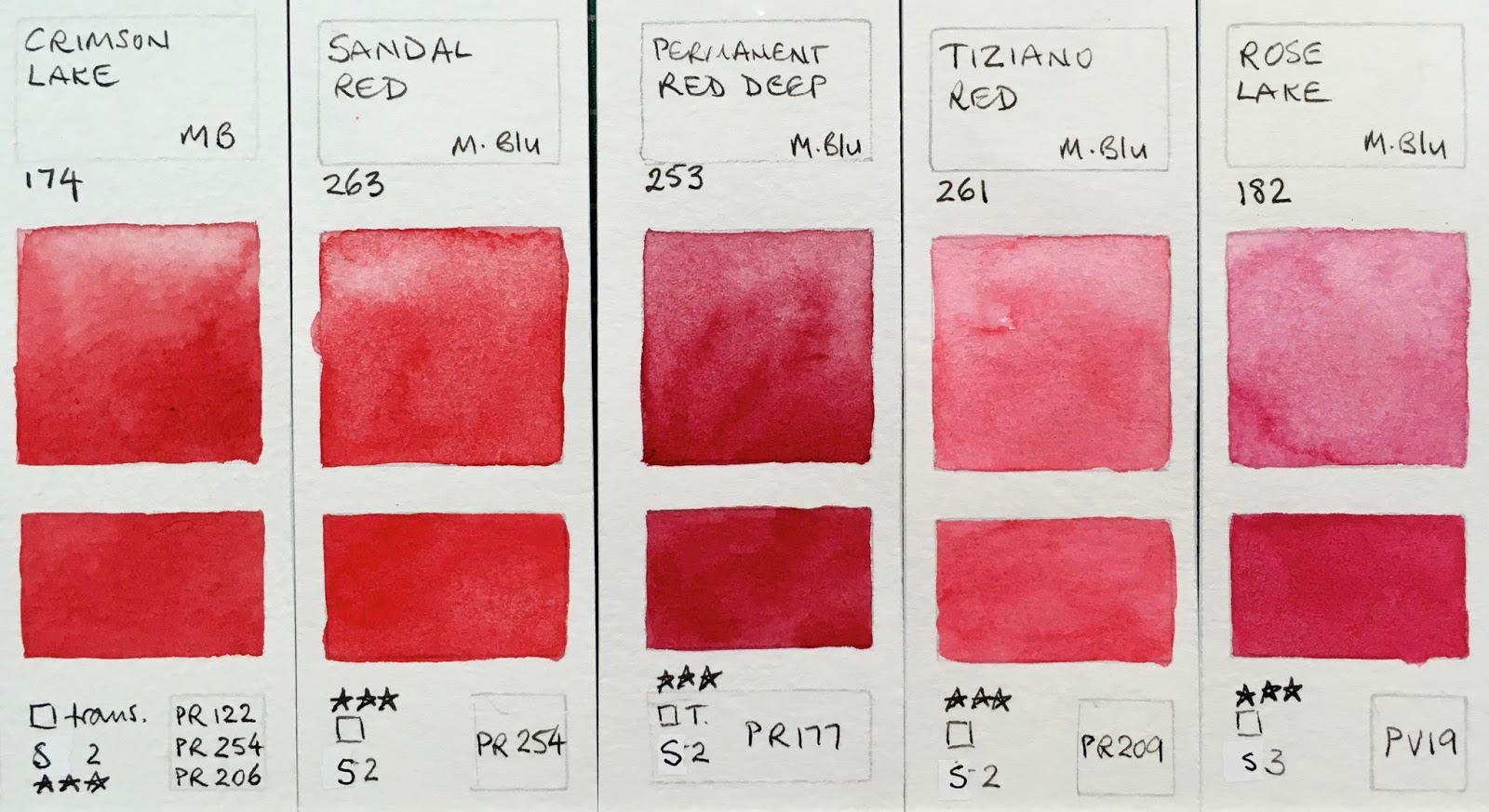 |
| MaimeriBlu Superior Watercolours - Crimson Lake (staining, high diffusion), Sandal Red (staining, high diffusion), Permanent Red Deep (staining, high diffusion), Tiziano Red (staining, high diffusion), Rose Lake (staining, high diffusion). |
These all painted out well, except the always tricky PV16 mineral violet pigment though this granulates nicely.
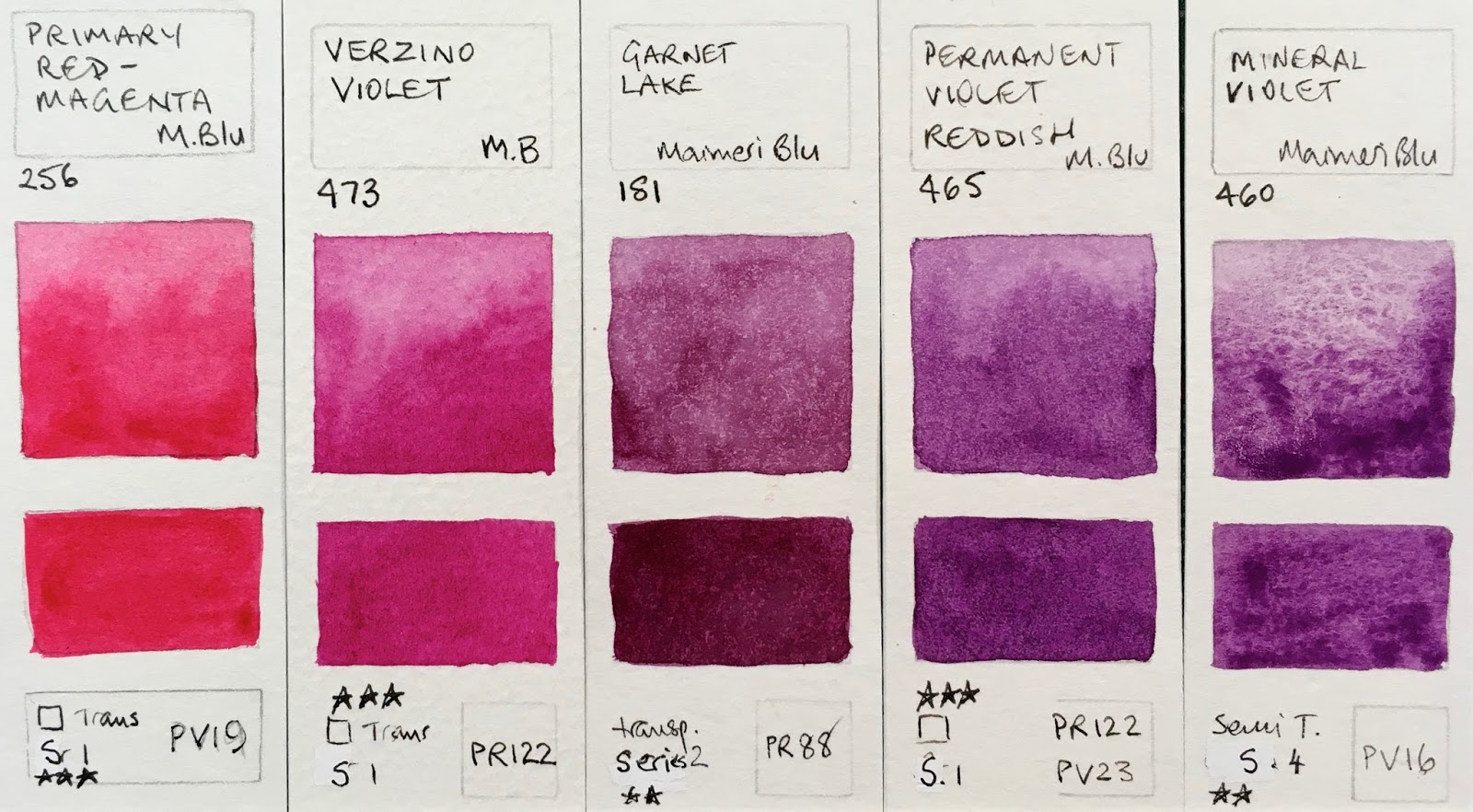 |
| MaimeriBlu Superior Watercolours -Primary Red-Magenta (staining, high diffusion), Verzino Red (staining, high diffusion), Garnet Lake (staining, high diffusion), Permanent Violet Reddish (staining, high diffusion), Mineral Violet (granulating, low dispersion). |
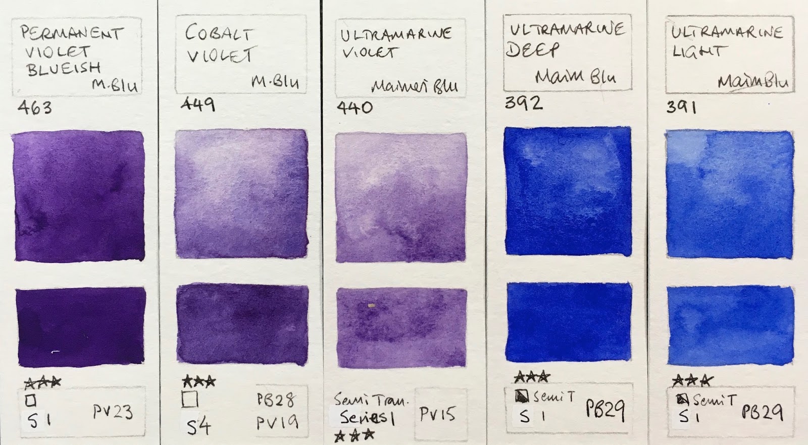 |
| MaimeriBlu Superior Watercolours - Permanent Violet Blueish (staining, high diffusion), Cobalt Violet (granulating, medium diffusion), Ultramarine Violet (granulating, low diffusion), Ultramarine Deep (granulating, medium diffusion), Ultramarine Light (high diffusion). |
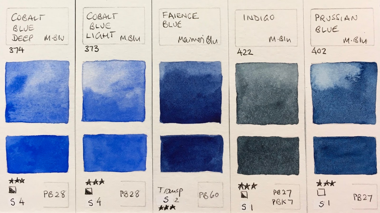 |
| MaimeriBlu Superior Watercolours - Cobalt Blue Deep (granulating, high diffusion), Cobalt Blue Light (low diffusion), Faience Blue (staining, high diffusion. Made with PB60), Indigo (staining, high diffusion), Prussian Blue (staining, high diffusion). |
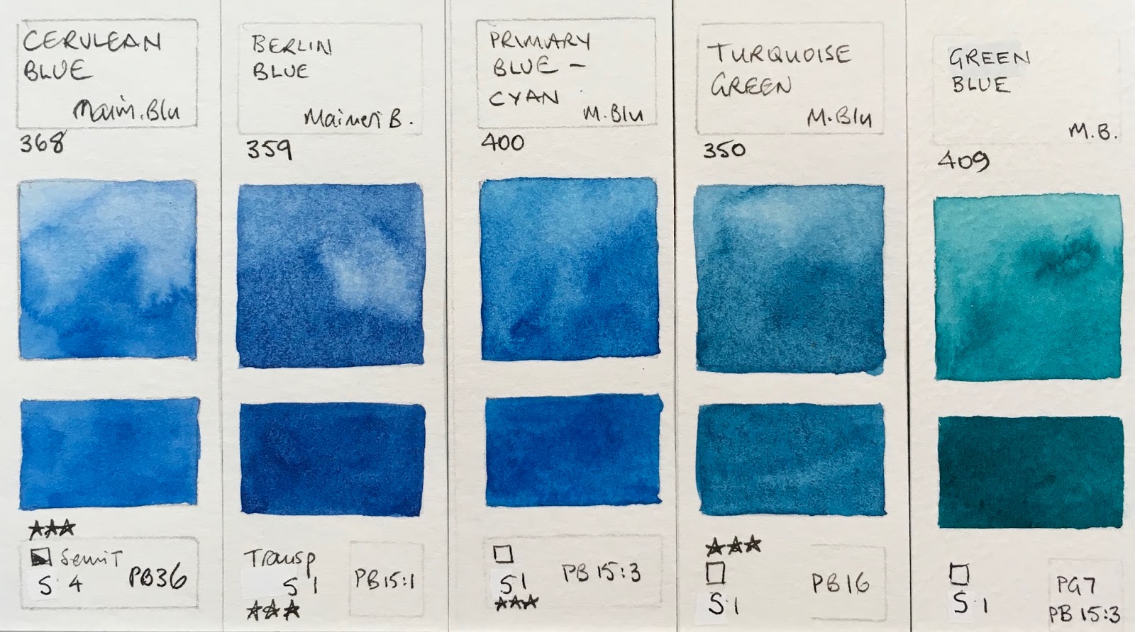 |
| MaimeriBlu Superior Watercolours - Cerulean Blue (low diffusion), Berlin Blue (staining, high diffusion), Primary Blue-Cyan (staining, high diffusion), Turquoise Green (staining, high diffusion), Green Blue (staining, high diffusion). |
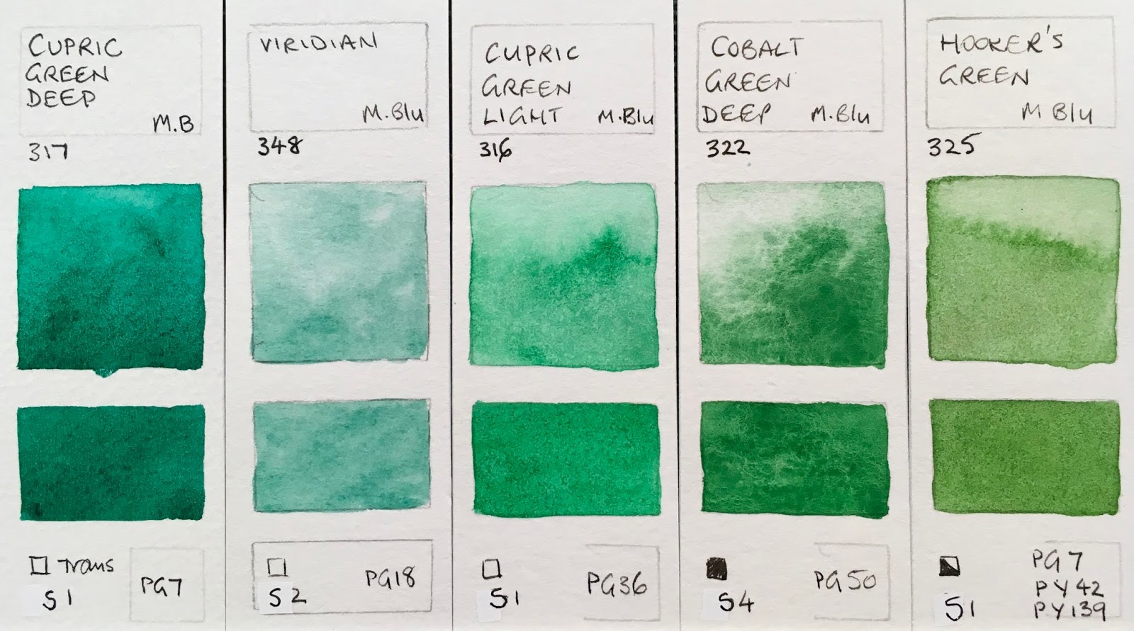 |
| MaimeriBlu Superior Watercolours - Cupric Green Deep (staining, granulating, high diffusion), Viridian (granulating, low diffusion), Cupric Green Light (granulating, high diffusion), Cobalt Green Deep (staining, granulating, high diffusion), Hooker's Green staining, medium diffusion). |
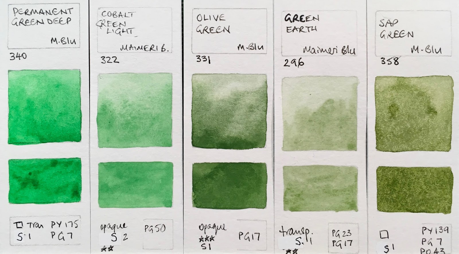 |
| MaimeriBlu Superior Watercolours - Permanent Green Deep (staining, medium diffusion), Cobalt Green Light ((staining, high diffusion), Olive Green (low diffusion), Green Earth (low diffusion), Sap Green (staining, low diffusion). |
 |
| MaimeriBlu Superior Watercolours - Permanent Green Light (staining, low diffusions), Permanent Green Yellowish (low diffusion), Naples Yellow Light (high diffusion), Naples Yellow Reddish (high diffusion), Yellow Ochre (staining, high diffusion). |
 |
| MaimeriBlu Superior Watercolours - Golden Lake (possibly made with PR101? granulating, medium diffusion), Raw Sienna (medium diffusion), Transparent Mars Red (high diffusion), Burnt Sienna (low diffusion), Transparent Mars Brown (staining, low diffusion). |
 |
| MaimeriBlu Superior Watercolours - Dragon's Blood (staining, high diffusion), Avignon Orange (staining, high diffusion), Venetian Red (staining, high diffusion), Stil de Grain Brown (staining, low diffusion), Burnt Umber (granulating). |
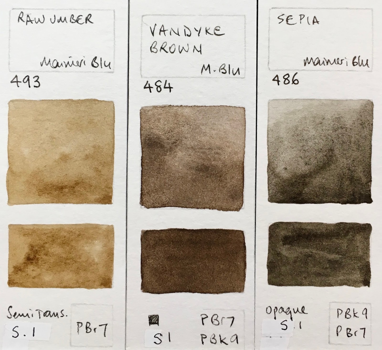 |
| MaimeriBlu Superior Watercolours - Raw Umber (granulating, low diffusion), Vandyke Brown (low diffusion), Sepia (granulating, low diffusion). |
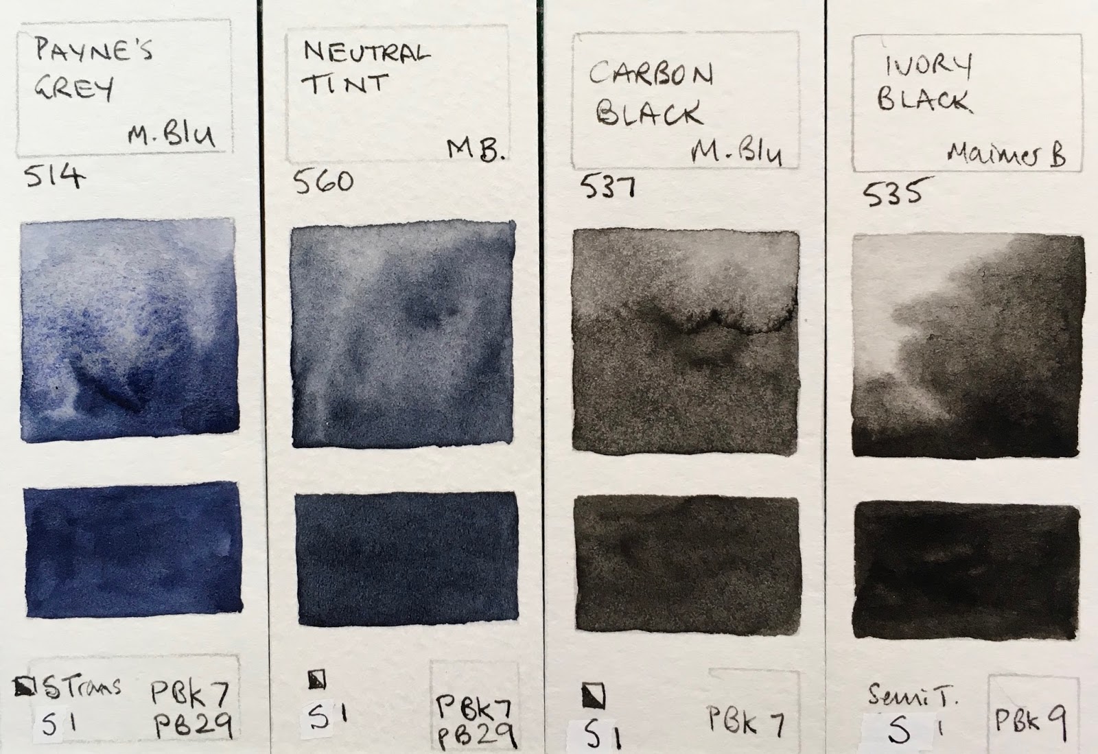 |
| MaimeriBlu Superior Watercolours -Payne's Grey (granulating, low diffusion), Neutral Tint (medium diffusion), Carbon Black (staining, high diffusion), Ivory Black (staining, granulating, low diffusion). |
October 2018
Maimeri Blu has completely overhauled their range, removing all (but 1) of the mixes so it is almost a purely single pigment range. Wow! The only mix is a surprise - Mars Black has PR101 + PBk11. I wonder why? there is also a colour with two versions of PR206.
Many excellent pigments have been added - Potter's Pink PR233, Pyrrole Orange P071 and Pyrrole Red PR255 to name a few. The many unnecessary greens and purples have been removed.
Here is what the new range looks like. Where the colour number and pigment number has remained unchanged I have included the old swatch. Where the pigment has changed I have created a new one. And of course for the many new colours I've added a new swatch. 34 colours have been removed or changed.
Titanium White is a new addition to the updated range. Nickel Titanate Yellow is not a powerful yellow, but this one paints out nicely. Yellow Vanadium is also a new colour to the range.


Maimeri Blu Watercolours new range - Chinese White, Titanium White (not shown), Nickel Titanate Yellow,
Permanent Yellow Lemon, Cadmium Yellow Lemon, Yellow Vanadium (not shown).
Golden Yellow is a new colour, as are Transparent Yellow and Cadmium Yellow Medium. Permanent Yellow Deep is a new version of a previous colour. I really like PY65 as a pure warm yellow so the new version Indian Yellow should be useful. It looks a little brighter in life than shown here.


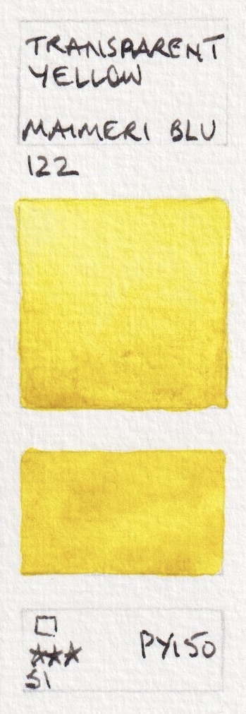


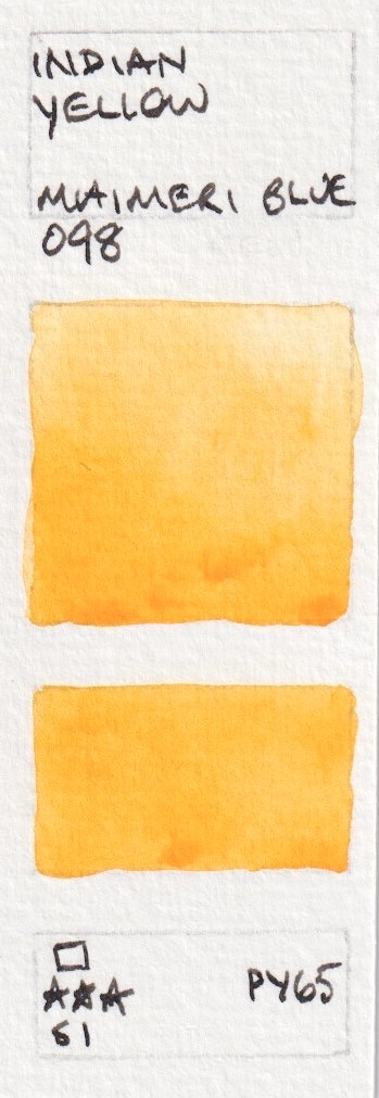
Maimeri Blu Watercolours new range - Primary Yellow, Golden Yellow (not shown), Transparent Yellow,
Cadmium Yellow Medium (not shown), Permanent Yellow Deep (not shown), Indian Yellow.


Maimeri Blu Watercolours new range - Cadmium Yellow Deep, Gamboge (Hue), Permanent Yellow Orange,
Cadmium Orange, Pyrrole Orange.
Orange Lake is brighter than it appears here. The other colours are fairly accurate. Cadmium Red Orange is a new colour in the updated range. Permanent Red Orange is a new name for a previously used pigment, Cadmium Red Medium is a new colour.


Maimeri Blu Watercolours new range - Orange Lake, Cadmium Red Orange (not shown), Cadmium Red Light, Permanent Red Light, Cadmium Red Medium (not shown), Sandal Red.


Maimeri Blu Watercolours new range - Pyrrole Red, Quinacrdione Red, Permanent Red Deep, Permanent Carmine (not shown), Crimson Lake (not shown) and Rose (Alizarin) Crimson Madder (not shown).
 |
| Maimeri Blu Watercolours new range - Permanent Madder Deep (new colour), Rose Lake, Primary Red-Magenta, Versino Violet, Magenta Quinacridone (new colour). |
 |
| Maimeri Blu Watercolours new range - Quinacridone Lake (new colour), Quinacridone Violet (new colour), Manganese Violet (new colour), Permanent Violet Blueish, Ultramarine Violet. |
 |
| Maimeri Blu Watercolours new range - Ultramarine Violet (new colour), Ultramarine Deep, Ultramarine Light, Cobalt Blue Deep (new pigment), Cobalt Blue (new colour). |
 |
| Maimeri Blu Watercolours new range - Cobalt Blue Light, Faience Blue, Indigo (new pigment), Cerulean Sky Blue (new colour), Cerulean Blue. |
Phthalo Turquoise is a lovely turquoise version of PB15 - PB15:4. See bottom of post.
 |
| Maimeri Blu Watercolours new range - Prussian Blue, Berlin Blue, Primary Blue-Cyan, Cobalt Blue Green (new colour), Phthalo Turquoise (new colour). |
Turquoise Cobalt is a very popular colour. See bottom of post.
 |
| Maimeri Blu Watercolours new range - Cobalt Green Bluish (new colour), Turquoise Cobalt (new colour), Turquoise Green, Copper Oxide Green Deep (new colour - but probably replacing 317 Cupric Green Deep), Viridian. |
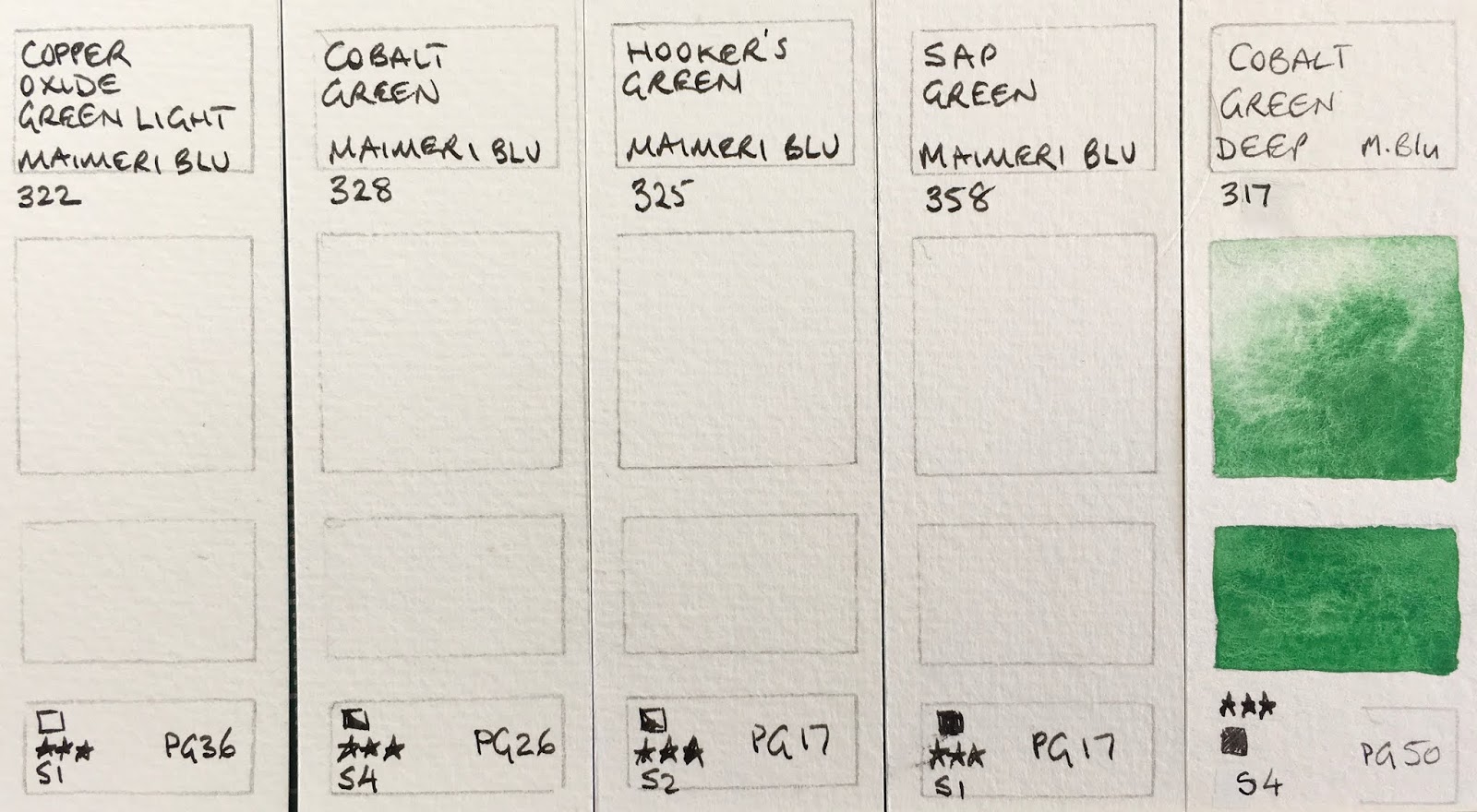 |
| Maimeri Blu Watercolours new range - Copper Oxide Green Light (new colour but probably replacing 316 Cupric Green Light), Cobalt Green (new colour), Hooker's Green (new pigment replacing 331), Sap Green (new pigment replacing 358), Cobalt Green Deep. |
Green Gold is made from the lovely PY129 - see bottom of post.
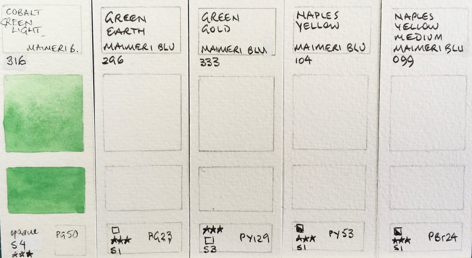 |
| Maimeri Blu Watercolours new range - Cobalt Green Light, Green Earth (new pigment), Green Gold (new colour, replacing 339 Permanent Green Light), Naples Yellow (new colour), Naples Yellow Medium (new colour). |
The Raw Sienna seems unchanged.
Brown Madder (Alizarin) is one of only two mixed pigment colours in this new range as far as I can see, and it uses two versions of PR206.
The only other two-pigment mix is Mars Black - PBk11 is a fabulous granulating magnetic black pigment. I wonder why PR101 was added?
I'll create a new post once I manage to try the new colours as it is a massive change.
Update - 6 of the new colours.
 |
| Maimeri Blu Watercolours new range - Yellow Ochre, Golden Ochre (new colour replacing 128 Golden Lake), Raw Sienna, Transparent Mars Red, Burnt Sienna. |
Brown Madder (Alizarin) is one of only two mixed pigment colours in this new range as far as I can see, and it uses two versions of PR206.
 |
| Maimeri Blu Watercolours new range - Venetian Red, Pozzuoli Earth (new colour), Dragon's Blood (new pigment), Brown Madder (Alizarin) (new colour replacing Avignon Orange), Mars Brown (new colour replacing Transparent Mars Brown). |
 |
| Maimeri Blu Watercolours new range - Potter's Pink (new colour), Burnt Umber, Raw Umber, Vandyke Brown (new pigment), Sepia (new pigment). |
The only other two-pigment mix is Mars Black - PBk11 is a fabulous granulating magnetic black pigment. I wonder why PR101 was added?
 |
| Maimeri Blu Watercolours new range - Payne's Grey (new pigment), Neutral Tint (new pigment), Ivory Black, Carbon Black, Mars Black ((new colour). |
I'll create a new post once I manage to try the new colours as it is a massive change.
Update - 6 of the new colours.
 |
| MaimeriBlu watercolours after overhaul - Indian Yellow (new pigment), Pyrrole Orange, Quinacridone Lake |
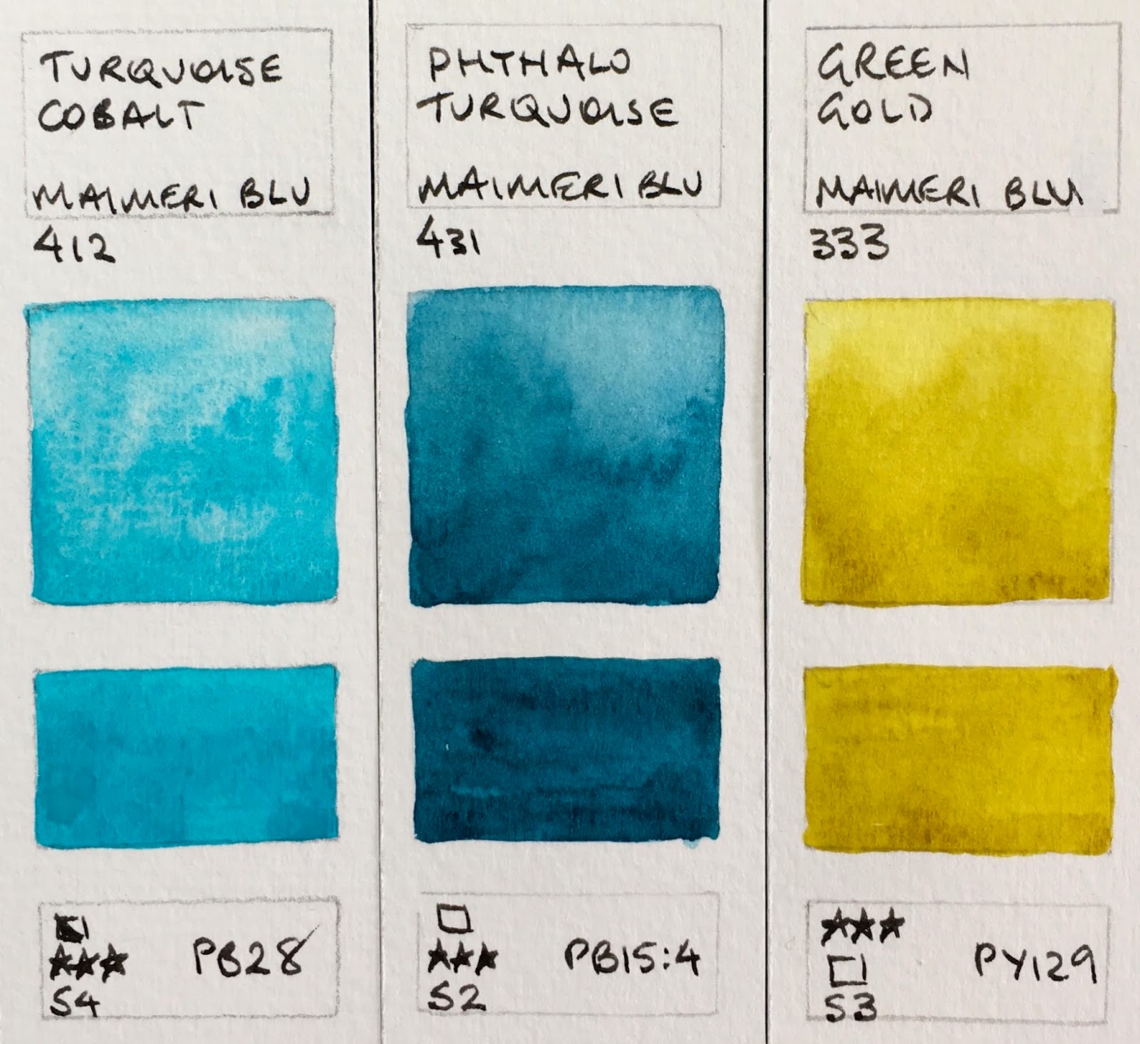 |
| MaimeriBlu watercolours after the overhaul - Turquoise Cobalt, Phthalo Turquoise, Green Gold. |
I also tested the new versions of Ultramarine Deep, Raw Sienna and Verzino Violet and they appear unchanged.
Here is the website with the whole range of 90 colours.
Here is the website with the whole range of 90 colours.
Subscribe to:
Posts (Atom)