They are all on my website in the Painted Watercolour Swatches section, which is creeping to almost 800 different painted samples now. If you have some more watercolours and would like to send me a sample to paint out, please get in touch :-)
I've been asked about adding some mixing information about these paints.
They are made with a new type of synthetic binder rather than the traditional gum arabic. It makes them feel and behave differently from traditional watercolours - a bit like painting with liquid acrylic, I felt. Golden make wonderful acrylics but I'm afraid I don't find these to be wonderful watercolours - I guess they are just not what I am used to. However, for those who are starting out they may work well. There are certainly some excellent colours but also some that are simply.... weird.
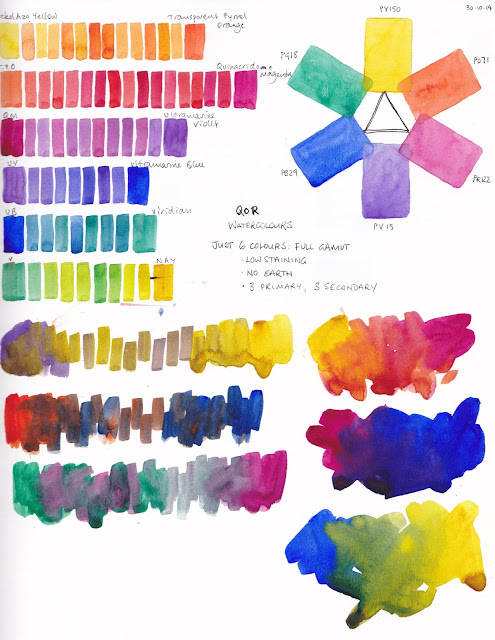
Anyway, I'll include a paintout I did using the palette of 6 that I chose. I decided to go with a balanced full gamut palette of nickel azo yellow PY150, transparent pyrrol orange PO71, quinacridone magenta PR122, ultramarine violet PV15, ultramarine blue PB29 and viridian PG18. No earth colours, and all transparent with three normally granulating pigments. Viridian and ultramarine violet are often quite weak colours so I thought these would be good to test the QoR claim of stronger colours. They are pretty powerful if you pre-wet them well before use, but not very granulating and quite difficult to lift.
 |
| QoR exploration - 6 colour full gamut palette. |
QoR have a much more powerful purple than this - Dioxazine purple, and a much more powerful green - Phthalo green. So this palette could be made up with stronger colours. Bismuth Vandate yellow could be used instead of Nickel Azo yellow. They also have a strong crimson which is the mixing opposite to Phthalo green, which could be used rather than the magenta. So this palette is not intended as a recommended palette, just an exploratory one.
That's the limit of my exploration of these paints. Partly, I guess, since I would actually very rarely set up a palette without burnt sienna, cerulean and a good warm yellow. Also, though it's a pretty colour, and a great mixer, I don't like painting with quinacridone magenta. While I love exploring what limited palettes can do but I don't actually choose to paint with them :-)
I don't know how well this brand would mix with traditional watercolours as I haven't tested them further. If anyone else has, please comment below.
Here is a similar full gamut palette made up with Daniel Smith paints - a powerful crimson (Pyrrol crimson), and the very strong Carbazole violet (the same pigment as Dioxazine violet) and phthalo green. There is more about this palette here. Once again it isn't a palette I would necessarily choose to paint with though even though they are so much fun to explore! My smallest palette contains lots of earthy pigments including burnt sienna and is shown here though I do have a full gamut palette in a silver locket ;-)
 |
| Daniel Smith 6-colour full gamut palette exploration |

Thanks for the QoR ideas. And, always, thanks for sharing COLOR -- so luscious.
ReplyDeleteI love sharing colour explorations. I probably should share more paintings though ;-)
DeleteI started out with a palette of mostly QoR (the 12 tube intro set) when I first switched to artist paint and when they first came out. Since then, I've had a chance to mix them with WN Cotman and Artist, Da Vinci, and Daniel Smith and I find they don't quite want to play well together. I like to mix and blend on the paper a lot and that doesn't work well when you mix the QoR with a different brand that uses gum arabic. Overall I don't really like painting with them and am slowly replacing them.
ReplyDeleteYes I feel that QoR may work OK alone if that's what you start out with but I don't recommend them over traditional gum arabic watercolours. I don't want to mix them with other brands. They may also appeal to acrylic painters more than traditional watercolourists.
DeleteI have mixed the transparent pyrrole orange from Qor with Opera Pink from Daniel Smith and it is lovely together! So I guess it works sometimes!
ReplyDeleteGood to know Robin. They didn't interact in any strange manner? I thought it would be possible the gum arabic based colour might soften more than the QoR colour...
DeleteI got the earth color set for christmas, and I've only done some mixing swatches so far, but it seems to mix just fine with DS! I will keep exploring though, as you never know! Personally I find them beautiful and will definitely put some in my palette :)
ReplyDeleteThat's good to know. Yes many are beautiful and bright. I haven't explored mixing them with other brands but will work on adding the rest of the colours for now!
Delete