Sunday 29 January 2017

A bit more detail...

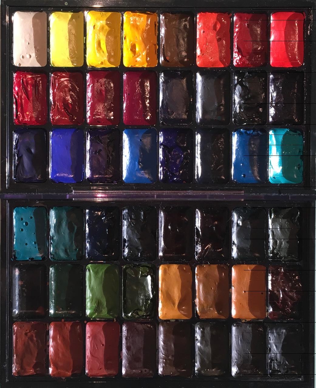
 I've been asked for more detail about the colours I showed in the MAC Palette of my favourite watercolours last post. Here is what I like about each of them. I don't for a minute suggest anyone needs all these in their palette - some suit a small or limited palette, others are just fun for a special purpose. Some I only have so I can demonstrate the differences between similar hues. But of the hundreds of watercolours I've tried, these are the ones I think are particularly useful or special. So this is my sample palette for teaching.

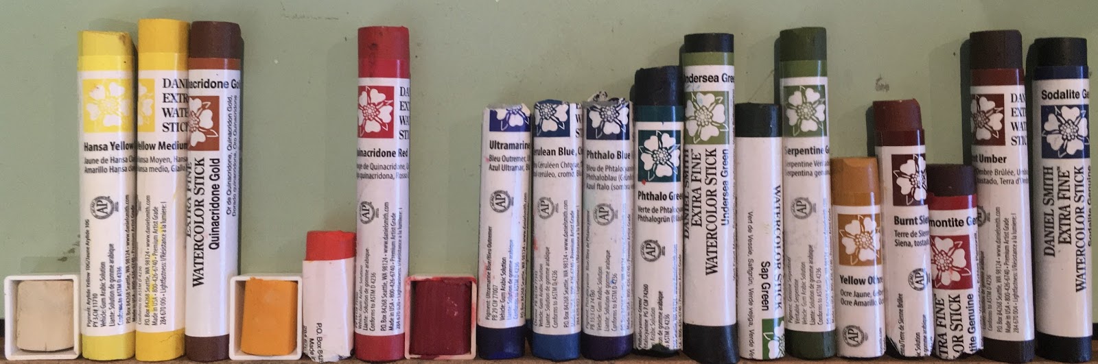
While most are Daniel Smith since they are the paints I have been using for over 20 years, there are similar colours and/or pigments available in other brands for some of these, others are DS exclusives. I have made my Ultimate Mixing Set bold, and my favourite 24-colours for my own palette italic (so many are both

I usually have an 'extras' palette, even when plein air, in case I want the wonderful properties of one of the Primateks or other pigments. I have said many times - watercolour is not just about the colour - they can be mixed from a very small selection - it's also about the properties of the pigments :-)
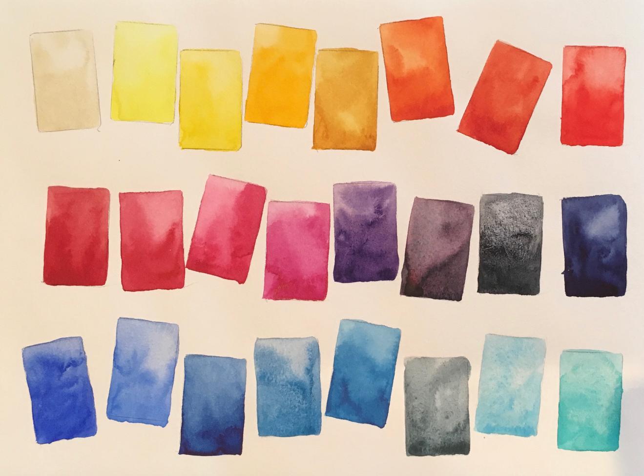
The first row.

  • Buff titanium DS PW6:1 a granulating and slightly unbleached white opaque watercolour great for urban sketching, sand effects, sandstone, marble and gum trees. This is one of my most used colours.
  • Hansa Yellow Light DS PY3 - a very pure and bright cool yellow. I don't use a cool yellow much, but this is a great choice if you want one as it is relatively transparent and mixes beautifully. I have this to demonstrate, and put a cool yellow in my students' palettes.
  • Hansa yellow medium DS PY97. I use this as my main yellow. It's a mid or primary yellow, but so much more lightfast than aureolin (PY40). It's a great pair with quinacridone gold.
  • New Gamboge DS PY153 This has been reformulated, but I have some old stock. Very similar in hue to Hansa Yellow Deep, with is another excellent choice for a bright warm yellow - a great pair with hansa yellow light.
  • Quinacridone Gold DS PO49 I love this slightly neutralised warm yellow as a great mixing gold. It makes wonderful greens with any blue or with phthalo green, and adds a glow to a painting. Only available in DS 15ml tubes, though the mixed hue in the 5ml tubes and sticks is also very pretty.
  • Benzimida orange deep PO36 DV. Da Vinci make excellent watercolours, including many in 37ml tubes. This is one of my favourite single pigment oranges. It's very bright, semi transparent and mixes beautifully with blues for neutrals. 
  • Trasparent pyrrol orange DS PO71. I love this as a very transparent warm red option. It's a little more tricky to use than pyrrol scarlet, the warm red I recommend, as it has more of a drying shift. But it is gorgeous as an orange wash under red fruit and flowers for more brilliance
  • Pyrrol Scarlet DS PR255 This is possibly the most beautiful warm red I've used. Really bright and mixes nicely with yellows to make bright oranges or interesting neutrals with phthlo blue


Second row

  • Pyrrol Crimson PR264 DS is a powerful crimson. I love it alone or mixed with phthalo green to make a fantastic range of deep greens, maroons, greys and a rich black.
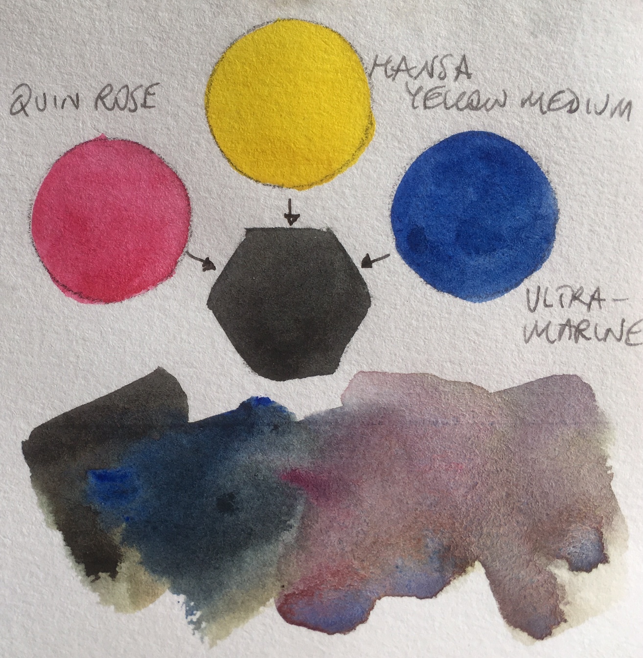
  • Carmine DS. This is one of my favourite primary red options in a limited palette - it is a lovely crimson but also mixes clean oranges and purples. Quin rose is cleaner still, so is another excellent primary red.
  • Purple Magenta Schmincke PR122. Daniel Smith have just released a PR122, which I haven't yet tried. It is probably the closest to a primary magenta as found in a CYM palette. It mixes clean purples and clean oranges. However I don't like the basic magenta colour as much as the basic rose colour so I prefer Quinacridone Rose as my purple-mixing red.
  • Quinacridone Rose DS PV19. This is another great primary red choice, and the colour I use to mix purples. Transparent and beautiful, is is useful for skin tones, florals, mixing and so on. One of my key mixing colours.
  • Imperial Purple DS PV19 + PB29. While this is a very easy purple to mix using palette colours, sometimes it is useful to have a convenient premixed purple and this granulates nicely. As it is made from two basic palette colours, I can always use it without any loss of colour harmony. The alternative PV23 purples are more staining though useful if you don't want granulation.
  • Moonglow DS PR177+PG18+PB29. This is a really interesting purple-grey with fantastic granulation. It is gorgeous in the shadow areas of florals and as I don't tend to have viridian in my palette it is a difficult one to mix myself on the go. Not used often, but I do love it.
  • Sodilite genuine DS - this is a lovely granulating blue-grey. Similar in hue to my Jane's Grey but even more granulating.
  • Indanthrone Blue DS PB60. This is one of the most beautiful rich deep blues. It has a little drying shift but is a powerful deep warm blue option. I use ultramarine more, but this is gorgeous for a night sky or stormclouds.

Third row


  • Ultramarine Blue DS PB29. There is also French Ultramarine, which is ever so sligthtly more red and more granulating, but I use the series 1 ultramarine as it mixes perfectly with Burnt Sienna to make my Jane's Grey. This is a basic palette colour for me. Great for skies, for mixing a range of greens or purples, and for use as a lovely non-staining warm blue.
  • Cobalt Blue DS PB28. I love this colour, though I won't often use it. I use ultramarine more as it is more on the purple-side so gives a more versatile warm blue. Cobalt is a mid blue - neither warm nor cool - and would be lovely in a limited palette with hansa yellow medium and Quinacridone Rose.
  • Phthalo Blue Red Shade DS. I love the way this mixes with Transparent Pyrrol Orange. It can also be the exact colour of the Australian sky. However I tend to recommend the Green Shade for a greater mixing range.
  • Cerulean Chromium DS PB36. There is also a cerulean made from PB35 but it is not as strongly pigmented nor as cool. I love this for sketching - with ultramarine you can mix a blue-sky colour for anywhere in the world. Being non-staining, it is easy to lift out the clouds.
  • Phthalo Blue Green Shade DS. A powerful, transparent and staining cool blue - excellent mixer and great for glazing. It's a basic palette colour though I tend to use it more for mixing than painted alone.
  • Blue Apatite Genuine DS. I really love granulation. I don't use this much, but I enjoy playing with it :-)
  • Manganese Blue Old Holland PB33. Though now discontinued, this lovely gentle blue has exquisite granulation. It's perfect for the sparkly shadows of snow in some lights, though not for Australia sadly. I don't use it much but have a little stock of this now difficult to get pigment.
  • Cobalt Teal Blue DS. I don't actually paint with this, but have it in this palette to show the difference between it and my preferred Cobatl Turquoise below. It's a gorgeous colour, and I'd take it to New Zealand to paint the colour of the water in the rivers, but it's often just to unrealistic for me.
Fourth row.

  • Cobalt Turquoise DS PB36. This is the same pigment as ceruelan chromium and it has the same semi opaque and heavy granulating characteristics. I use this in water, for creating copper effects and for extra granulation. A lovely extra.
  • Viridian PG18 DS. This is a much more gentle cool green. It won't mix the powerful blacks you can make with phthalo green, but the granulation is lovely. I don't use it much, but keep it more for comparisons.
  • Phthalo Green Blue Shade PG7. This is a colour I don't use alone, and suggest you simply don't when painting from life as it is such an unrealistic green. It's a great mixer though, making spectacular greens with a warm yellow or many of the earth colours.
  • Jadeite DS. This is a great alternative to phthalo green if you want more granulation and texture. A lovely colour that changes mood whether applied in a wash or deep masstone.
  • Jane's Black PG7 + PR264. This is another custom mix I make to have a rich deep black without using a black pigment. Made from Pyrrol Crimson and Phthalo Green to a neutral deep black.
  • Perylene Green PBk31 DS. This is one black pigment that I use. I love this deep shadow colour for the shade between trees, the deep green in foliage and the lovely greens it makes when mixed with yellows. convenience darks save time when painting.
  • Undersea Green DS PB29 + PO49. This is an old tube as the new formula is a three-pigment mix, but I find it a very useful green for foliage in Australia and overseas.
  • Green Apatite Genuine DS. This is a lovely granulating green, similar to Sap green, that gives surprising results. Fun to play with. (lives in my 'extras' palette)

Fifth row

  • blank - the 48th pigment I may add to this set is Potter's Pink. Or perhaps a single pigment granulating violet - I usually mix my purples but PV14, PV15 and PV16 are interesting... though it means moving a lot of colours in the palette...
  • Sap Green DS PO49 + PG7. This is another old stock Sap Green (I bought a lot when they were changing the formula) and it is a perfect premix for foliage and leaves throughout the world. Having a convenience 'home green' can really be helpful when painting, especially on location.
  • Serpentine Genuine DS. This is a beautiful extra - perfect for a field of grass. I don't use it much, but the lovely specks of brown that appear as it dries are just gorgeous. (Also lives in my 'extras' palette)
  • Rich Green Gold DS PY129. A very green-yellow, useful for foliage when the light is shining through the trees. Not an essential colour, but I use it in plain air palettes of 24 colours.
  • Yellow Ochre PY43 DS. One of three earth yellows - this will mix great sap greens and is lovely in an earth primary palette. 
  • Goethite DS PY43. My most used earth yellow - I love the granulation, and the way it creates sandstone, beaches and other textures with such ease. I mix this with Quinacridone Gold for a gorgeous granulating gold earth.
  • Raw Sienna PBr7 DS. This is a slightly more orange yellow earth, but it mixes quite differently from yellow ochre, making it useful to have both.
  • Quinacridone Burnt Orange PO48 DS. This is a lovely colour that creates and incredible range with phthalo blue, but I don't use it much. i keep it as a comparison with burnt sienna and transparent red oxide.
Sixth row


    • Transparent Red Oxide PR101 DS. I just love this colour. It's a brighter, more orange and more wildly granulating pigment than burnt sienna. I like to have both in my palette - this for rusty effects, the burnt sienna for a more subdued colour.
    • Burnt Sienna PBr7 DS. A basic palette colour, this is a perfect hue to wash down to a skin-tone with lots of water, and to mix with blues for lovely greys. 
    • Indian Red PR101 DS. This is the most opaque watercolour, but that doesn't mean it can't be used with lots of water for lovely granulating effects. I love it with yellow ochre (or my mixed granulating gold) and cerulean chromium for a gorgeous earth primary palette.
    • Piemontite DS. There is a surprising soft dusty pink in washes, with a deep red-brown in mass-tone - this is perfect for rusty effects, along with transparent red oxide.
    • Burnt Umber DS PBr7. It's not an essential colour as it is easily mixed, but in a 20-colour palette I like to have burnt umber as a convenient warm brown.
    • Raw Umber PBr7 DS. This is more difficult to mix, and varies considerably from manufacturer to manufacturer. I love this cool deep brown, which is more difficult to mix. It's one of my ultimate mixing set.
    • Jane's Grey PB29 + PBr 7. A convenience mix that I make up 60ml at a time. It is granulating and liftable so perfect for skies, shadows and works as a neutral tint to darken other colours. A basic palette colour for me as it saves time when painting.
    • Lunar Black PBk11 DS. I don't tend to use black pigments but this is an exception as it is exceptional in its granulation. It creates incredible patterns as the pigment floats and moves - such fun :-)


    Sunday 15 January 2017

    MAC palette as watercolour palette - all my favourites - can you guess what they all are?

    There are many hundreds of different watercolours available, made with hundreds of different pigments and pigment mixtures. Over many years, I've been exploring the various pigments and colours available to find the ones I think are the most interesting and/or generally useful. 

    I have a rather large collection of tubes and many are squeezed into more portable storage palettes, and of course I have my painting palettes. Here I thought I'd go through my favourite watercolours, and explain why I like them. I don't necessarily paint with them all and of course never in one painting!

    I was looking for a large palette that would hold many different pigments. I didn't need a mixing area in this one, as it was not for painting, but for demonstrating and explaining the differences between various colours and pigments. So I didn't look in traditional watercolour supply stores, but makeup stores. MAC makes empty pro palettes for makeup artists to fill with lipsticks. They are rather flat wells, so don't hold a lot of paint, but they don't need to. They are inexpensive, another bonus.

    I bought a 24-colour lipstick palette. You could, of course, spray the lid section white and use this as a painting palette of 24, but I bought an extra 24-colour insert, creating a 48-colour storage palette.

    Here it is filled with my favourites. Some of you would be able to make a pretty good guess at what colours are here. 

    But I won't leave you totally in the dark about what they are - here's a paint-out of the top section. I've now updated this post with the full palette names but just cover the caption to test yourself :-)

    Top row: buff titanium, hansa yellow light, hansa yellow medium, new gamboge PY153 (very like hansa yellow deep), quinacridone gold, Da Vinci benzimida orange deep, transparent pyrrol orange, pyrrol scarlet.
    Middle Row: Pyrrol crimson, carmine, quinacridone rose, Schmincke purple magenta PR122, imperial purple, moonglow, sodalite genuine, indanthrone blue.
    Bottom row: ultramarine, cobalt blue, phthalo blue red shade, cerulean chromium, phthalo blue green shade, blue apatite genuine, Old Holland manganese blue genuine, cobalt teal blue


    And here is the bottom section. There is one spot empty. It's probably the spot for Potter's Pink. Not a colour I use a lot, but a rather beautiful pigment. I'd have to rearrange the colours to put it in though...

    Top row: cobalt turquoise, viridian, phthalo green BS, jadeite genuine, Jane's black (pyrrol crimson + phthalo green BS), perylene green, undersea green, green apatite genuine.
    Middle row: blank, sap green, serpentine genuine, rich green gold, yellow ochre, goethite, raw sienna, quinacridone burnt orange
    Bottom row: transparent red oxide, burnt sienna, Indian red, piemontite genuine, burnt umber, raw umber, Jane's grey (ultramarine + burnt sienna), lunar black.

    Of the 47 colours, 42 are Daniel Smith, 2 are my own custom mixes using DS paints and 3 are other brands - a Da Vinci, and Old Holland and a Schmincke.

    I haven't included any cadmiums, even though they are excellent pigments with specific uses. I have them in my other storage sets!

    Well done to Bob who pretty much nailed the guessing below :-)


    Tuesday 10 January 2017

    Watercolour Sticks from Daniel Smith

    I wrote about making palettes using Daniel Smith watercolour sticks here.

    I thought I'd add some more information, with photos, since I have noticed that watercolour sticks are now more readily available, including in Australia :-)

    Here is my collection of watercolour sticks after my trip to the US last year. Some I have cut down to add colours to my students' palettes, some to add to my own palettes. I guess you could use them straight from the stick and not put them in a palette at all but that certainly isn't my suggestion. Once there is only 1/5 left of a stick I press it into a half pan, and, of course, write on the side what colour it is in a permanent pen.

    20 colours - buff titanium, hansa yellow light, hansa yellow medium, quinacridone gold and hansa yellow deep - not that you need all four; organic vermilion, quinacridone red and permanent alizarin crimson; ultramarine, cerulean chromium and phthalo blue GS; phthalo green BS, undersea green, sap green and serpentine genuine; yellow ochre, burnt sienna, piemontite genuine, burnt umber and sodalite genuine.


    My 'travel sticks' ready to go again.
    Three half pans made up with 1/5 of
    a watercolour tube squished in.
    With watercolour sticks, unlike tube colours, there are no lids to screw on, no tubes to worry about leaking and no need to declare as liquids as part of your on-board luggage - they are very travel friendly. Though they do need to be stored in a dry container and can, of course, dirty each other if allowed to rattle around loose in a pencil case. They are formulated with the same ingredients as the tube colours, though with more pigment and less water so the drying has already been done. Even if you are not travelling with them, the ease of making up palettes is apparent. You simply cut off 1/5 of a stick and press in into the palette or pan. Done.

    The only disadvantage is that you can't make up custom colours with them.

    Note, though they were designed to draw with, I don't choose to use them for drawing. This is in part because I prefer to work with pencils and pens, but it is also because I live in a humid climate and I find they go soft so are not suitable for drawing where I live.

    You don't need all of those yellows - I'd suggest hansa yellow light and hansa yellow deep (or you might prefer hansa yellow medium and quinacridone gold.)

    Here's the set of 14 painted out, including three of the yellows, three reds, three blues and some lovely earth colours. Sodalite genuine is a dark blue pigment that is very similar to my Jane's Grey. I scribbled on the paler with the sticks and brushed water over them, though in the palette you would just touch a wet brush to them as with other watercolour pans.

    A basic palette of 14 colours using watercolour sticks. Or switch out one of the yellows and add Piemontite as an earth red.


    And here are some of the gorgeous extras.
    Serpentine genuine is normally an expensive colour in a tube but all the sticks are priced the same. I love it for grassy meadows.
    Undersea green is a wonderful olive green that works beautifully in Australia as it perfectly captures our dull gum leaves. It can be a distant green too, watered down for atmospheric effects.
    Sap green works the world over as a convenient realistic foliage green - add more light yellow to brighten it up further.
    Piemontite genuine is an earthy red. Really lovely with yellow ochre and cerulean chromium as an earth triad. Indian red has more colour but isn't available as a stick.
    Burnt umber is a colour that I like to have as a pair with raw umber (also not available as a stick). It isn't an essential colour since you can create this hue by mixing a little ultramarine with the burnt sienna, but it can be useful to have convenient darks.

    Lovely extras.
    The 12 colours that are asterisked are a suggested 12-colour sketching palette if just using watercolour sticks.

    An finally an 18-colour palette option.

    Happy travels :-)


    10 years x 10 classes Urban Sketching world wide workshops

    For the first time, the Urban Sketchers organisation is offering long term workshops, all over the world. We'll have a series of 10 workshop classes created in a range of cities to celebrate 10 years of the Urban Sketchers organisation. While each series of classes is different and will be taught by different people, they all follow the same idea of little stories, medium stories and great stories and are each designed around the city in which they will be held.

    Some will be taught by a number of instructors, some by just one.

    Here's the detail - check them out and get them booked into your diary :-)

    http://www.urbansketchers.org/p/10-years-x-10-classes.html

    Thursday 5 January 2017

    All that Grey...

    Happy New Year. It's been a busy time getting our new house sorted and I still haven't unpacked everything I need in my art room - including my scanner - so please excuse the less than ideal photos. I wanted to share some ideas with you...

    Back in 1999, when we lived in New Jersey, USA, my then very young son looked out the window one very grey February day and said plaintively "I wish that the world was all the colours of the rainbow."

    While those of us in the Southern Hemisphere are getting our massive dose of vitamin D and watching out for the extreme UV over the Summer, for many of you this time of the year is all about grey - grey skies, grey roads, grey trees, grey buildings. There are many ways to mix greys and I thought I'd share a few.

    Jane's Grey mixture


    I am sure you will be familiar with my favourite grey mix - Jane's Grey. I generally prefer to create two-pigment greys since they are simple and can easily be moved between the two colours without any loss of colour harmony.


    A cool dusty grey


    Burnt Sienna and Cerulean Chromium is another lovely grey - I use this for dusty greys especially in the sky in the northern hemisphere if the grey is rather cool. It is granulating and liftable so, like Jane's Grey, you can splash it around and lift out the clouds.


    A cool staining grey


    Pyrrol Scarlet and Phthalo blue GS will also make an interesting range of greys and near-blacks, including one I call 'Jane's Black R/B', but these will be non-granulating and staining. Where the above mixes can move between blues and browns, this will move between deep indigos and Indian red hues. It will also mix darker greys than the above. 


    A variation of this is Transparent Pyrrol Orange mixed with Phthalo Blue RS - this pair makes a gorgeous deep black and a range of browns and burnt oranges that I call Jane's Black B/O and use for bird or stone studies where the common colours are browns/oranges and blues. (Note: DS Transparent Pyrrol Orange has changed from a red-orange to a mid orange so this is no longer a neutralising pair.)


    A neutral staining grey is created when you 
    dilute Jane's Black


    Another favourite two-colour mix is Phthalo Green BS and Pyrrol Crimson - at full strength this makes Jane's Black (R/G) - a wonderful deep staining black. It can be watered down to a very soft range of greys. It can lean towards the deep maroons or deep greens so can be useful for foliage and landscape greys and blacks.


    For a greater range of greys, try mixing three primaries together.


    Granulating greys.

    A lovely general purpose primary triad consists of ultramarine, Quinacridone Gold or another warm yellow (New Gamboge/Hansa Yellow Deep etc) and Pyrrol Crimson. This is a very useful triad in Australia as it mixes slightly dull greens, oranges and purples that suit our landscape. This Aussie Triad will also mix a rich black that can be watered down to a lovely granulating grey. As there are three pigments in the grey, it can also be moved to a more purplish grey, a more green-grey, a more brown-grey or of course more blue, more yellow or more red. That adds complexity in mixing but is fun to explore.


    A versatile range of greys.

    If you start with a cool triad - phthalo blue GS, Hansa yellow light (or medium as a pirmary yellow) and Quinacridone Rose - you can also mix a gorgeous rich and staining black. Watered down, this will make a range of soft greys that can be adjusted warmer or cooler as you prefer.


    Warm greys


    A rather classical triad of a warm red, a yellow and ultramarine will also make a rich black, and watered down the greys will be granulating. They will tend to be warmer greys too.


    Brown-greys


    Phthalo blue, Quinacridone gold and pyrrol scarlet make another deep black but the greys tend to be difficult to neutralise if you add the yellow - alone the scarlet and blue make a rich neutral black as seen above.


    My favourite granulating earth greys


    One of my favourites is the grey made with Cerulean Chromium, an earth yellow such as Yellow Ochre and Indian Red. This will be a granulating grey and rather lovely to explore for snow.


    Versatile granulating greys


    Ultramarine,  Hansa Yellow medium and Quinacridone Rose is one of the most versatile primary triads - you can make pretty much any colour with this set. Mixed together they make a lovely rich black and a range of beautiful greys.


    To make blacks and greys with any primary triad, I suggest making a mid orange first, then gradually add the blue. You could equally make a green and add the red or make a purple and add the yellow, but making the orange and adding the blue seems to be the most reliable method. And of course use very strong pigments with very little water to get a rich black.

    You can read more about three-pigment greys on Liz Steel's blog - she uses three colours to make her premixed greys, including her new soft grey, which is a little like the earth grey above.

    Enjoy your mixed greys and blacks :-)