Thursday 23 March 2017

Schmincke Watercolours 2017 - full range


It is the 125th Anniversary of Schmincke Horadam watercolours, and they have been building up to a big release as part of an overhaul of their watercolour range. I've looked at the websites, dot cards, old and new colour charts to try to figure out the exact changes. Some colours have been removed, a number renamed and 35 new or replacements introduced to increase their range from 110 to 139 colours. (Though I did read that it was 140 colours and couldn't work out the maths - I counted them and there are 139 in the new catalogue. It's been pointed out that the 140th is Oxgall.)

I posted the 35 new colours here. Here is the full range, with thanks to Schmincke Germany and Art Scene Sydney. Where I had them I have also shown the replaced and discontinued colours in the range. The full 6 that have been removed (as in the paint numbers are not shown on the new brochure) are shown at the bottom.  Only two of these have not been replaced with a new pigment or a new version of the same pigment - the Gamboge Modern and Pozzuoli Earth. I have noted where there has been a change in colour but the number has stayed the same. Here is the link to the new Schmincke brochure.

These swatches have been photographed under 'sunlight' lamps, but some colours are still difficult to show - especially the warm yellows and oranges. Schmincke has a number of beautiful orange-yellows and bright oranges so it's a shame not to be able to show them better :-(

There are some excellent new colours but still a large number of two-pigment colours remain that are not strictly necessary as there are excellent single pigment versions available. It's great to see some more granulating pigments, and a G has been added to the brochure information to highlight the more granulating colours in the range.

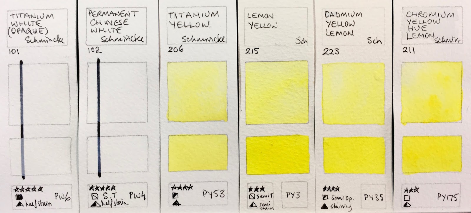
Schmincke Horadam Watercolours - Titanium Opaque White (was Titanium White Opaque), Permanent Chinese White,
Titanium Yellow, Lemon Yellow, Cadmium Yellow Lemon,
Chromium Yellow Hue Lemon (was Chrome Yellow lemon, no lead).

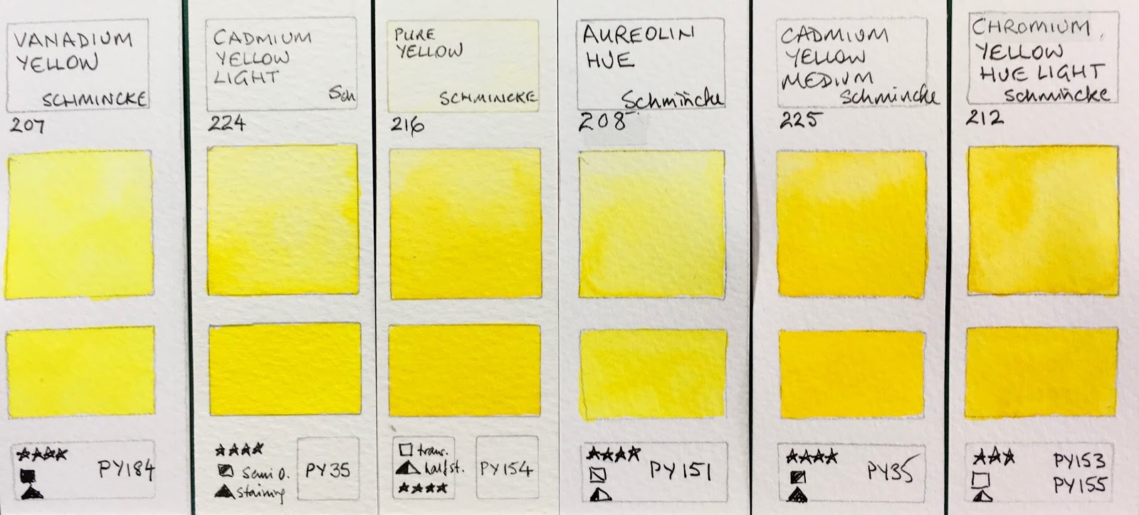
Schmincke Horadam Watercolours - Vanadium Yellow, Cadmium Yellow Light, Pure Yellow, Aureolin Hue (was Aureolin Modern), Cadmium Yellow Medium, Chromium Yellow Hue Light (was Chrome Yellow light, no lead).

These swatches are more orange than shown. The new Turner's Yellow is a rich almost pastel yellow, like a Yellow Naples. The last two are definitely more orange than they appear here.

Transparent Yellow (was Translucent Yellow), New Gamboge (was also called Gamboge Gum Modern -
discontinued 2017, no direct replacement), Turner's Yellow (new 2017), Quinacridone Gold Hue (new 2017),
Chromium Yellow Hue Deep (was Chrome Yellow Deep, no lead), Cadmium Yellow Deep. 

These are also a richer orange than they appear. The new Yellow Orange is a definite orange yellow as PY110 tends to be. It's a lovely addition.

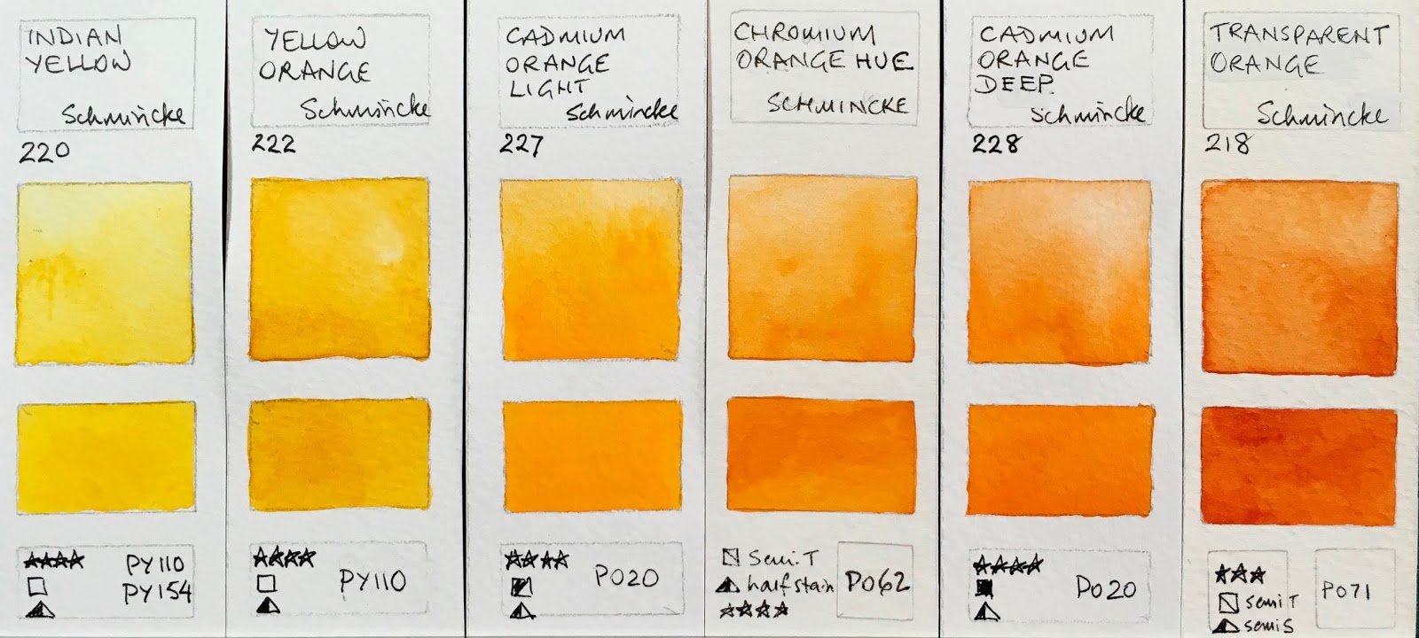
Schmincke Horadam Watercolours - Indian Yellow, Yellow Orange (new 2017), Cadmium Orange Light,
Chromium Orange Hue (was Chrome Orange, no lead), Cadmium Orange Deep, Transparent Orange
(was Translucent Orange) 

These are all brighter orange reds.

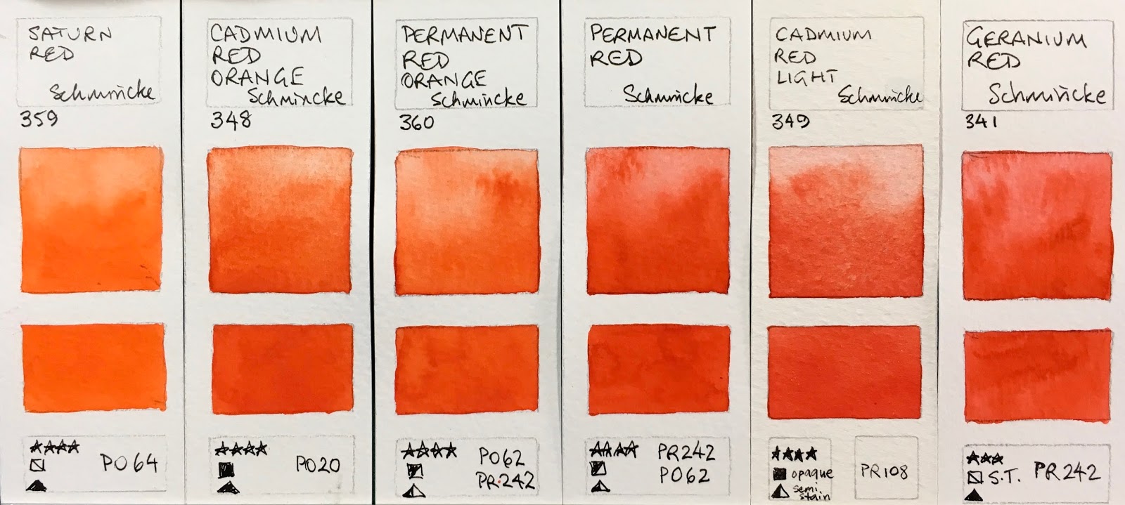
Schmincke Horadam Watercolours - Saturn Red (new 2017), Cadmium Red Orange, Permanent Red Orange,
Permanent Red, Cadmium Red Light, Geranium Red (new 2017).

Schmincke Horadam Watercolours - Vermilion, Vermilion Light (new 2017), Scarlet Red, Cadmium Red Medium,
Quinacridone Red Light (new 2017), Transparent Red Deep (new 2017).

Ruby Red Deep is a great addition as this is my favourite crimson pigment.
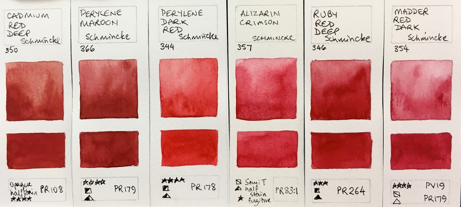
Schmincke Horadam Watercolours - Cadmium Red Deep, Perylene Maroon (was Deep Red), Perylene Dark Red
(new 2017, replaces 345 Dark Red discontinued 2017 not shown here - see below) ), Alizarin Crimson,
Ruby Red Deep (new 2017), Madder Red Dark. 
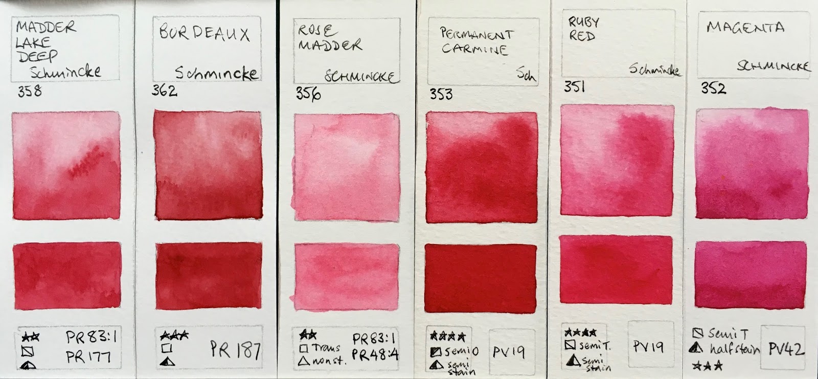
 Schmincke Horadam Watercolours Madder Lake Deep, Bordeaux (new 2017), Rose Madder, Permanent Carmine,
Ruby Red, Magenta. 

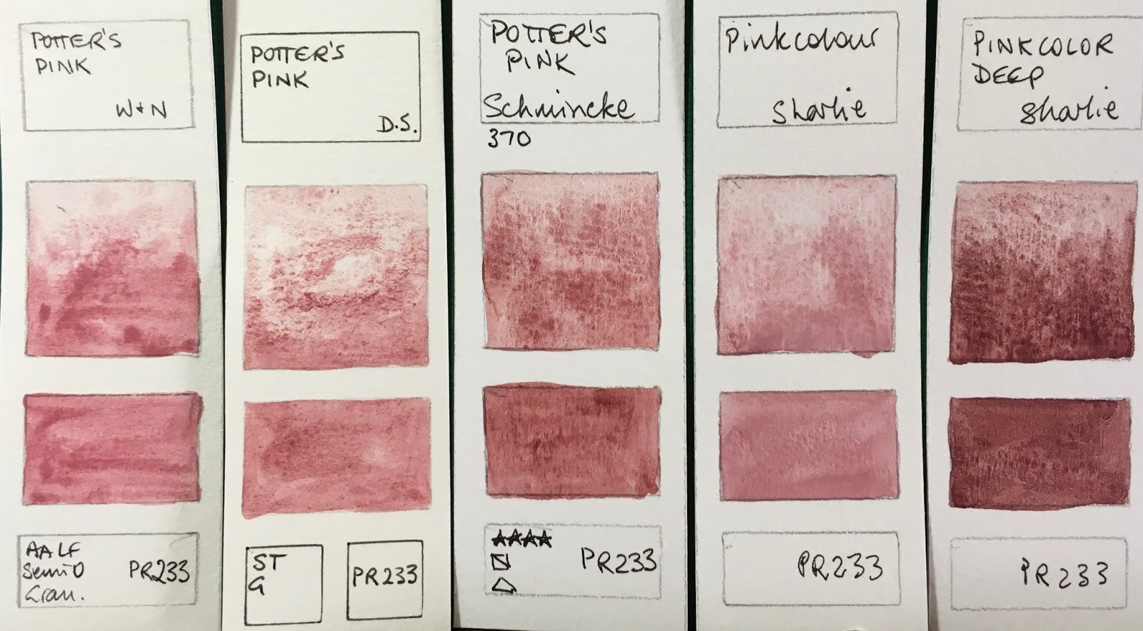
Schmincke Horadam Watercolours - Purple Magenta, Quinacridone Magenta (new 2017), Quinacridone Violet,
Potter's Pink (new 2017 - deeper than the W&N or D.S. versions), Perylene Violet (new 2017),
Quinacridone Purple (new 2017).

Purples and violets are easy to mix, but sometimes a single pigment version is lovely for certain characteristics, such as granulation or staining power.
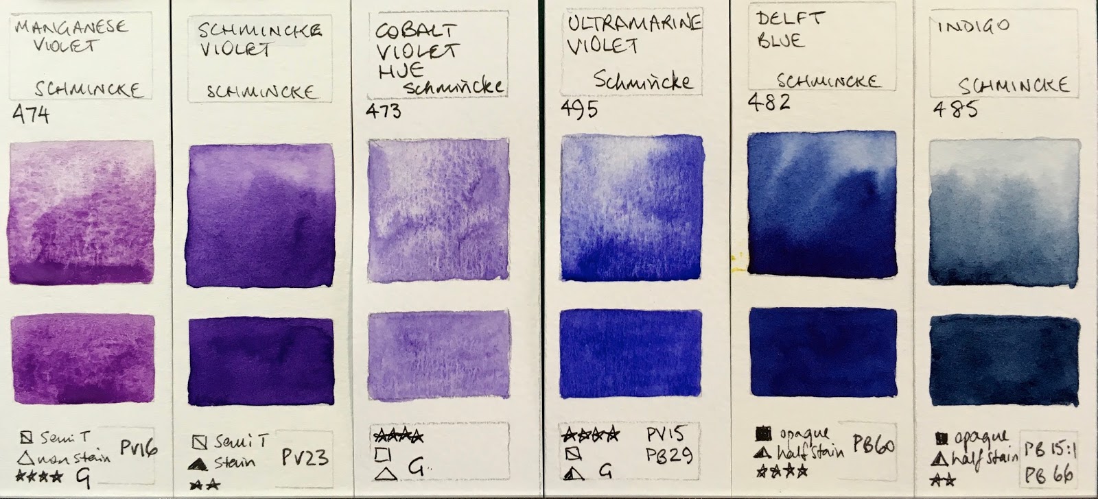
Schmincke Horadam Watercolours - Manganese Violet, Schmincke Violet (was Mauve), Cobalt Violet Hue
(new 2017 - no pigments given, but apparently it is an apatite), Ultramarine Violet, Delft Blue, Indigo.

Schmincke Horadam Watercolours - Dark Blue (was Dark Blue Indigo), Phthalo Sapphire Blue (new 2017
Replaces Helio blue Reddish 478 discontinued 2017 not shown here - see below), Cobalt Blue Deep,
French Ultramarine (new 2017), Ultramarine Finest, Ultramarine Blue.

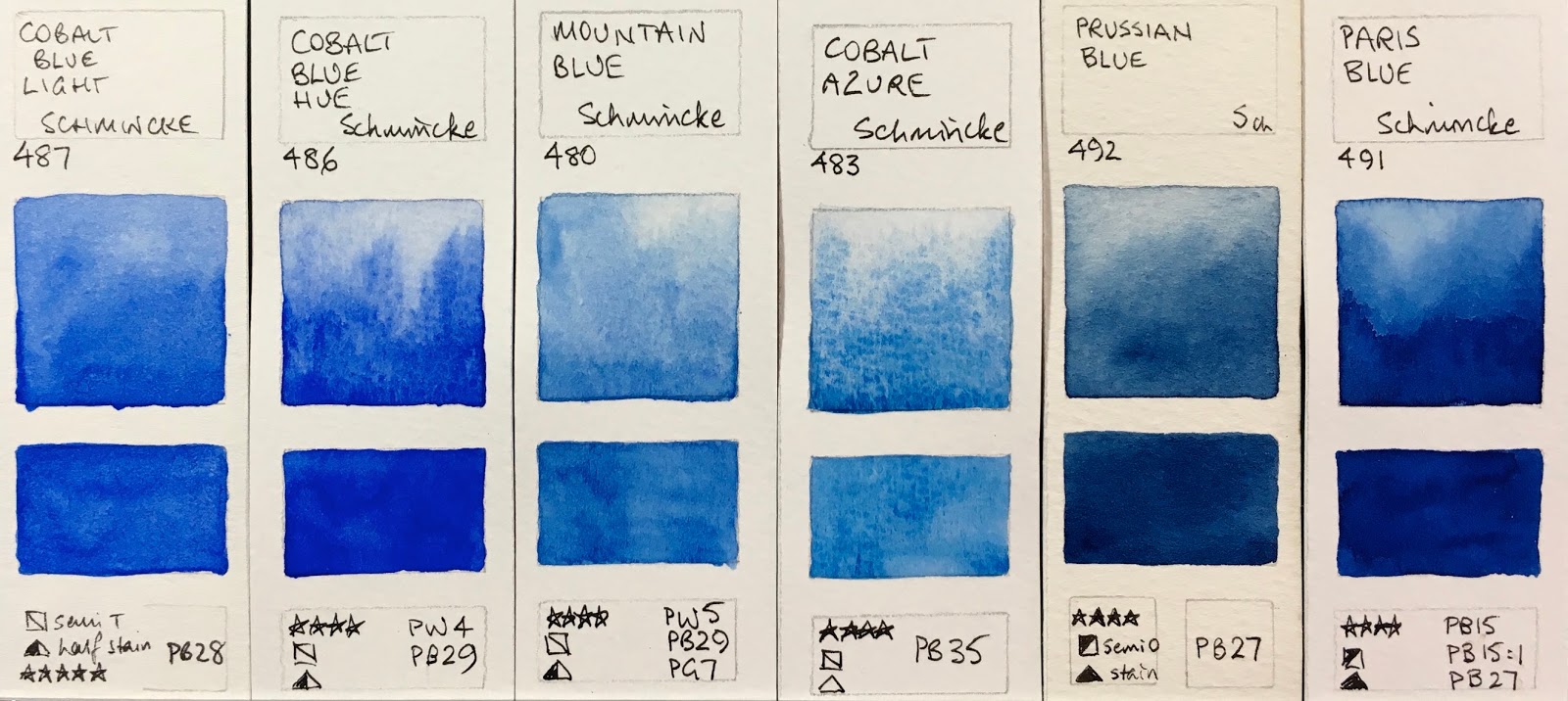
Schmincke Horadam Watercolours - Cobalt Blue LIght, Cobalt Blue Hue, Mountain Blue, Cobalt Azure (new 2017),
Prussian Blue, Paris Blue. 

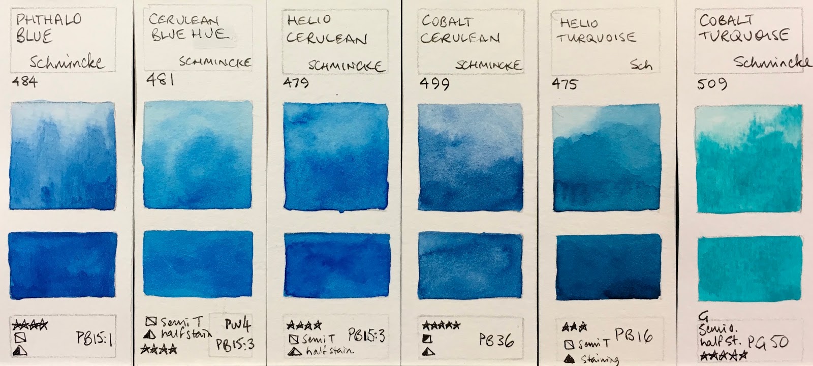
Schmincke Horadam Watercolours - Phthalo blue, Cerulean Blue Hue (was Cerulean Blue Tone), Helio Cerulean,
Cobalt Cerulean, Helio Turquoise, Cobalt Turquoise.

Schmincke Horadam Watercolours - Cobalt Green Turquoise, Prussian Green, Viridian (new 2017),
Chromium Oxide Green Brilliant, Phthalo Green, Helio Green.

Schmincke Horadam Watercolours - Permanent Green Olive, Sap Green, Permanent Green, May Green,
Cobalt Green Pure, Cobalt Green Dark


The new Transparent Green Gold is not the usual single pigment PY129 sadly, but another two pigment hue - PY154 and PBr7.

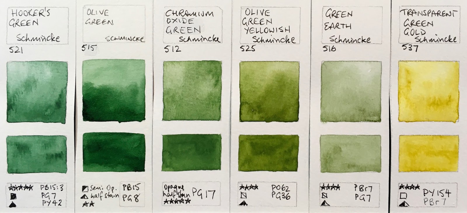
Schmincke Horadam Watercolours - Hooker's Green, Olive Green, Chromium Oxide Green, Olive Green Yellowish, Transparent Green Gold (New 2017. Replaces 536 Green Yellow which was discontinued 2017. Not shown here - see below).

I'd prefer the Raw Sienna was a single pigment PBr7. The Yellow ochre is lovely - better than this swatch shows, though I do prefer PY43 for yellow ochre. I really like the Titanium Gold Ochre - not a new colour but one I'd like to explore.
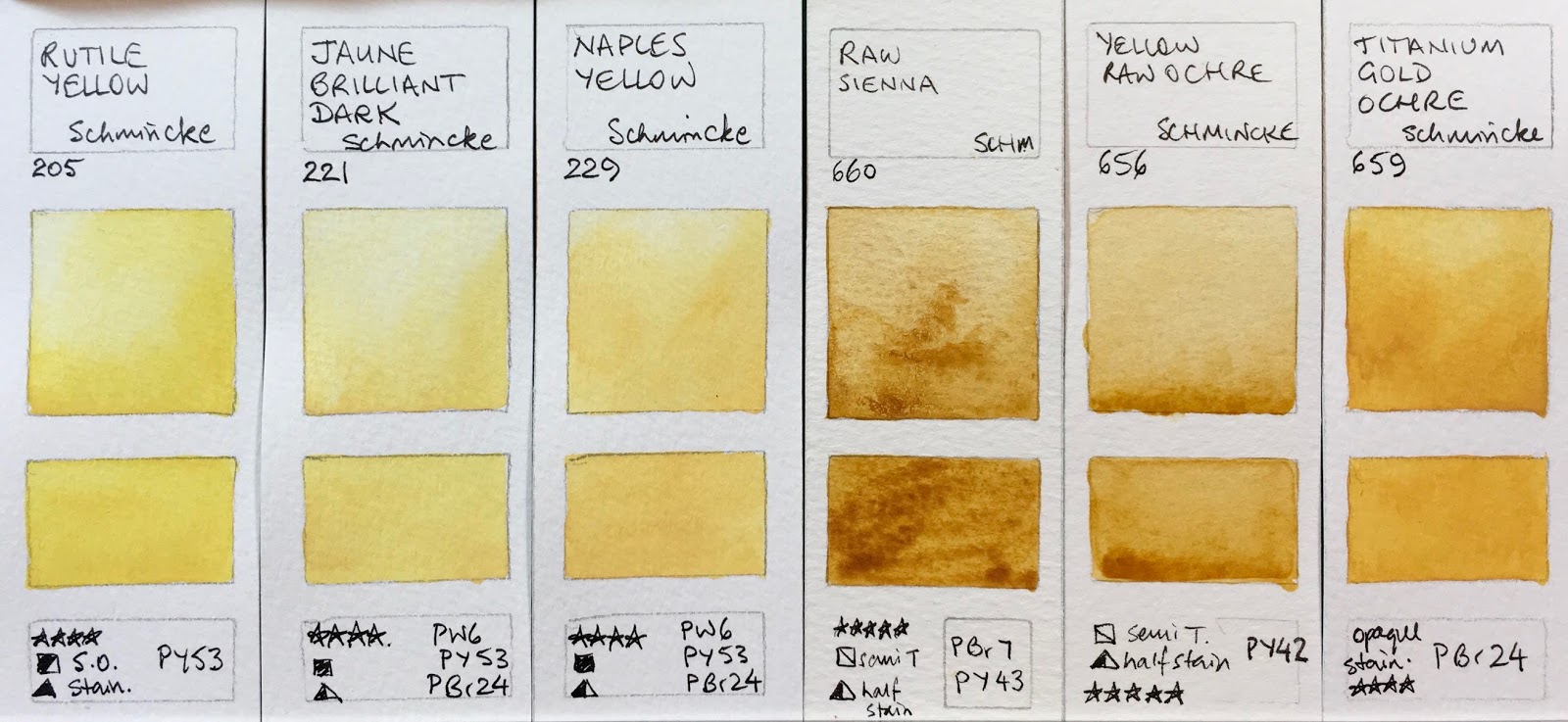
Schmincke Horadam Watercolours - Rutile Yellow (new 2017), Jaune Brilliant Dark, Naples Yellow, Raw Sienna,
Yellow Raw Ochre, Titanium Gold Ochre.

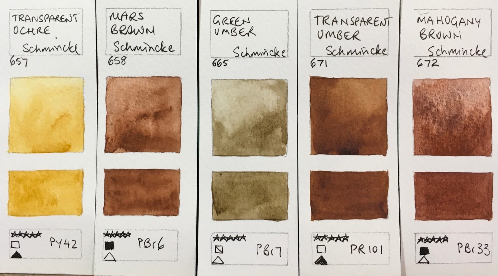
Schmincke Horadam Watercolours - Yellow Ochre, Transparent Ochre (new 2017), Raw Umber,
(new version 2017 is two pigments), Raw Umber (old version), Naples Yellow Reddish, Spinel Brown
(new 2017 - a really interesting colour)

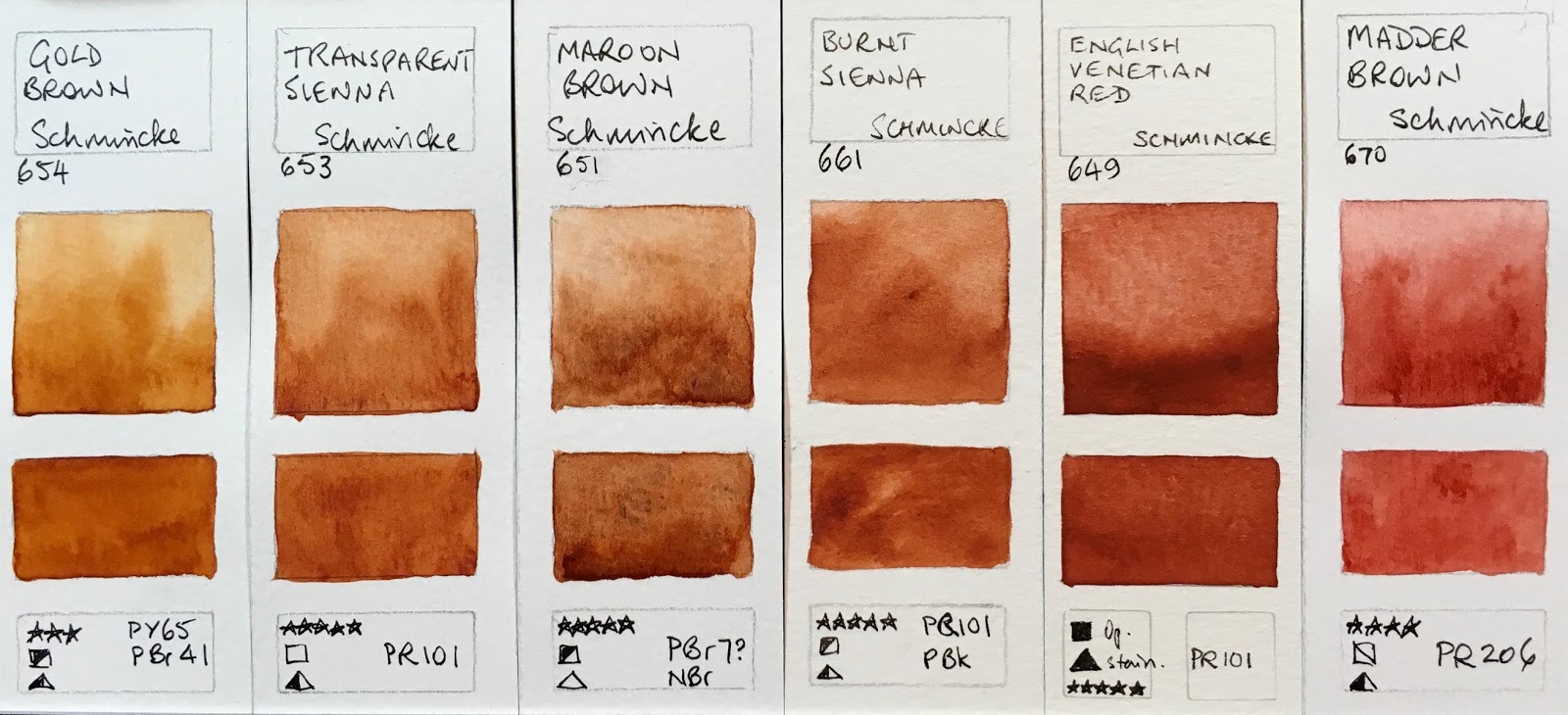
Schmincke Horadam Watercolours - Gold Brown, Transparent Sienna (new 2017), Maroon Brown
(new 2017 - listed as NBr - but I think it is PBr 7 - I love this as a great natural Burnt Sienna colour),
Burnt Sienna, English Venetian Red, Madder Brown.

Schmincke Horadam Watercolours - Transparent Brown (was Translucent Brown), Mahogany Brown (new 2017 - using the PBr33 that was in the discontinued Walnut Brown shown below), Indian Red, Pozzuoli Earth (discontinued 2017 - no replacement), Mars Brown (new 2017), Transparent Umber (new 2017)

Schmincke Horadam Watercolours - Burnt Umber, Green Umber (new 2017), Vandyke Brown, Sepia Brown,
Sepia Brown Reddish (was Sepia Brown Tone), Neutral Tint.
(Not Shown 652 Walnut Brown, discontinued 2017 - see below)

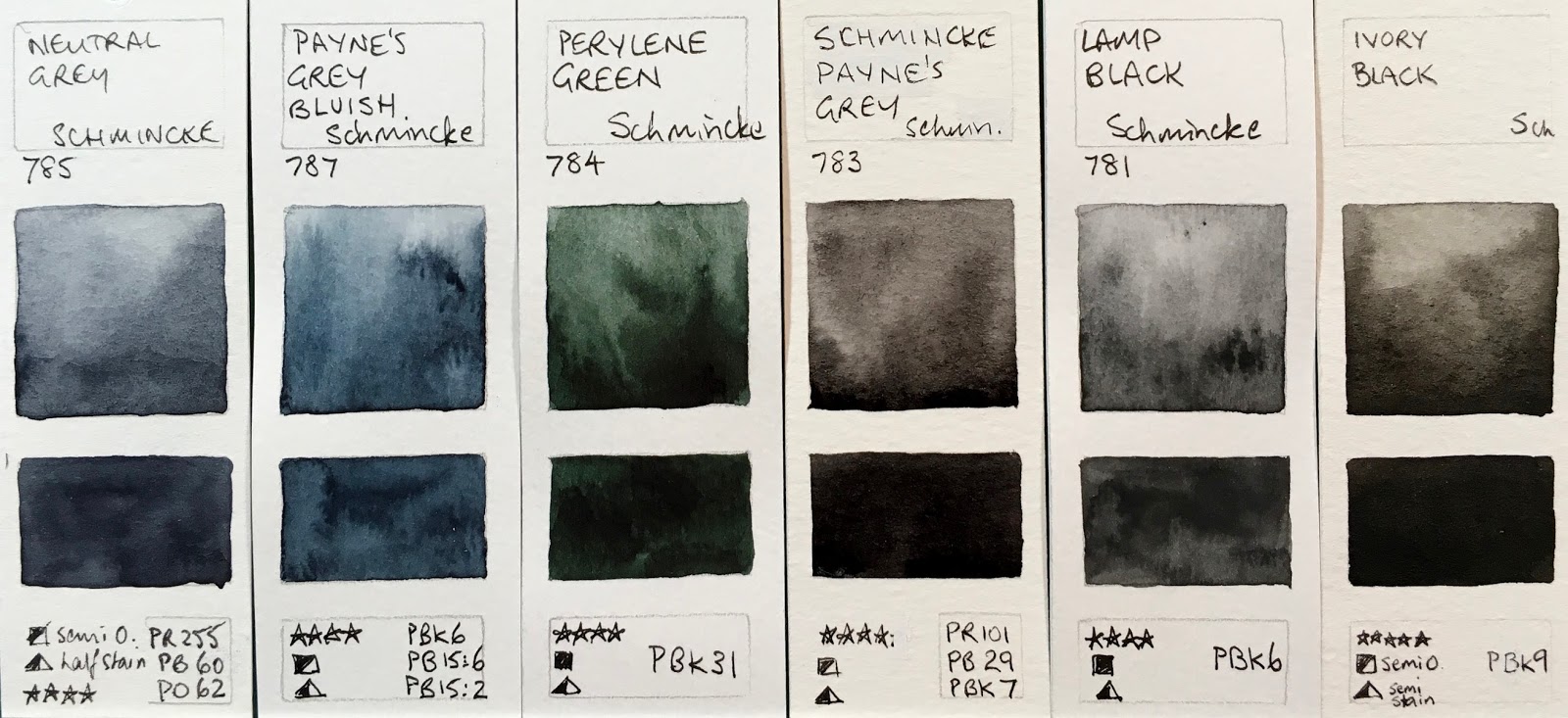
Schmincke Horadam Watercolours - Neutral Grey, Payne's Grey Bluish, Perylene Green (new 2017),
Schmincke Payne's Grey, Lamp Black, Ivory Black

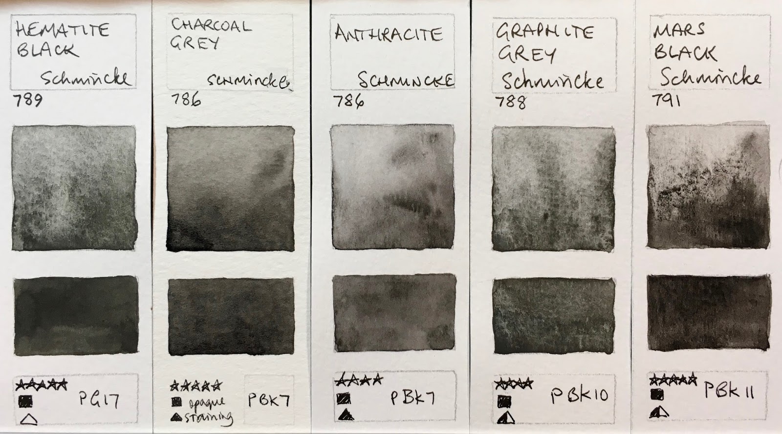
Schmincke Horadam Watercolours - Hematite Black (new 2017), Charcoal Grey (replaced with Anthracite, 2017),
Anthracite (new 2017), Graphite Grey (new 2017), Mars Black (new 2017)

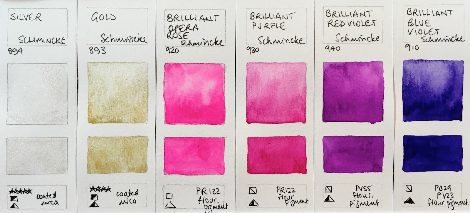
Schmincke Horadam Watercolours - Silver, Gold, Brilliant Opera Rose (new 2017), Brilliant Purple,
Brilliant Red Violet, Brilliant Blue Violet.

Here are the discontinued colours. In most cases they have been replaced with a different pigment (and a different colour number) or a different version of the same pigment. If you love any of these, stock up! I really like the Walnut brown, but this version of PBr33 is not longer available - the Mahogany Brown that replaces it is also a wonderfully granulating though much warmer brown.

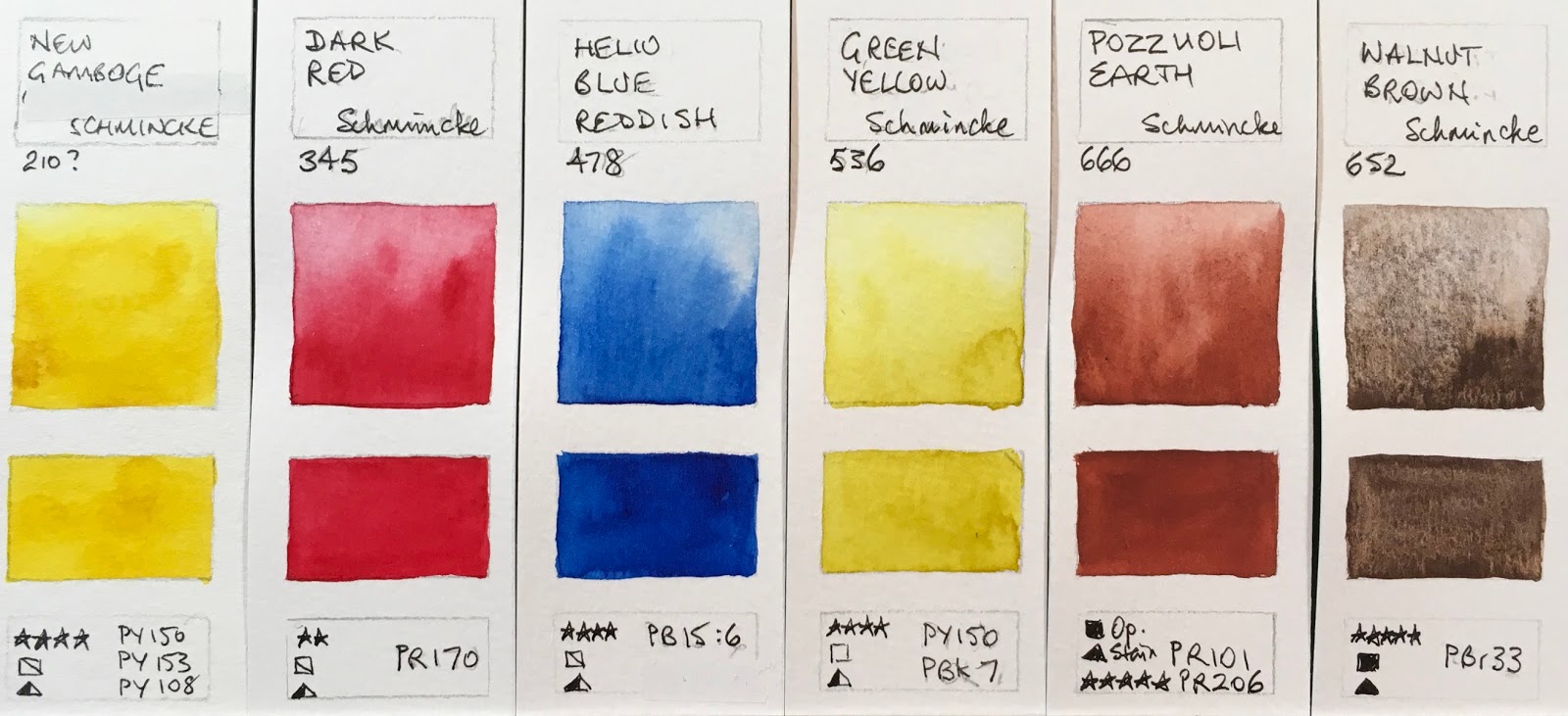
Discontinued Schmincke Horadam Watercolours - 210 New Gamboge (or Gamboge Gum Modern) no replacement, 345 Dark Red (replaced with a better pigment - Perylene Dark Red), 478 Helio blue Reddish (replaced with Phthalo Sapphire), 536 Green Yellow (replaced with Transparent Green Gold), 666 Pozzuoli Earth (not replaced), 652 Walnut Brown (the same pigment is used in the new but warmer Mahogany Brown - wonderful granulation).

Schmincke also introduced a metal palette with a porcelain insert - really clever - with two different 12-colour palette options.

2021 update - new colours from Schmincke.

Happy painting!


Monday 20 March 2017

A Rose by any other name...Rose Madder and Potter's Pink.

Rose Madder is a natural colour from the roots of the common madder plant called Rubia Tinctorum. It is a soft granulating rose colour, but it is not lightfast so should not be used for exhibition purposes or outside of a sketchbook or reproduction work.

As far I know only DS and W&N have the genuine NR9 pigment. I am rather glad they do - even though I don't choose to use fugitive paints, it's nice to be able to test them out to see what the hues are trying to replicate! The genuine versions in W&N and DS are the first two swatches below.

There are a number of hues available to replicate this delicate colour and I have shown three of them - Schmincke has a Rose Madder, Daniel Smith has just released a Rose Madder Permanent, Art Spectrum has a Rose Madder (Permanent Hue).

I thought I'd show them all together.


When you see the range of hue in the genuine NR9 between W&N and DS, it's easy to see why the hues also vary.  Rose madder was used for portraiture and as a cool red, often with the also fugitive aureolin and alizarin crimson pigments (one of which is included in the Schmincke hue)! These days quinacridone rose does a better job, but sometimes a softer colour is desired, and Quinacridone Rose doesn't granulate.

Another granulating soft pink is Potter's Pink or Pinkcolor made with a very reliable PR233. I've included the W&N, DS and Schmincke versions as well as some handmade watercolours to show the range of hues in this pigment too. 


I'd make a Rose Madder hue with the softly granulating Potter's Pink mixed with the more powerful Quinacridone Rose - I just might explore that mix some time. The PV19 pigment might float to the surface too much of course. It would be interesting to try with DS Rhodonite too. I do mix Potter's Pink with Indian Red to deepen it, and have shown that mix (Jane's Earth Rose) here. Sharlie's Pinkcolor Deep is similar.

A few more interesting rose pigments are the very deep Piemontite genuine, that can paint out to a soft rose colour, and some of the pipestone pigments.

Apparently the W&N Rose Madder smells lovely - a rose by any other name?


Sunday 19 March 2017

New Daniel Smith Watercolours


New Daniel Smith colours. Photo from Daniel Smith (http://www.danielsmith.com/content--id-871)

It takes a little while for new colours to arrive in Australia but here they are - the new Daniel Smith colours released in 2017.

Daniel Smith Aussie Red Gold, Rose Madder Permanent (note this also has PR202), Quinacridone Lilac and Wisteria.

I've photographed my painted swatches but getting accurate colour reproduction is not easy. The Aussie Red Gold is more orange than it looks here - rather like a PY110 yellow - you can see it better in the photograph above. It's a lovely 3-pigment mixed orange-yellow that really glows. It uses the same pigments as the Art Spectrum Australian Red Gold. It creates extraordinary greens when mixed with blues - I've shown some mixes in little videos on Instagram (Janeblundellart)

The Rose Madder Permanent, Quinacridone Lilac and Wisteria are more accurate in this photo. Genuine Rose Madder NR9 is a lovely gentle granulating rose colour, but it fades. The DS hue mimics the soft value range of the original colour, using a mix of three pigments - PR209, PV19 and PR202 (I've labelled it incorrectly on my swatch).

Quinacridone Lilac PR122 is known as Quinacridone Magenta in many brands, Purple Magenta in Schmincke, as is a very welcome DS colour by all those who like to work with a CYM palette is PR122 is a fabulous primary red. It painted out beautifully. While I prefer to use Quinacridone Rose for the job of mixing gorgeous purples, I am really glad to see this pigment in the DS range.

Wisteria is made with PR122 and white.


Daniel Smith Lavender, Raw Sienna Light, Burnt Sienna LIght and Payne's Blue Grey.
Lavender is a popular mix available from other ranges. Some use cobalt, DS uses ultramarine, along with a violet pigment and white.

Raw Sienna Light is a single pigment PY42 yellow earth. It looks a little warmer in the flesh than this painted sample. (See photo above again)

Burnt Sienna Light is a mix of PR101 and PO48 - transparent red oxide and quinacridone burnt orange. It was released as part of the Alvaro set in 5ml tubes but is now available in the larger 15ml tubes.  It looks a little more earthy in real life than this photo.

Payne's Blue Grey is fairly accurate in hue. It uses the same mix of pigments as DS Indigo - Indanthrone Blue and black. Many Payne's greys are made with Phthalo blue and a black pigment.

New colours are always fun to explore. Happy painting :-)


Monday 13 March 2017

New Schmincke Watercolours 2017


The first professional watercolour set I bought over three decades ago was Schmincke. The pigments that were included in that set of 24 pans have been changed over the years, with 110 colours available in their most recent range up until this year. They are a very accessible brand as they come in 5ml and 15ml tubes as well as half and full pans. They also come in sets but tend to have some rather odd choices in them.

This year Schmincke have released 35 new colours as part of their 125 year anniversary revamp, changing some formulations, renaming old colours and expanding their range to 140 colours.

I haven't used them much myself in recent years as unfortunately two of the key colours I use - burnt sienna and ultramarine - have not been to my liking. The burnt sienna is PR101 with black pigment added and the ultramarine finest doesn't granulate much at all. So I am delighted with their decision to introduce a French Ultramarine  - a granulating version, and a new burnt sienna made without black. It uses PR101 rather than my preferred PBr7, but it's a step in the right direction. To be fair - I think it's terrific that there was a less granulating 'ultramarine finest' available for those who don't like granulation, I'm just pleased there is now a choice. There is another new colour called Maroon Brown that is labelled as NBr (whatever that is!) but that looks to me like a natural burnt sienna PBr7. It's gorgeous :-)


They have also released some dot cards, a Daniel Smith innovation that makes testing out colours so much better for those of us trying to choose them. Jackson's Art UK website has a great post about the colours here. To see the new colours in detail, there is a PDF here.


I get sent dot cards periodically of paints that people have that are missing from my website so was sent a few of the new colours before they were released in Australia. (Thanks Corinna and Ricarda :-) Then I was able to check out the rest of the colours at my favourite local art store Art Scene, and received the full range dot cards from Schmincke Germany, so here is the full range of new paints painted out and photographed without adjustment.


New Schmincke colours 2017 - Rutile Yellow, Quinacridone Gold Hue, Turner's Yellow, Yellow Orange and Geranium Red.
  • Rutile yellow is interesting - it's a completely different version of the usual PY53. Rather like some versions of Naples yellow. I can see it being useful to many.
  • The Quinacridone Gold Hue is close to the genuine colour. This is a good pair of pigments to make the hue.
  • Turner's Yellow ia also very opaque, like a yellow with white added. Interesting :-) It is richer than it looks on my screen. Another very interesting addition.
  • Yellow Orange is more orange than it looks on my screen. It reads as a yellow orange rather than a warm yellow. Very beautiful.
  • Geranium red is the colour of geraniums - a bright red.

New Schmincke colours 2017 - Vermilion Light, Quinacridone Red Light, Perylene Dark Red, Ruby Red Deep and Transparent Red Deep.

  •  Vermilion Light is a coral colour.
  • Quinacridone Red Light is a slightly more pink coral colour rather like many of the quinacridone coral/reds made with PR209.
  • Perylene Dark Red is rich crimson.
  • Ruby Red Deep is a deeper stronger crimson - a great colour (like the Pyrrol Crimson DS made from the same pigment.)
  • Transparent Red Deep is more of a deep fire engine red.

New Schmincke colours 2017 - Saturn Red, Bordeaux, Quinacridone Magenta, Potter's Pink and Perylene Violet.

  • Saturn Red is brighter and more vibrant than this looks on my screen - a lovely mid orange, close to Transparent orange but without the slightly yellow undertone.
  • Bordeaux is very like Ruby Red Deep
  • Quinacridone Magenta is the same pigment as DS Quinacridone Magenta - slightly violet magenta. 
  • Potter's Pink is deeper than most versions. (I like this - saves me having to make any more Jane's Earth Rose!)
  • Perylene Violet looks correct on my screen.

New Schmincke colours 2017 - Quinacridone Purple, Cobalt Violet (no pigment number given as it is an apatite pigment), Phthalo Sapphire Blue, Cobalt Azure and French Ultramarine.

  • Quinacridone Purple is the same pigment as the DS colour.
  • Cobalt Violet Hue is granulating but no pigment number is given.
  • Phthalo Sapphire Blue is a warmer phthalo blue. It looks accurate on my screen.
  • Cobalt Azure is cerulean PB35 pigment. Nice and granulating and non-staining.
  • French Ultramarine is rich and strong - very nice.

New Schmincke colours 2017 - Viridian, Transparent Green Gold (Should read PY154 + PBr7) , Spinel Brown, Maroon Brown (which I think is made with PBr7) and Transparent Sienna.

  • Viridian is never an easy pigment to paint with. This is not the strongest version of PG18 I have tried. It looks too blue on my screen.
  • Transparent Green Gold is a slightly dull olive green. I originally thought this was an unusual version of PY154, but I was missing the PBr7 that is also in the mix. It would have been better if they had used PY129 as then it would have been a single pigment green gold.
  • Spinel Brown made from PY119, which is also used in Manganese Brown by W&N. Lovely granulation :-)
  • Maroon Brown is labelled NBr (whatever that means) but it looks to me very like the Schmincke Burnt Sienna PBr 7 pigment so perhaps it is a natural burnt sienna? I love it. Jackson's website labels it PBr7. I'd call it Burnt Sienna Natural :-)
  • Transparent Sienna is a very earthy version of this PR101 pigment - not too bright. It actually looks like a burnt sienna rather than a Quinacridone burnt orange.

Transparent Ochre, Mars Brown, Green Umber, Transparent Umber and Mahogany Brown.

  •  Transparent Ochre is a staining ochre - it looks more yellow on my screen.
  • Mars Brown is like a burnt umber.
  • Green Umber is raw umber in many other brands. I really like to have a cool dark brown in my palette so this is a useful colour, but I would like to see it much richer and more heavily pigmented.
  • Transparent Umber is another Burnt Umber option.
  • Mahogany Brown is made with PBr33 - as was the now discontinued Walnut Brown. But this is a lovely warm colour with interesting granulation and might wash out nicely for skin tones.

New Schmincke colours 2017 - Perylene Green, Graphite Grey, Hematite Black, Mars Black and Brilliant Opera Rose.

  • Perylene Green is such a useful colour. Mix with yellows for fabulous mid greens.
  • Graphite Grey is nice and granulating.
  • Hematitie Black is made from a green pigment.
  • Mars Black granulates nicely though not as much as DS Lunar Black
  • Brilliant Opera Rose is certainly bright - until it fades.

The new colours are largely single pigment colours, and it's nice to see some lovely granulating colours among them. It's now possible to put together a lovely sketching set of single pigment colours :-)


Art Spectrum watercolours here
Blockx full range of Watercolours here
Daniel Smith new colours 2017 here
Daniel Smith full range here
Da Vinci range here
Dr PH Hydrus Watercolours here
Lukas watercolours here
M.Graham watercolours here
MaimeriBlu full range here
Mission Blue full range here
Old Holland full range here
Rembrandt Watercolours here
Schmincke new colours 2017 here
Schmincke full range here
Sennelier watercolours here
St Petersburg Watercolours here
Wallace Seymour Artists Watercolours here
White Nights watercolours here
Winsor & Newton Full range here

Still to come - Daler Rowney and Holbein - nearly there!


Saturday 11 March 2017

Handmade watercolours using Schmincke pigments

I recently wrote about some of Sharlie's hand made watercolours, which were a joy to try. She gathers pigments from all over the world and is making quite a range of colours so I haven't tried, or shown, them all.

I was told about, and then received samples of, Matteo Grilli's selection of 10 colours. Made in Australia! He is using Schmincke pigments and binder, and explains the process beautifully here

Matteo Grilli's 10 watercolours, as they arrived in the post.
Matteo Grilli's Indian Yellow, Raw Sienna and
 Ultramarine Blue Light
The colours are lovely to paint with, rewetting with ease, and very strong and richly pigmented. I painted out some swatches as I usually do. 

The first, Indian Yellow PY153, is a pigment that is not easy to find any more. It's a beautifully warm yellow that has been discontinued in most ranges so lovely to see it here. PY65 (Hansa Yellow Deep in DS; Arylide Yellow Deep in DV, Chromium Yellow Hue Deep (213 in Schmincke) is almost identical in hue, but just behaves a little differently.

Raw Sienna PBr7 is a lovely yellow earth option. It varies considerably betweens brands - in DS and DS it is more on the orange side. In Schmincke I am guessing this is perhaps used in their Raw Umber (667). They have just released a Transparent Ochre using PY42 (657) which is far more yellow.

The Ultramarine Blue Light is lovely. Painted out with ease and has some granulation. Schmincke now have two ultramarines using PB29 - the familiar Schmincke Ultramarine Finest (494) and the new French Ultramarine (493).

Here is the Ultramarine again next to the Burnt Sienna. I love this combination and the Burnt Sienna is a beautiful colour! It is made with PBr7 and has a fabulous granulation with some flecks of other colours in it. It is similar in hue as the Daniel Smith burnt sienna but more varied. It reminds me of the old Art Spectrum Burnt Sienna Natural that I used to love, but which was replaced with a hue :-(

Matteo Grilli's Ultramarine Blue Light, Burnt Sienna,
Raw Umber Greenish and amazingly deep Burnt Umber
Schmincke have just released a colour called 'Maroon Brown', listed as NBr (Natural Brown - though no number) which looks incredibly similar to Matteo's Burnt Sienna to me. They have also released a 'Transparent Sienna' PR101 which is like the W&N burnt sienna. And they have their original Burnt Sienna made with PR101 and PBk7 that I have never been interested in since I don't choose to use colours with black pigments in them. (The exceptions being perylene green PBk31, which I love, and DS Lunar Black PBk11 which I also enjoy for special effects :-)

The Raw Umber Greenish is a deep cool umber - similar to the DS or DV Raw Umber so a very useful colour. Schmincke has also released this pigment in a colour called Green Umber (665) but it isn't as strong as Matteo's version.

Burnt Umber is very rich and dark - this is the colour I think of as Sepia that would normally be made with a brown and a black pigment. Lovely :-) I think I'll have to buy some of this one...I haven't come across such a lovely deep Burnt Umber before...


Matteo Grilli's Carmine, Terra Pozzuoli,
Prussian Blue and Madder Red Deep
Carmine is PV19, and Schmincke has two colours using this pigment - the more pink Ruby Red (351) and the more crimson Permanent Carmine (353). This is fabulous 'primary' red as it mixes so cleanly to make oranges and purples as well as bright reds. This is really pigment loaded and luscious.

Terra Pozzuoli is an opaque Indian red colour - really rich and lovely. It washes out to gorgeous flesh tones. I am fascinated by the many versions of PR101 that exist. It is one of the multi-personality pigments I will write about soon. Have a look at them all in my website here. I still have a number to add as well!

Schmincke used to have a Pozzuoli Earth colour that was more orange, but that seems to have been removed in the overhaul of their pigments this year. A similar colour to the Terra Pozzuoli in the new Schmincke range is Indian Red (645) made with PR101 and PR206. Earth reds are terrific for earth triads - I love exploring them.

Prussian Blue PB27 is a rich, deep cool blue. I tend to mix this hue if I need it but Matteo paints gorgeous wildlife paintings using this as his cool blue. (491 in Schmincke)

Madder Red Deep is a very earthy red colour made with the very lightfast PR179 - also known as Perylene Maroon (366) and available from many manufacturers.


It is very special to paint with handmade colours. I bought 5 of Matteo's - a lovely palette of Indian Red, Carmine, Ultramarine Light, Burnt Sienna and Raw Sienna as they play so nicely together. I have added Cerulean Chromium (DS) and of course Jane's Grey to my limited palette of 7. But I just may need to add the Burnt and Raw Umbers and Terra Pozzuoli too... Of course I explored the mix of Ultramarine and Burnt Sienna - lovely greys :-)


I'll be loading up the full range of Schmincke new colours soon, though you can see many of them on Instagram - just follow janeblundellart.