
I recently wrote about some of Sharlie's hand made watercolours, which were a joy to try. She gathers pigments from all over the world and is making quite a range of colours so I haven't tried, or shown, them all.
I was told about, and then received samples of, Matteo Grilli's selection of 10 colours. Made in Australia! He is using Schmincke pigments and binder, and explains the process beautifully here
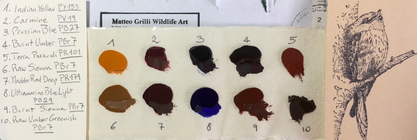 |
| Matteo Grilli's 10 watercolours, as they arrived in the post. |
 |
| Matteo Grilli's Indian Yellow, Raw Sienna and Ultramarine Blue Light |
The colours are lovely to paint with, rewetting with ease, and very strong and richly pigmented. I painted out some swatches as I usually do.
The first, Indian Yellow PY153, is a pigment that is not easy to find any more. It's a beautifully warm yellow that has been discontinued in most ranges so lovely to see it here. PY65 (Hansa Yellow Deep in DS; Arylide Yellow Deep in DV, Chromium Yellow Hue Deep (213 in Schmincke) is almost identical in hue, but just behaves a little differently.
Raw Sienna PBr7 is a lovely yellow earth option. It varies considerably betweens brands - in DS and DS it is more on the orange side. In Schmincke I am guessing this is perhaps used in their Raw Umber (667). They have just released a Transparent Ochre using PY42 (657) which is far more yellow.
The Ultramarine Blue Light is lovely. Painted out with ease and has some granulation. Schmincke now have two ultramarines using PB29 - the familiar Schmincke Ultramarine Finest (494) and the new French Ultramarine (493).
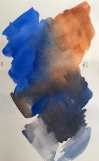
Here is the Ultramarine again next to the Burnt Sienna. I love this combination and the Burnt Sienna is a beautiful colour! It is made with PBr7 and has a fabulous granulation with some flecks of other colours in it. It is similar in hue as the Daniel Smith burnt sienna but more varied. It reminds me of the old Art Spectrum Burnt Sienna Natural that I used to love, but which was replaced with a hue :-(
 |
| Matteo Grilli's Ultramarine Blue Light, Burnt Sienna, Raw Umber Greenish and amazingly deep Burnt Umber |
Schmincke have just released a colour called 'Maroon Brown', listed as NBr (Natural Brown - though no number) which looks incredibly similar to Matteo's Burnt Sienna to me. They have also released a 'Transparent Sienna' PR101 which is like the W&N burnt sienna. And they have their original Burnt Sienna made with PR101 and PBk7 that I have never been interested in since I don't choose to use colours with black pigments in them. (The exceptions being perylene green PBk31, which I love, and DS Lunar Black PBk11 which I also enjoy for special effects :-)
The Raw Umber Greenish is a deep cool umber - similar to the DS or DV Raw Umber so a very useful colour. Schmincke has also released this pigment in a colour called Green Umber (665) but it isn't as strong as Matteo's version.
Burnt Umber is very rich and dark - this is the colour I think of as Sepia that would normally be made with a brown and a black pigment. Lovely :-) I think I'll have to buy some of this one...I haven't come across such a lovely deep Burnt Umber before...
 |
| Matteo Grilli's Carmine, Terra Pozzuoli, Prussian Blue and Madder Red Deep |
Carmine is PV19, and Schmincke has two colours using this pigment - the more pink Ruby Red (351) and the more crimson Permanent Carmine (353). This is fabulous 'primary' red as it mixes so cleanly to make oranges and purples as well as bright reds. This is really pigment loaded and luscious.
Terra Pozzuoli is an opaque Indian red colour - really rich and lovely. It washes out to gorgeous flesh tones. I am fascinated by the many versions of PR101 that exist. It is one of the multi-personality pigments I will write about soon. Have a look at them all in my website here. I still have a number to add as well!
Schmincke used to have a Pozzuoli Earth colour that was more orange, but that seems to have been removed in the overhaul of their pigments this year. A similar colour to the Terra Pozzuoli in the new Schmincke range is Indian Red (645) made with PR101 and PR206. Earth reds are terrific for earth triads - I love exploring them.
Prussian Blue PB27 is a rich, deep cool blue. I tend to mix this hue if I need it but Matteo paints gorgeous wildlife paintings using this as his cool blue. (491 in Schmincke)
Madder Red Deep is a very earthy red colour made with the very lightfast PR179 - also known as Perylene Maroon (366) and available from many manufacturers.
It is very special to paint with handmade colours. I bought 5 of Matteo's - a lovely palette of Indian Red, Carmine, Ultramarine Light, Burnt Sienna and Raw Sienna as they play so nicely together. I have added Cerulean Chromium (DS) and of course Jane's Grey to my limited palette of 7. But I just may need to add the Burnt and Raw Umbers and Terra Pozzuoli too... Of course I explored the mix of Ultramarine and Burnt Sienna - lovely greys :-)

It is very special to paint with handmade colours. I bought 5 of Matteo's - a lovely palette of Indian Red, Carmine, Ultramarine Light, Burnt Sienna and Raw Sienna as they play so nicely together. I have added Cerulean Chromium (DS) and of course Jane's Grey to my limited palette of 7. But I just may need to add the Burnt and Raw Umbers and Terra Pozzuoli too... Of course I explored the mix of Ultramarine and Burnt Sienna - lovely greys :-)
I'll be loading up the full range of Schmincke new colours soon, though you can see many of them on Instagram - just follow janeblundellart.
Glad you like Matteo's paints.
ReplyDeleteI have a small palette of 12. I left out the Raw Umber Greenish and to the rest I added Daniel Smith Buff Titanium, Serpentine and Green Apetite. I have them in a small Whiskey Painter's black travel palette. Small enough to carry in my bag.
I do love his colors. They seem so much more intense than others.
I'm considering asking Matteo to make me a custom set in whole pans. I'd limit it to Indian Yellow, Carmine, Ultramarine and Burnt Sienna. And perhaps Prussian Blue.
Hmm - lovely palette :-) You know you can fit up to 15 in the Whiskey palette if you do a bit of 'adjusting'? You can see it on my website with 14, but if you remove the insert you can squeeze 15 into it if you use small Cotman-style pans.
DeleteOne day I'll probably have a go at making them myself - I have quite a few pigments already, including some stunning Provence pigments - but it's a road I am reluctant to start down...it may never end and I am happy with the commercial paints I have been using (and have tested for lightfastness).
I prefer to leave the dividers alone and just fill the middle for 12. If I want to fit in more, I have other tins. I just stick some magnetic tape on the bottom of the pans and I can then switch them in and out. I have a few small cigar tins I do this with. I also have a Daler Rowney travel palette that holds 18 quarter pans. I popped out their colors and refilled it with my Daniel Smith. I find quarter pans are good enough for journaling and the tin can hold at least one brush. I can fit everything I need in an old harddrive case about 4x5.
DeleteThese hand made paints are going to go into my precious Frazer-Price box. I've been saving it for some very special paints. I want to carry brushes in it too so it will only hold 8 colors: 6 whole pans and 2 half pans. I'll add a whole pan Quin Gold to Matteo's paints and then half pans Phthalo green and Buff Titanium. That makes 8. A limited palette but still flexible.
Until they arrive, I'm working on creating my own "Arches #3 travel mop" using a cannibalized ProArte case and a mop I'll cut down and glue in. I'm finding I really use the mops a lot and the two from Rosemary aren't large enough.
If you have a really special pigment you'd like to have as a paint, maybe Matteo or Sharlie can use it to make you a few pans. That way you don't really have to invest in producing paints, just using them.
Indian yellow is one of my favorite colors, so warm and golden!
ReplyDeleteThank you for sharing about Matteo's paints, Jane. I'm looking forward to receiving the set of 8!
ReplyDelete