Thursday 20 April 2017

Da Vinci Watercolours complete range

Da Vinci (USA) is a third generation family owned company based in California. They make oils, acrylics, gouache, painting mediums and, of course, watercolour. What's great is that they make watercolours in a huge range of tube sizes from 5ml to 15ml to 37ml, as well as a couple of palettes of selected pan colours. You can see the full watercolour set and colour range here.

I have been using their 37ml tubes for many years to make up my students' palettes. Don't get me wrong - they are not student colours. My student palettes are made up entirely of artist quality colours, but I use a mix of Daniel Smith and Da Vinci to make them up. The 37ml DV tubes are so economical that I can price my palettes at a very reasonable rate and get my students started with artist quality watercolours. They are probably some of the most consistent watercolours available - thick and strong out of the tube, and they rewet well. They are now available in Sydney, Australia from Pigment Lab in Newtown, who will also do mail order.

June 2018 update: I have now tried their full current range of 104 colours, and will eventually add the last one - Lapis Lazuli - if it becomes available again. These swatches are all gradually being added to my website here.

As always, I've tried to colour match, but will mention it when the colour I see on my screen and the colour of the swatches is way out...


First are the cool yellows. Nickel titanate is usually a very weak pigment - this is one of the best example of this opaque and granulating yellow I've tried. Hansa Yellow Light is the coolest of these and a very clean yellow. I don't recommend PY40 as it will fade in washes and can discolour in mass-tone.

Da Vinci Watercolours - Nickel titanate yellow, Cadmium Yellow Lemon, Hansa Yellow Light, Da Vinci Yellow, Aureolin Mixture.
For some reason, I really struggle to show the true beauty of the orange-yellows on my computer - Gamboge Hue is definitely more orange than this swatch - it looks more like the Hansa Deep shown next.

Da Vinci Watercolours - Arylide Yellow, Cadmium Yellow Light, Hansa Yellow Medium, Cadmium Yellow Medium, Gamboge Hue.
 ...and these are all more on the orange side then they appear here. The Arylide Yellow Deep is the same pigment (and the same colour) as DS hansa yellow deep and Schmincke Chromium yellow hue deep.

Da Vinci Watercolours - Hansa Yellow Deep, Cadmium Yellow Deep, Arylide Yellow Deep, Indian Yellow,
Benzimida Orange.
These swatches should also be a little more on the red side. The DaVinci Cadmium orange is a lovely single pigment version - in many ranges this colour is a mix.   Benzimida Orange Deep is one of my favourite single pigment oranges - along with Schmincke's Transparent Orange. It's rich and powerful.

Da Vinci Watercolours - Cadmium Orange, Da Vinci Orange, Benzimida Orange Deep, Vermilion Hue, Bright Red.
These should be a little more red. Da Vinci Red is a rich fire engine red, just starting to move past the mid-red and into the blue-red range.

Da Vinci Watercolours - Cadmium Scarlet, Cadmium Red Light, Permanent Red, Cadmium Red Deep, Da Vinci Red.

Naphthol Red is described as 'mid tone' and it really does seem a perfect mid red. The tube I have of this was more runny than any others and took a long time to dry. Quinacridone Red is a coral colour - like the DS Quin Coral. The Alizarin Gold is more dull than it looks here, and the Alizarin Crimson (Quin) is more crimson - I think it's the closest I've seen to the genuine but fugitive Alizarin Crimson PR83 pigment.

Da Vinci Watercolours - rose Dore (Quinacridone), Naphthol Red, Quinacridone Red, Alizarin Gold, Alizarin Crimson (Quinacridone).
 Lots of variations using PV19 here - the Carmine is a little more dull than the Alizarin Quin shown above. Perylene Maroon is also a lovely version. It has a strong drying shift, but not the very neutral colour is often can be. The Rose Red Deep and Permanent Rose are so similar that you certainly wouldn't need both.

Da Vinci Watercolours - Carmine (Quinacridone), Perylene Maroon, Rose Red Deep (Quinacridone), Permanent Rose(quinacridone), Rose Madder (Quinacridone)
 I'm not a fan of Opus Pink and other flouro colours but they are popular. Cobalt Violet is always a very gentle granulating pigment.

Da Vinci Watercolours - Opus (Vivid Pink), Quinacridone Fuchsia, Thioindigo Violet, Cobalt Violet.
 I'm obviously missing a couple of purples - it's not a colour I buy much as I like to mix them. I'd like to rest the Manganese Violet as PV16 is such a lovely granulating red-violet usually. The Mauve is a convenient way to buy the common Ultramarine + Quin Violet or Quin Rose mix if you are painting a lot of purple items. The Ultramarine Violet is a fairly strong version of this gentle granulating pigment.

Da Vinci Watercolours - Cobalt Violet Deep, Lilac Permanent, Manganese Violet, Mauve, Ultramarine Violet.
 Da Vinci Violet (also called Winsor Violet, Carbazole Violet, Dioxazine Violet etc) is a powerful and staining pigment. I love Indanthrone Blue. Cobalt Blue Deep is often made from PB74 so it is interesting to see it here made from PB28. It looks very similar to French Ultramarine, but not identical.

Da Vinci Watercolours - Da Vinci Violet, Lavender Permanent, Indanthrone Blue, Cobalt Blue Deep, Cobalt Blue.
Some gaps, and it's hard to see the difference between the red and green shades of phthalo blue, but they are quite different. I find the Green Shade (just called phthalo blue) more useful if you want it as a cool blue, but I like the Red Shade in a CYM palette as the greens are a little less unrealistic. Lapis Lazuli is not being made at the moment as they are sourcing new pigment. Prussian blue green shade will appear eventually :-)

Da Vinci Watercolours - Phthalo Blue (Red Shade), Lapis Lazuli Genuine (not shown - not currently available), Prussian Blue, Prussian Blue Green Shade), Phthalo Blue.
You can see that there is a difference between the Ultramarine and the French Ultramarine with  the French being warmer (more red). I prefer the regular. I always prefer genuine cerulean made with PB36 rather than a hue as I love the granulating character of PB36 or PB35.

Da Vinci Watercolours - French Ultramarine, Ultramarine Blue, Ultramarine Blue (Green Shade) (not shown), Cerulean Blue Genuine, Cerulean Blue (Hue)
It is becoming more difficult to find genuine Manganese blue PB33, with Old Holland perhaps no longer making it. The Da Vinci version also has PB15, but will granulate due to the PB33. Phthalo Turquoise is another lovely option instead of phthalo blue GS. I love Cobalt Turquoise Deep for copper effects and seascapes.

Da Vinci Watercolours - Manganese Blue (Permanent), Phthalo Turquoise, Cobalt Turquoise, Cobalt Turquoise Deep,
Cobalt Green Hue.
Phthalo Green for mixing and Perylene for deep shadow greens are two of my favourite palette greens. Viridian is a good choice if you want a less staining cool green option.

Da Vinci Watercolours - Phthalo Green, Viridian Green, Phthalo Green (Yellow Shade), Hooker's Green, Perylene Green.

Chromium Oxide Green is one of the most opaque pigments in watercolour, and it's a pigment I haven't explored much. The others here are convenience mixes, which can be useful if you find you tend to mix these hues a lot yourself.

Da Vinci Watercolours - Emerald Permanent (not shown), Chromium Oxide Green, Hooker's Green Light, Sap Green,
Olive Green.
 I love PY129 - it's a great colour for mixing and for the look of sunlight through trees. Nickel Azo Yellow is an interesting cool to mid dull yellow option. I don't tend to work with Naples Yellow but I like this one as it does'n have white pigments in it.

Da Vinci Watercolours - Green Gold, Leaf Green, Nickel Azo Yellow, Naples Yellow, Naples Yellow Deep.
Da Vinci make beautiful earth colours.

 Some lovely yellow earth options. I'd tend towards the single pigment colours every time.

Da Vinci Watercolours - Yellow Ochre, Raw Sienna, Gold Ochre, Quinacridone Gold, Raw Sienna Deep.
I love the orange earth colours. DV Burnt sienna is a little more on the orange side than the DS one I use. Lovely granulation.

Da Vinci Watercolours - Raw Umber Natural, Quinacridone Burnt Orange, Burnt Sienna, Burnt Sienna Deep,
Terra Cotta (Light Red).
 PR101 has so many different personalities - here are a few more versions.

Da Vinci Watercolours - Venetian Red, Indian Red Deep, Indian Red, Brown Madder (Quinacridone), Violet Iron Oxide.

Burnt Umber and Raw Umber are colours I like to include in most palettes as it gives a deep warm and cool brown. I am not fond of black pigments in watercolour so I like the Indigo made with PB27+PV19 rather than the usual phthalo blue, indanthrone blue or ultramarine mixed with black.

Da Vinci Watercolours - Burnt Umber, Raw Umber, Sepia, Indigo, Payne's Gray.
 I draw a black line on white swatches so I can see how opaque they are. the titanium White is more white - brighter - but also more opaque.

Da Vinci Watercolours - Ivory Black, Lamp Black, Davy's Gray, Chinese White, Titanium White.

As always, let me know if you notice any mistakes. Many thanks to those who have sent samples to help complete these posts, including Da Vinci paints in California and Pigment Lab in Newtown, Sydney. :-)


Monday 10 April 2017

Winsor & Newton Watercolours - full range

My first watercolours over 35 years ago was a small Winsor & Newton Cotman sketching kit that I still had until my car was broken into and it was taken about 10 years ago. I'd changed the colours over to professional colours by then but I rather liked that palette and it had been all over the world with me...

Winsor & Newton started in England in 1832, and is one of the most famous watercolour brands, usually available throughout the world. They are available in whole and half pans as well as in tubes of various sizes. Some even come in extra large 37ml tubes :-)

Here is the full range of 96 current colours. There are also swatches of some of the limited edition watercolours that have been released from time to time, and some that have been discontinued.

The swatches have been photographed and colour matches are ok but not perfect. I'll note in my comments where they are way out. The most difficult to match are the warm yellows and orange-reds.


PY53 is not a powerful pigment so generally looks quite soft. I prefer the other stronger cool or lemon yellows such as Winsor Lemon or Winsor Yellow as a cool to mid yellow on the palette.
Winsor & Newton Watercolours - Lemon Yellow, Bismuth Yellow, Cadmium Lemon, Winsor Lemon, Winsor Yellow.

I rather like the Transparent Yellow of this row, and PY150 is a lovely mid-yellow pigment that is absolutely transparent. Turner's Yellow in interesting - it has more of a slight yellow ochre pastel look to it than it appears here - picture the look of a cad deep mixed with a little white.
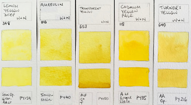
Winsor & Newton Watercolours - Lemon Yellow Deep, Aureolin, Transparent Yellow, Cadmium Yellow Pale, Turner's Yellow.

These yellow are all much more orange-yellow than they appear - I just can't adjust to make them look right. Winsor Yellow Deep is made with an excellent warm yellow pigment and is a great choice for a warm yellow in the palette.
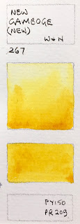
Winsor & Newton Watercolours - New Gamboge (now made with PY150 + PR209), Cadmium Yellow, Winsor Yellow Deep, Indian Yellow, Cadmium Yellow Deep.

Here is a sample of the new formula for New Gamboge. It doesn't have the magic of the beautiful but discontinued PY153. If you find an older version, do pick it up. It's a beautiful pigment.
Winsor & Newton Watercolours - New Gamboge updated version.

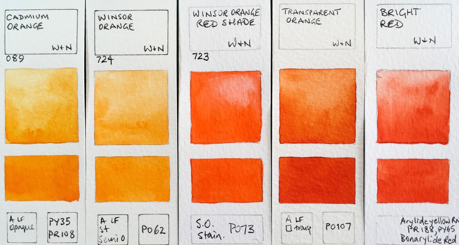
Cadmium Orange and Winsor Orange are more orange then they look here and Winsor Orange Red Shade is more or a warm red. Transparent Orange is one of the most beautiful single pigment oranges I think - along with Schmincke Transparent Orange and Da Vinci Benzimida Orange Deep and Daniel Smith Transparent Pyrrol Orange.
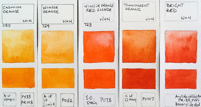
Winsor & Newton Watercolours - Cadmium Orange, Winsor Orange, Winsor Orange Red Shade, Transparent Orange (Limited Edition Colour), Bright Red (discontinued).

 Scarlet Lake is probably the best warm red option in a W&N palette.
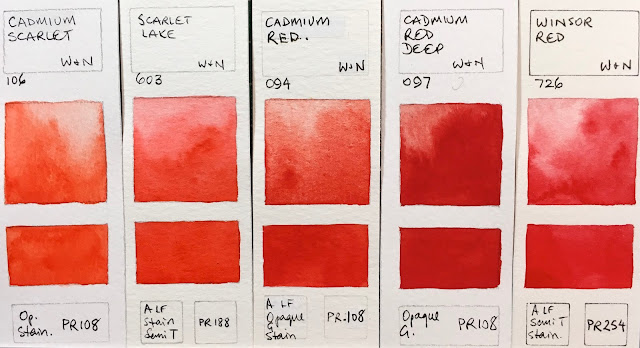
Winsor & Newton Watercolours - Cadmium Scarlet, Scarlet Lake, Cadmium Red, Cadmium Red Deep, Winsor Red.

 I like Winsor Red Deep for a good strong crimson. These swatches are closer to reality. I never use Alizarin Crimson but I do think it is helpful that is is still manufactured, as long as it is clearly marked as fugitive.
Winsor & Newton Watercolours - Rose Dore, Quinacridone Red, Winsor Red Deep, Permanent Alizarin Crimson, Alizarin Crimson.
Permanent Rose is great as a mixing rose or even as a primary red. W&N are the only manufacturer to still make genuine Rose Madder, and I'm glad it is still available to see what it looks like though it is fugitive so should be protected from light.
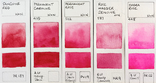
Winsor & Newton Watercolours - Sanguine Red (discontinued), Permanent Carmine, Permanent Rose, Rose Madder Genuine, Opera Rose.

 Quinacridone Magenta is a perfect choice for a CYM palette.
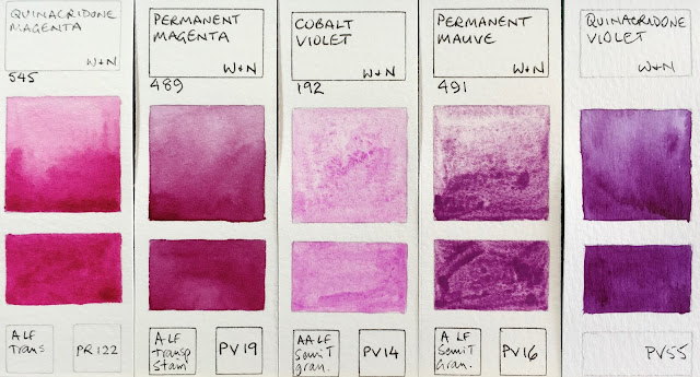
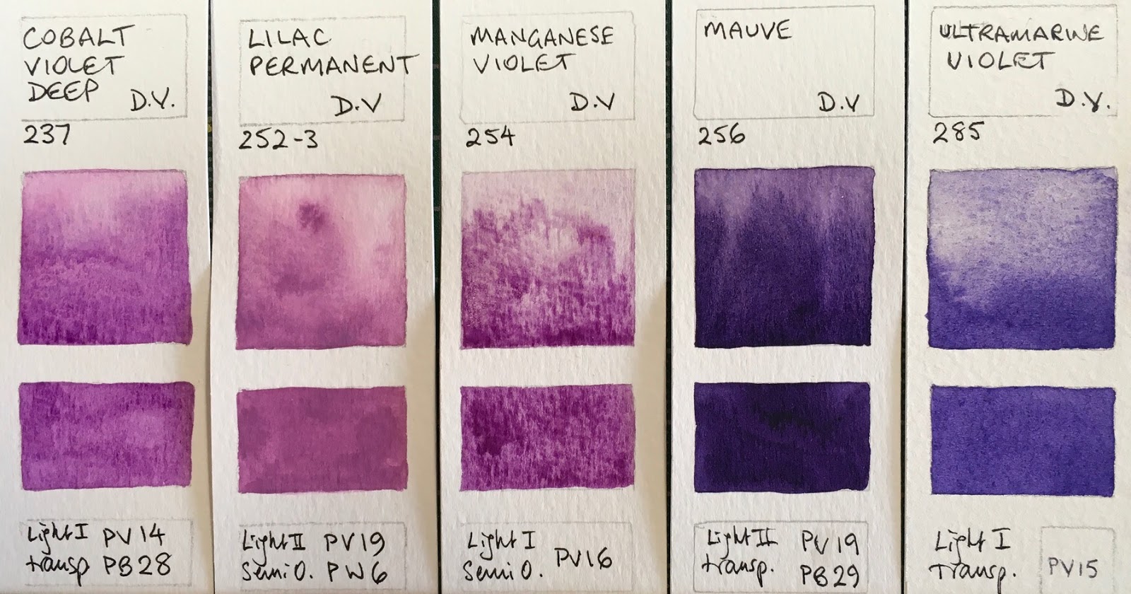
Winsor & Newton Watercolours - Quinacridone Magenta, Permanent Magenta, Cobalt Violet, Permanent Mauve, Quinacridone Violet.

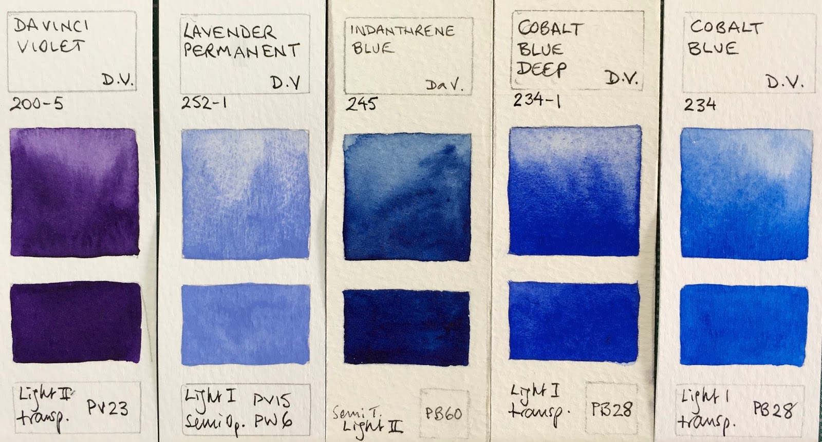
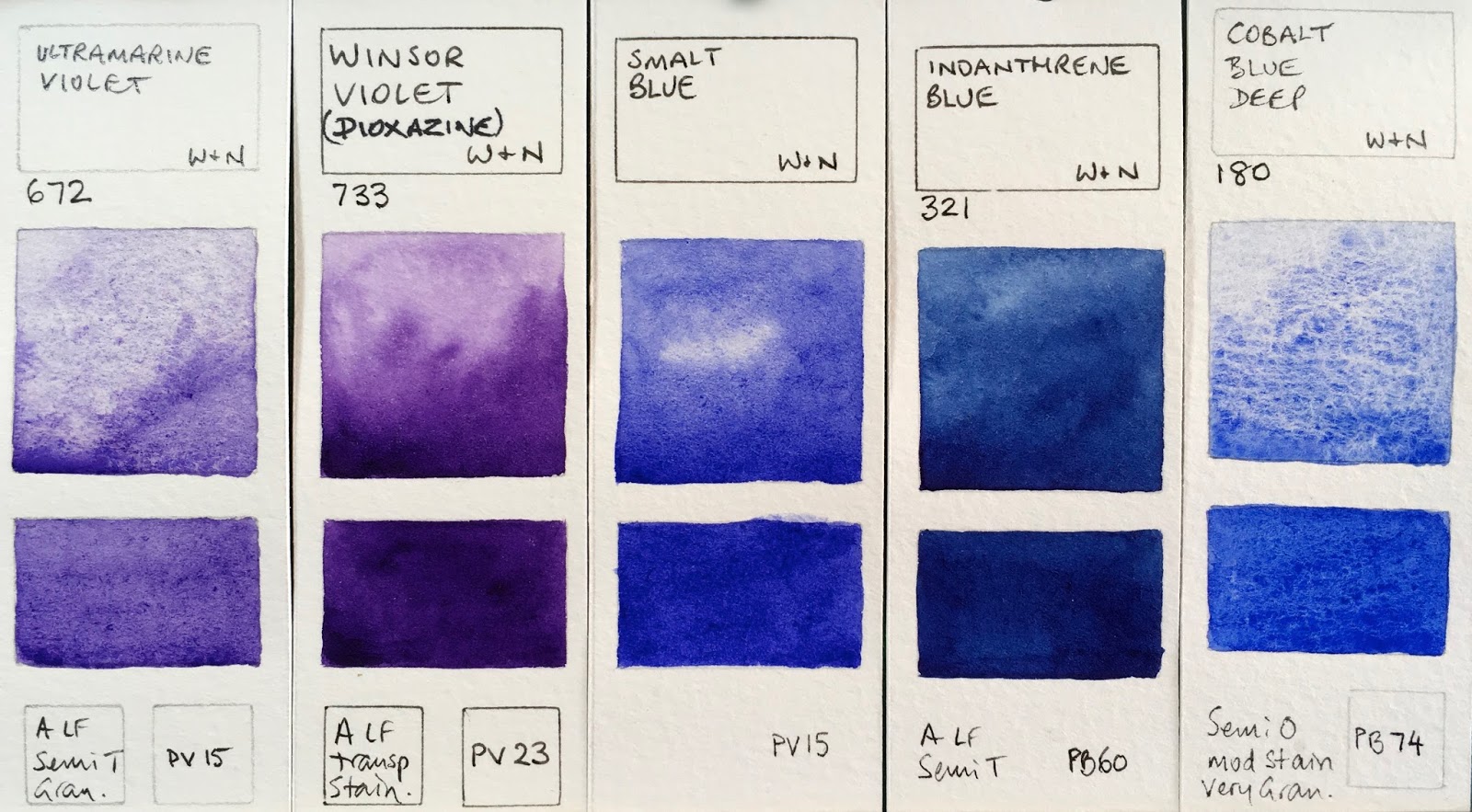
I like the granulation of PV15 Ultramarine, though it is not a strong mixer. I was really surprised to see this pigment in the rather amazing Smalt Blue limited edition colour.
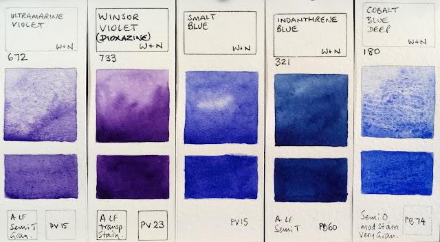
Winsor & Newton Watercolours - Ultramarine Violet, Winsor Violet (Dioxazine), Smalt Blue (limited edition), Indanthrene blue, cobalt Blue Deep.
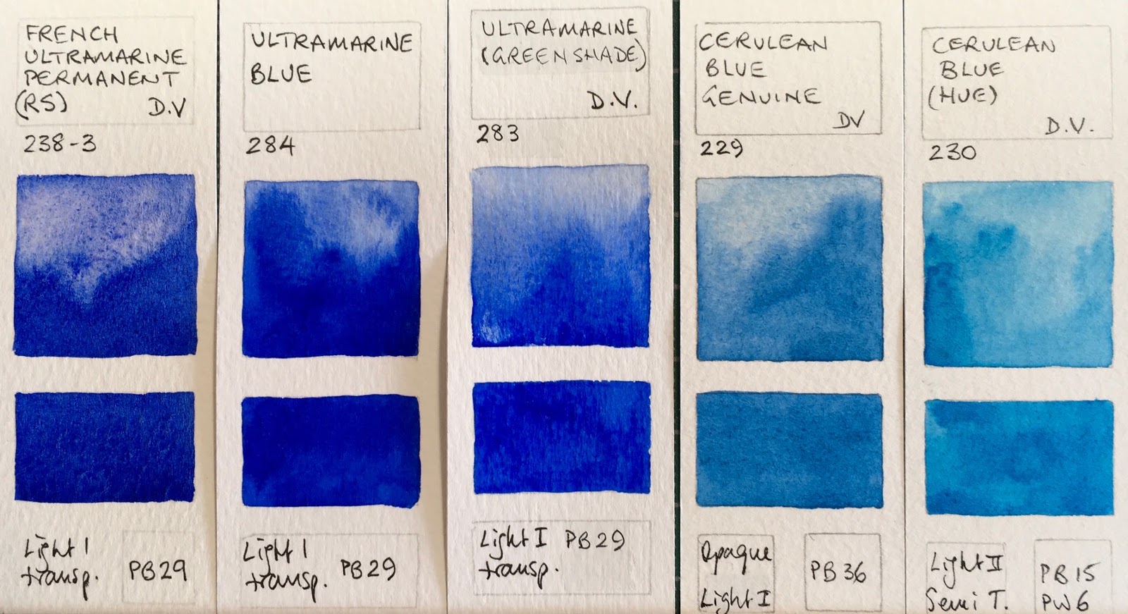
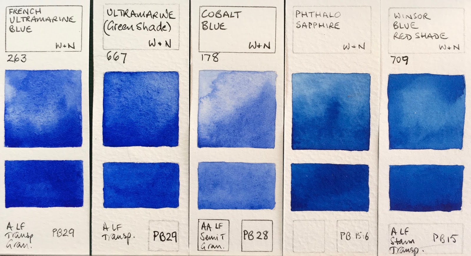
French Ultramarine is a palette staple. Winsor Blue Red shade and Phthalo Sapphire are very similar - both phthalo blue red shade colours.
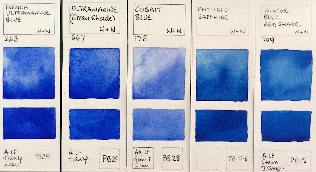
Winsor & Newton Watercolours - French Ultramarine, Ultramarine (Green Shade), Cobalt blue, Phthalo Sapphire, Winsor Blue Red Shade.

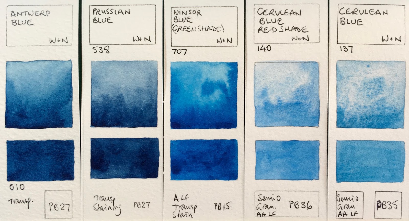
Winsor Blue Green Shade is often known as phthalo blue green shade - a lovely choice as a cool blue in a palette.
Winsor & Newton Watercolours - Antwerp blue, Prussian blue, Winsor Blue (Green Shade), Cerulean Blue Red Shade, Cerulean Blue.

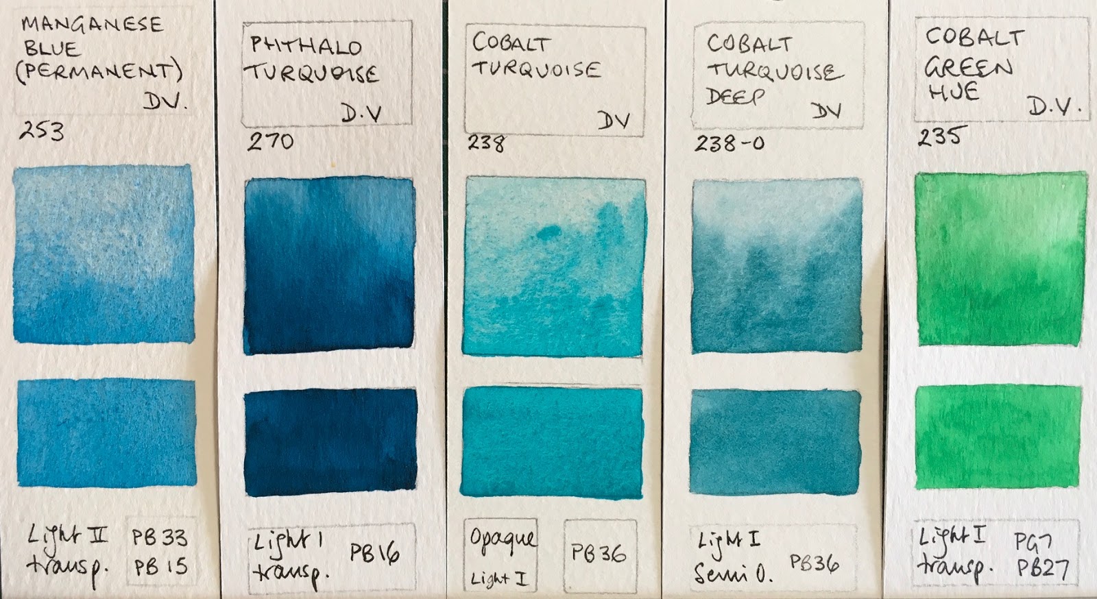
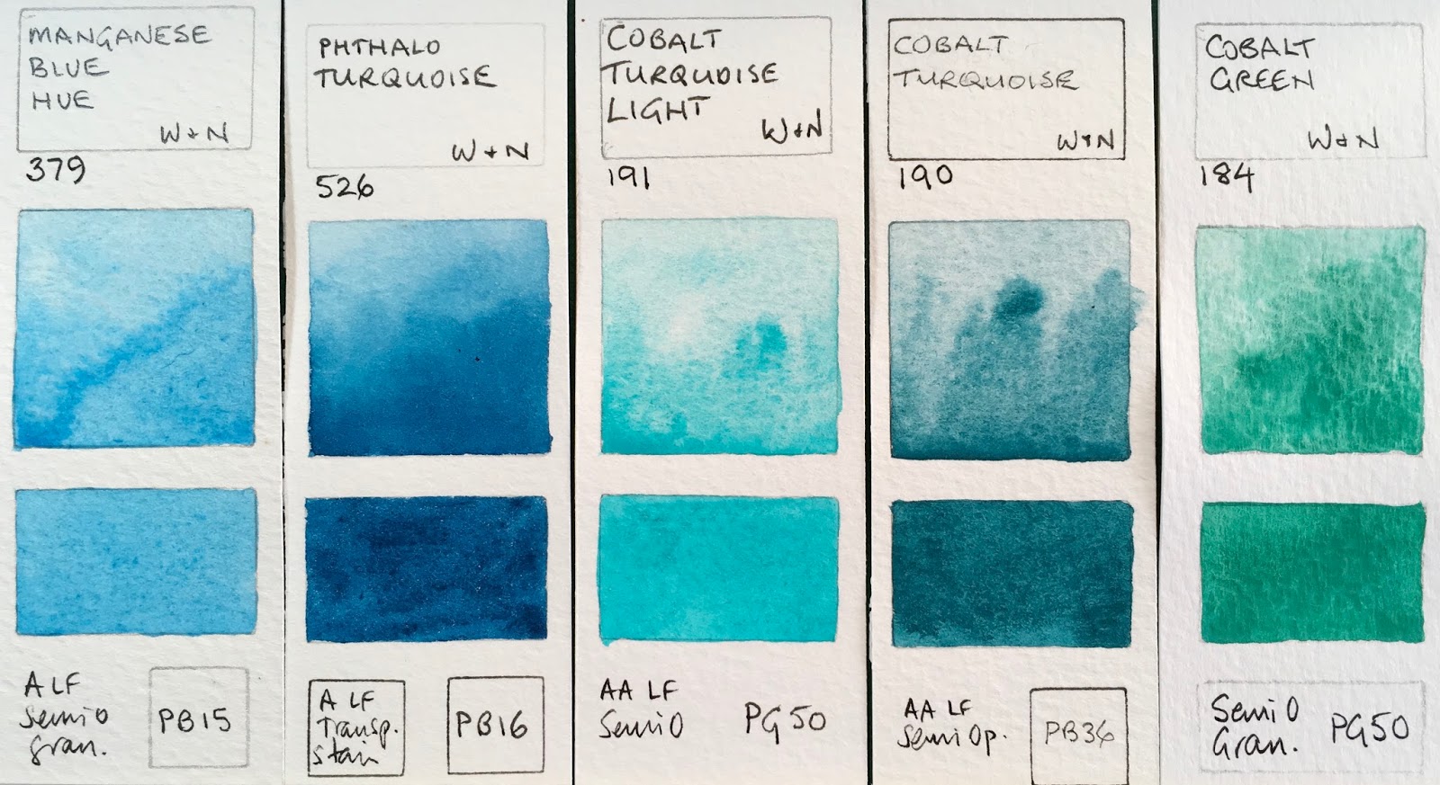
Cobalt colours are expensive, but add so much lovely texture. I particularly love Cobalt Turquoise. (Note as of 2018 Cobalt Turquoise is a two pigment mix of PB36 and PB28. )
Winsor & Newton Watercolours - Manganese Blue Hue, Phthalo Turquoise, Cobalt Turquoise Light, Cobalt Turquoise (now made with PB36+PB28), Cobalt Green.

Winsor Green and Winsor Green Blue Shade are the same thing if they are made with PG7. Also known as phthalo green blue shade. Viridian is a similar colour but more gentle and not staining.
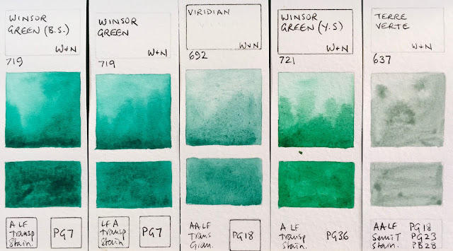
Winsor Green (Blue Shade), Winsor Green, Viridian, Winsor Green (Yellow Shade), Terre Verte.

I love Perylene Green for the shadows in foliage and am rather fascinated by the granulation and opacity of PG17 though I've never really explore this pigment.
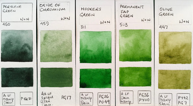
Perylene Green, Oxide or Chromium, Hooker's Green, Permanent Sap Green, Olive Green.

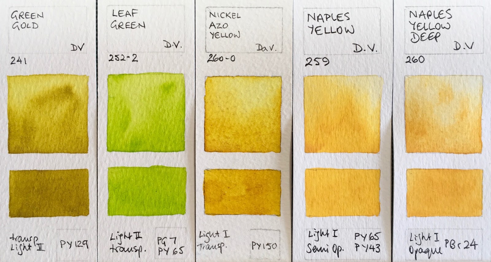
Green gold is useful for the look of sunlight shining through foliage.
Winsor & Newton Watercolours - Terre Verte (Yellow Shade), Green Gold, Naples Yellow, Naples Yellow Deep,
Yellow Ochre Light .

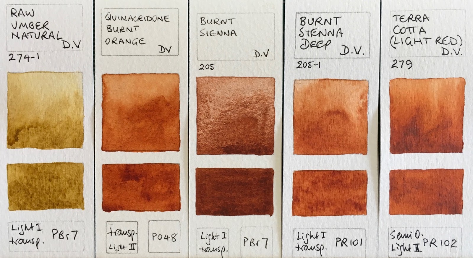
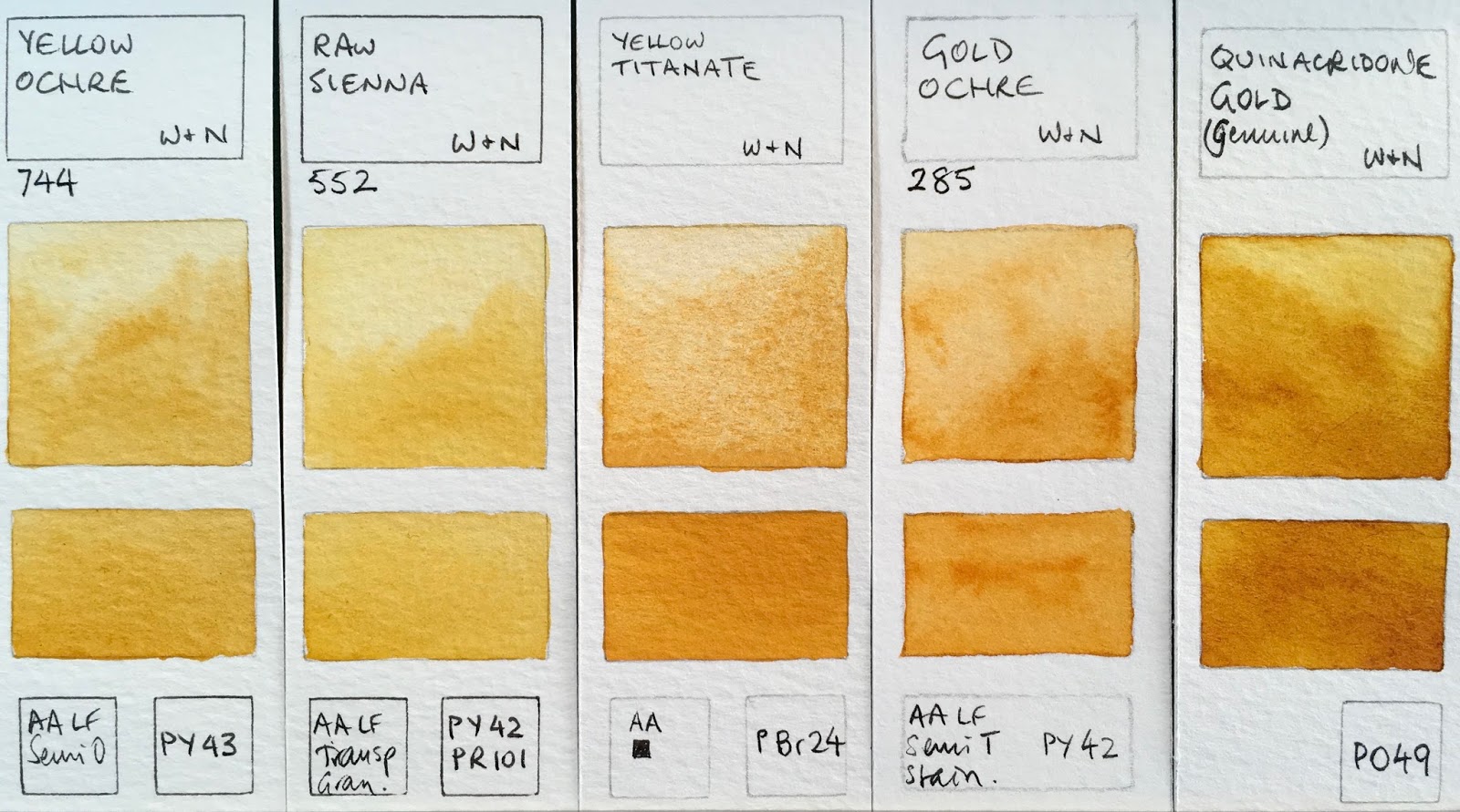
The Raw Sienna is a mix which is a shame as raw sienna PBr7 is a a lovely pigment. I like the yellow ochre and the lovely granulating Yellow Titanate.
Winsor & Newton Watercolours - Yellow Ochre, Raw Sienna, Yellow Titanate, Gold Ochre, Quinacridone Gold (genuine - discontinued)

Magnesium Brown is rather fun. Schmincke has just released a colour using this pigment too. Burnt Sienna is a gorgeous burnt orange colour. I prefer PBr7 burnt siennas but this will mix in a similar way to make greys with ultramarine.
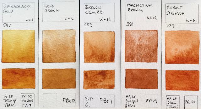
Winsor & Newton Watercolours - Quinacridone Gold, Gold Brown (limited edition), Brown Ochre, Magnesium Brown, Burnt Sienna.

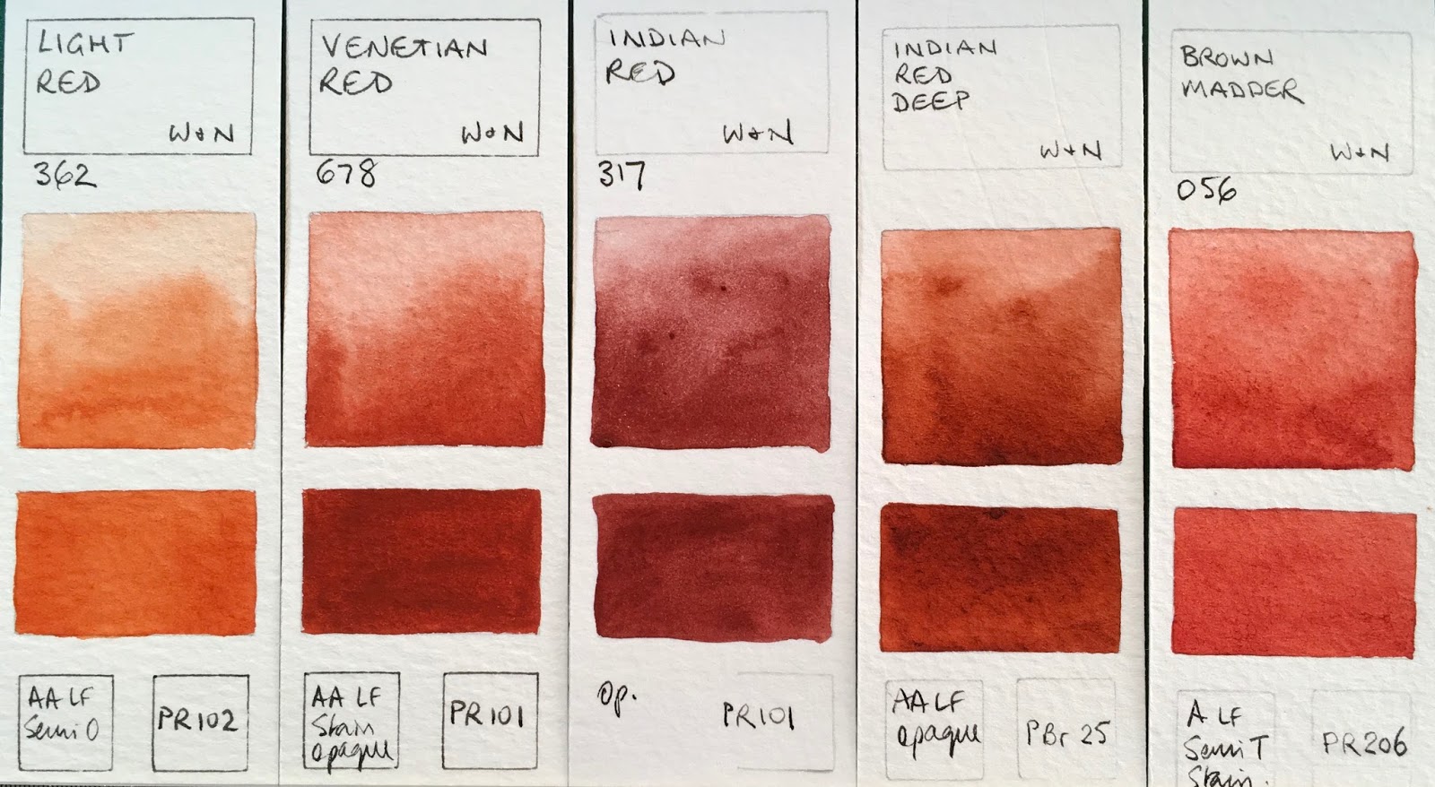
W&N Indian red is a fairly well behaved version of this colour. It can be rather wild and a little crazy, (which can be fun, but more difficult to control). Indian Red Deep is an interesting red-brown pigment made by a few other manufacturers. 
Winsor & Newton Watercolours - Light Red, Venetian Red, Indian Red (limited edition), Brown Madder.

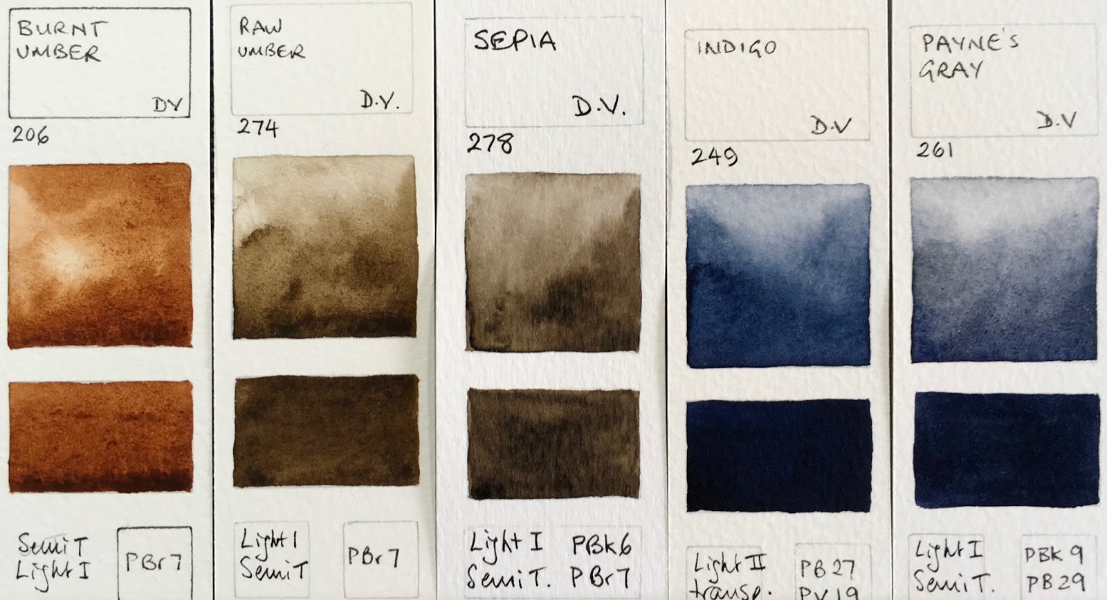
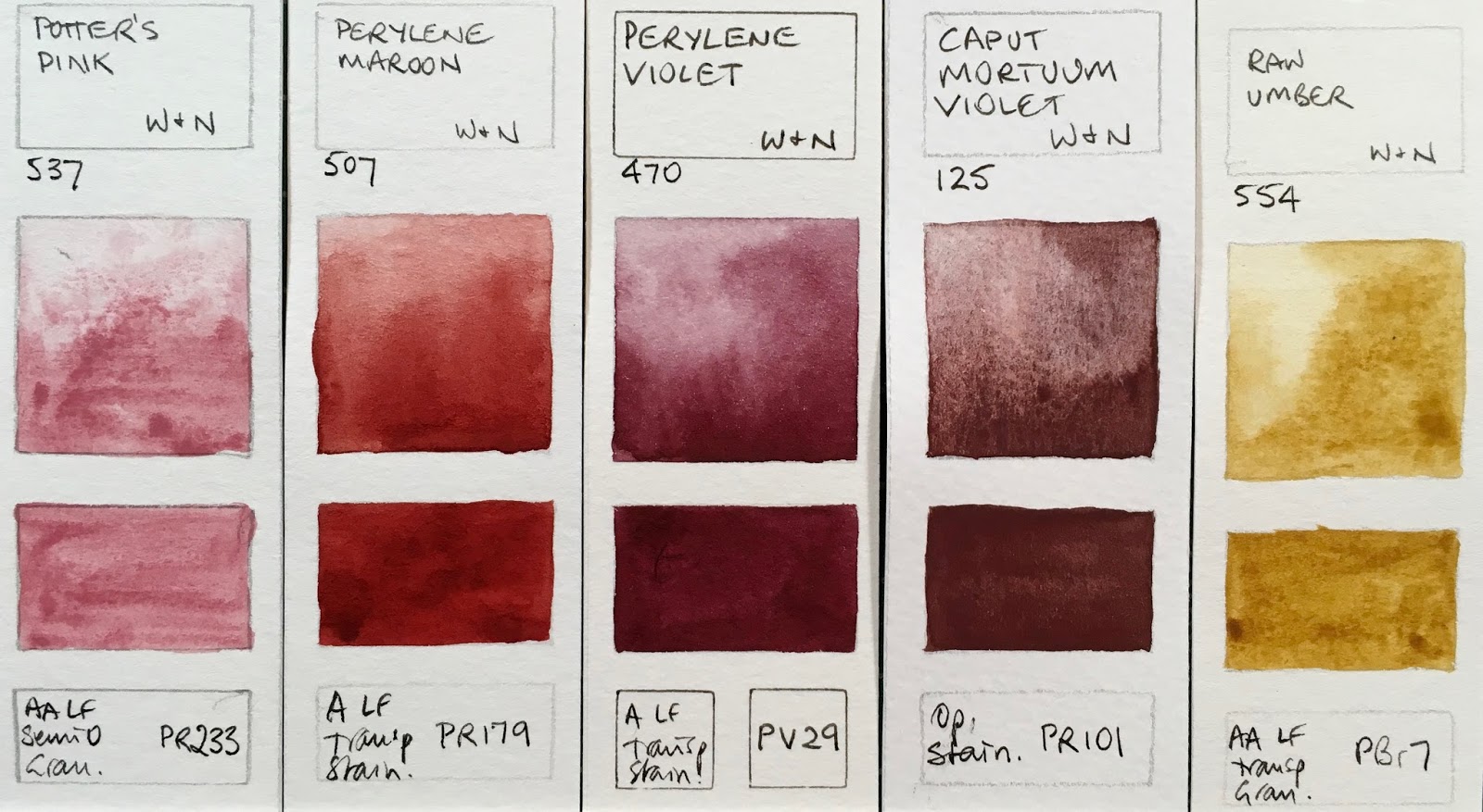
Raw Umber one of the colours which is produced as either this mid-toned colour or a dark cool brown colour depending on the manufacturer. I prefer the deeper version as a dark cool brown is not easy to mix.
Winsor & Newton Watercolours - Potter's Pink, Perylene Maroon, Perylene Violet, Caput Mortuum Violet, Raw Umber.


The very chocolate-coloured Dark Brown was a limited edition colour.
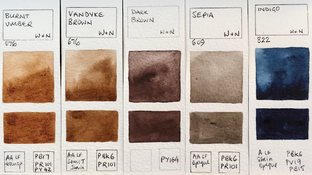
Winsor & Newton Watercolours - Burnt Umber, Vandyke Brown, Dark Brown (special limited edition), Sepia, Indigo.

W&N Mars Black can be seen here - it is the most granulating black, made with PBk11. 
Winsor & Newton Watercolours - Payne's Grey, Neutral tint, Ivory Black, Lamp Black, Mars Black

I don't tend to use black or white watercolours much but they are important, as are some greys for convenience.
Winsor & Newton Watercolours - Charcoal Grey, Davy's Grey, Chinese White, Titanium White.
This post was updated in June 2017. I am very grateful to Winsor & Newton Australia who presented each member of the Australian Watercolour Institute with a gift package including a paint dot card with the full W&N range. I was finally able to add the missing 5 colours :-)

As always, please let me know if I have made any errors.
Happy painting :-)