 |
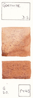
| Goethite, DS. PY43 |
Of the many characteristics the watercolour artist can explore, by far the most unique and special, is granulation. It's one of the reasons I use Daniel Smith watercolours - they are the masters of granulation.
Granulation is the effect you get when the pigment particles clump together rather than settling evenly on the painted surface. As a very general rule, the finer the particles, the less they granulate. So phthalos and quinacridones, being very fine and even sized man-made particles, appear very smooth in a wash.
Many of the natural earth pigments, ultramarines, cadmiums and of course the Daniel Smith Primateks have larger, more irregular particle sizes and granulate beautifully.
 |
Sydney sandstone sketch. Watercolour.
|
You can increase the effect further
by using rougher paper and more water.
As I am a realist, I really like to capture the texture as well as the colour of my subject, and granulating pigments helps to create texture in the otherwise 2D watercolour medium.
 |
Buff Titanium, DS
PW6:1
|
Two of my palette staples are DS Buff Titanium (shown left) and Goethite (shown above). The buff titanium is a granulating ecru colour, prefect for marble, snow gums, and for making pastel hues with other colours. Mixed with Goethite it creates a wonderful beach colour. You can see a lot more about mixing this wonderful colour here and it is mentioned in many of my blog posts here.
 |
Transparent Red Oxide,
DS. PR101
|
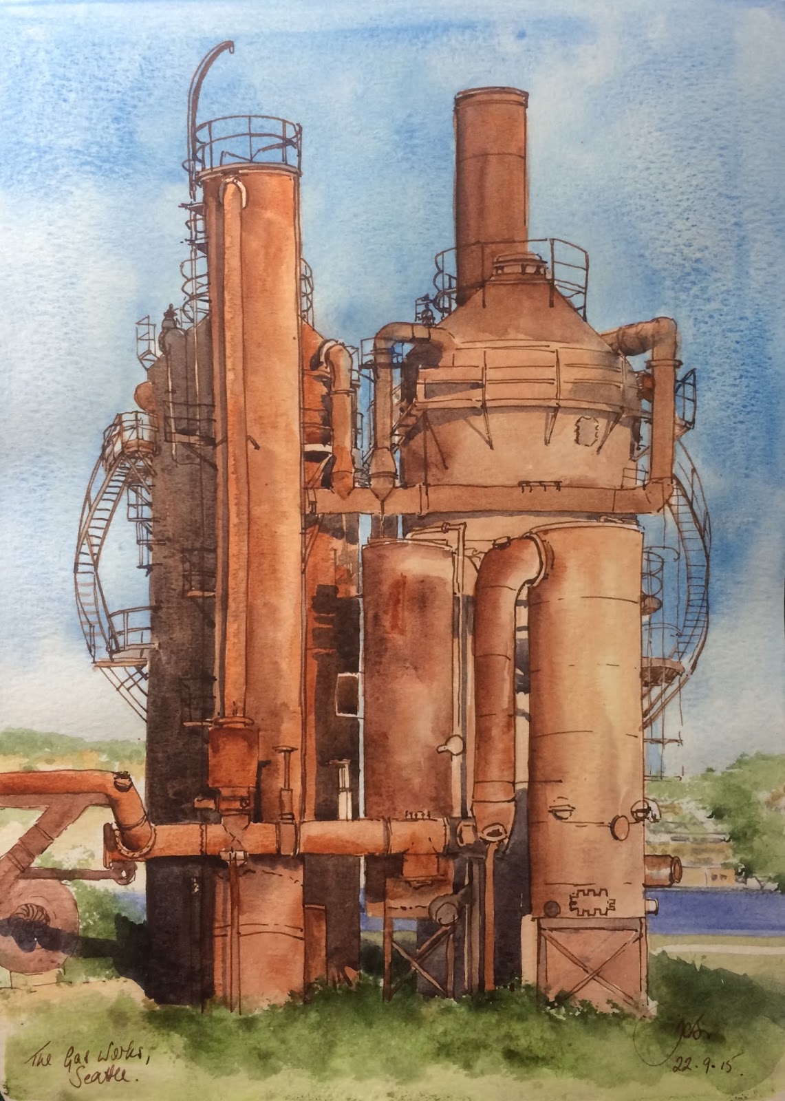
Together this pair is also fabulous for the fantastic range of colours in Sydney sandstone or the lovely honeycomb colour of Bath.
Adding DS transparent red oxide and/or burnt sienna and allowing the pigments to move on the paper allows the pigments to create extraordinary effects. You can see the granulation of the pigments in the bottom part of the sandstone rock sketch above and the cliff sketch below.
 |
Cliff sketch, Blue Mountains. Pen and ink and watercolour. |
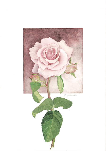 |
Governor Macquarie Rose. Watercolour.
|
This study of a Governor Macquarie Rose was painted in very soft washes of Piemontite and Quinacridone Rose, with just Piemontite used in the background. The colour changes when used in very weak washes or in mass-tone.
 |
| Piemontite, DS |
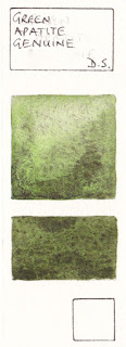 |
| Green Apatite Genuine, DS |
Green Apatite genuine is another fabulous granulating Primatek watercolour. It can create interest in passage of foliage as it also moves from brighter greens in soft dilutions to rich deep olive greens in masstone.
 |
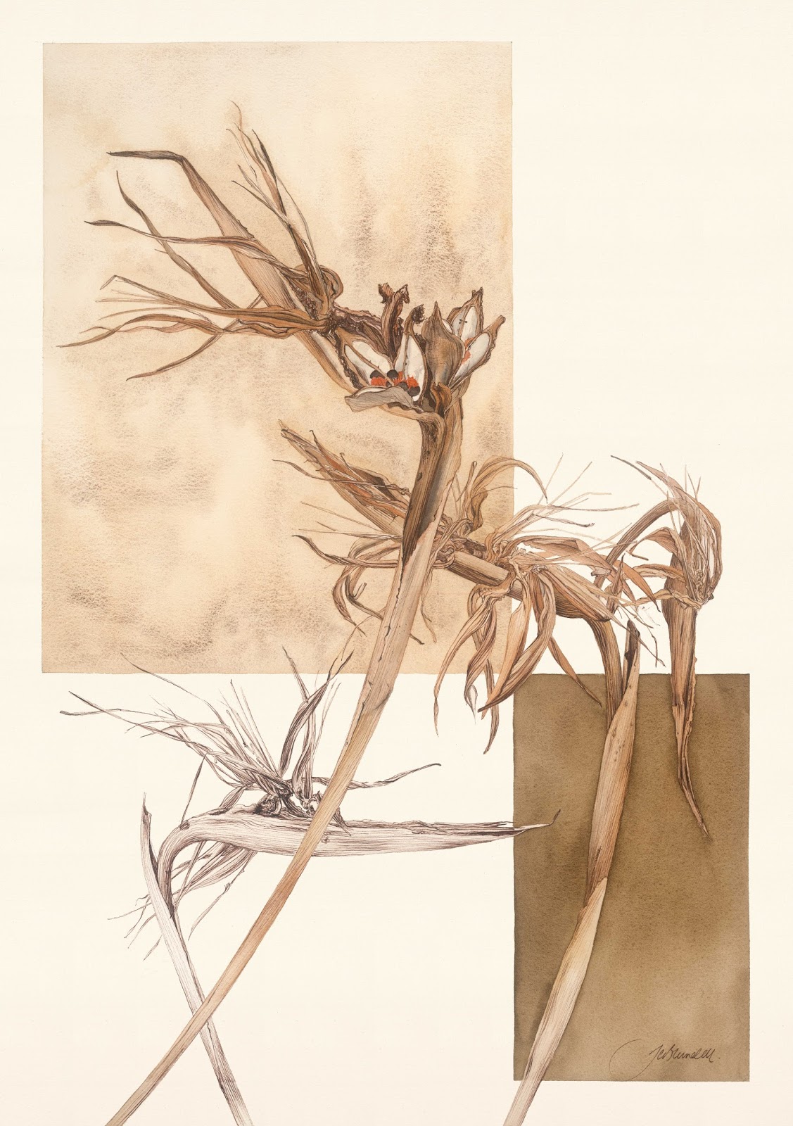
| The Gasworks, Seattle. Pen and ink with watercolour. |
Here I have used a combination of transparent red oxide and piemontite to paint the rusty texture of the Gas Works in Seattle - I love this place and look forward to returning when I go back to Seattle in October. You can also see the texture of Green Apatite genuine in the foreground foliage.
(For more on my upcoming US trip see here)
I love painting rusty things. And dead things, and decay...they could seem a little morbid but I seem them as extraordinarily beautiful :-)
 |
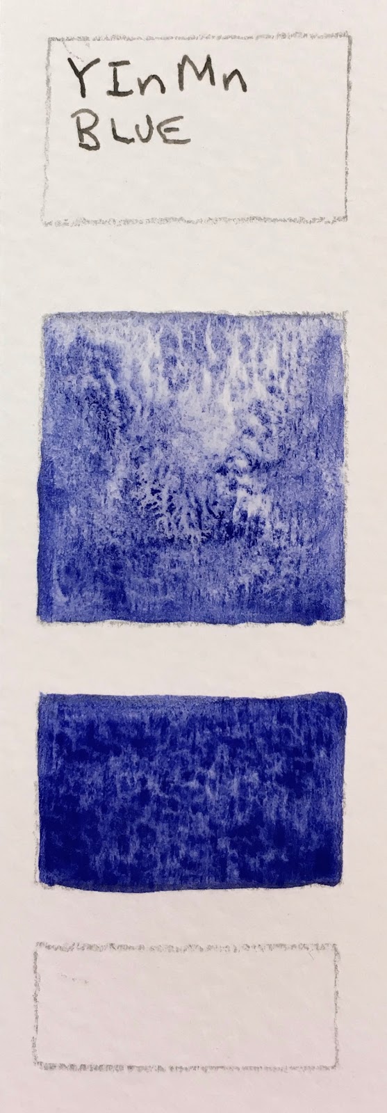
'Past their Prime'. Watercolour and Ink, 2017
|
The background in this pen and ink study of the dried Strelitzia was painted in a mixture of Goethite, Buff Titanium and Raw Umber. I love the way it produces a texture not obtainable any other way.
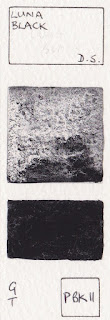 Perhaps the most spectacularly granulating pigment is PBk11 seen here in Lunar Black. I generally mix my own black hues, but I love exploring this one for amazing abstract or imaginary landscape studies as you can see in my gallery here.
I have also shown a swatch of an experimental Daniel Smith colour - the rare and expensive YInMn blue pigment. In any other medium I have seen it, it is a lovely colour but otherwise not anything so very special, but seen here as a watercolour it is really something.
I love exploring all the characteristics of watercolour, whether for sketches on location, urban sketching, botanicals, studio paintings or just to play. But my favourite by far is granulation.

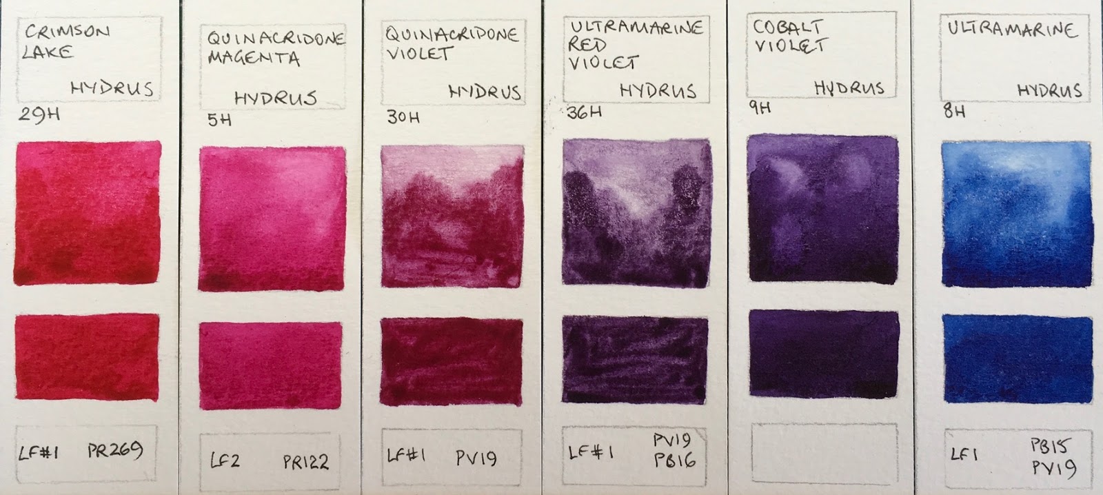
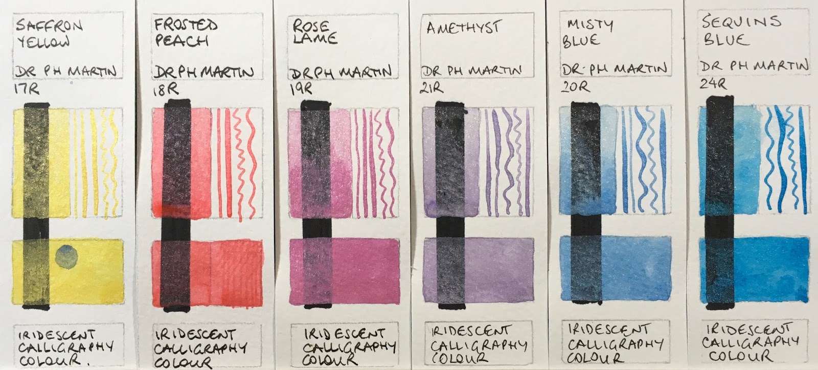
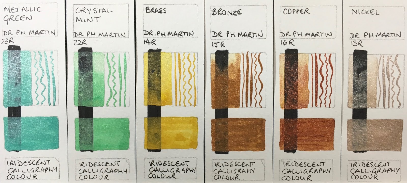
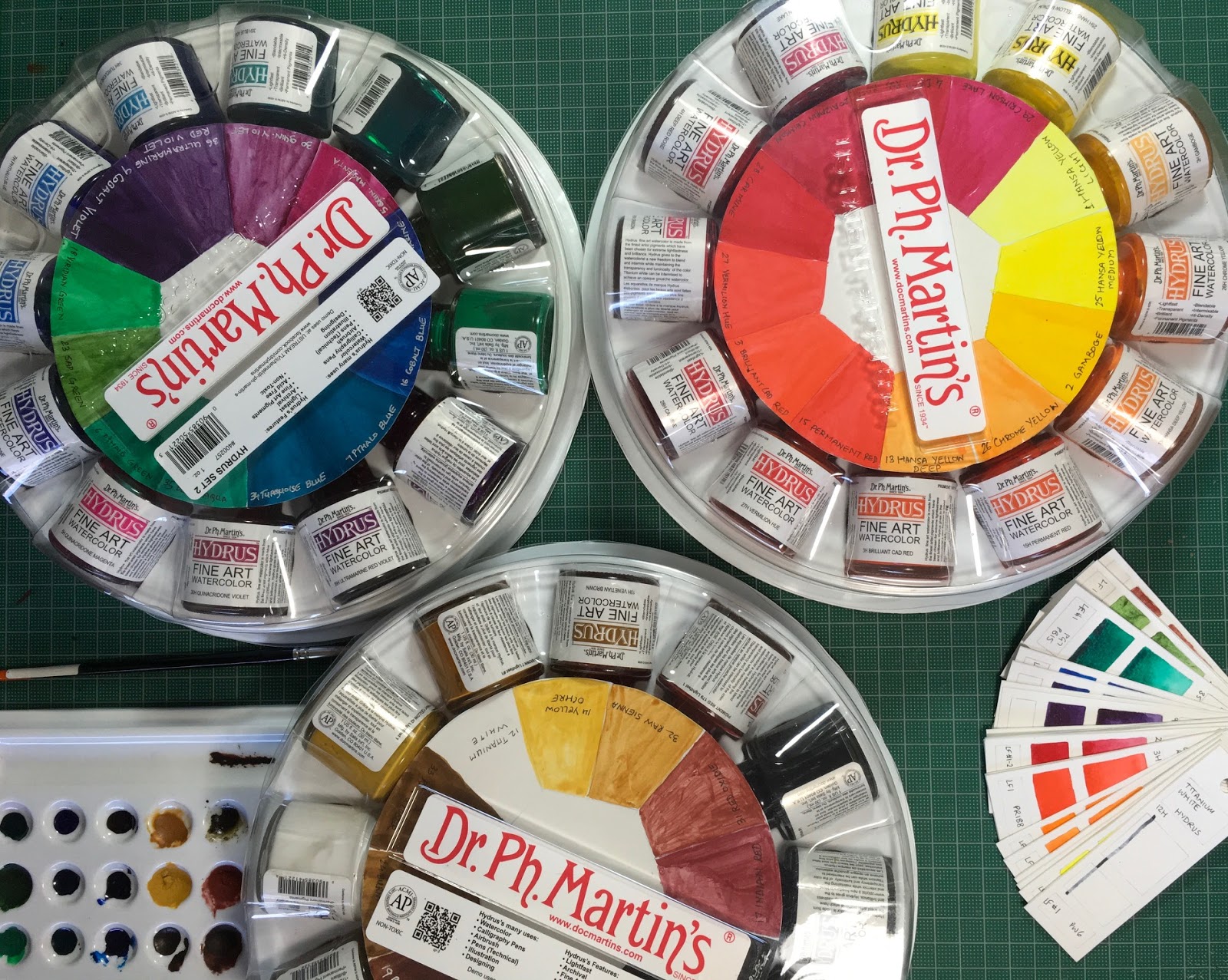 One of my lovely students, Sakshi, lent me a full set of Dr. Ph. Martin's Hydrus watercolours to test, which was great as they claim to be a range of pigmented lightfast liquid watercolours. Not something I am particularly interested in using necessarily, but interesting to try. I'm curious how they differ from working with pigmented inks.
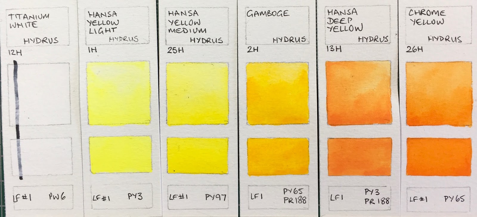


